My unrefined eye definitely favors one of these- I am eager to hear educated opinions.
regards, d.k.
caucasians
I apologize for having no information at all on these three - images were lifted
off the web at some point and stuck in my image collection.


My unrefined eye definitely favors one of these- I am eager to hear educated
opinions.
regards, d.k.
Hi Doug -
Working A, B and C from top down:
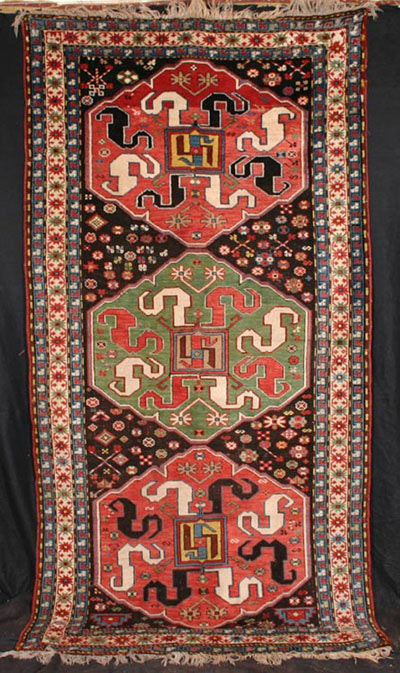
A: Good: 3
Rationale: Drawing of medallions well-planned and executed; color choices for
medallions pretty good; too many filler devices crowd field; scale of filler
devices and those of the borders too close for effective contrast.
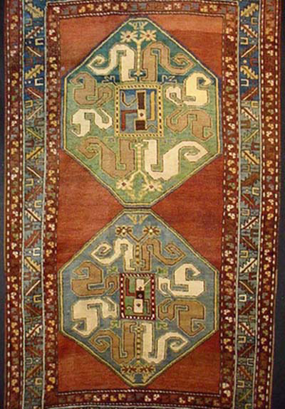
B. Better: 4
Rationale: Spacious empty field is effective in highlighting medallions; medallions
elongated, especially top one; spaciousness of field would enhance if interior
minor borders did not touch medallions. Colors unusual, OK, but not particularly
interesting in a Caucasian.
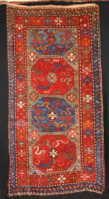
C: Good: 1
Rationale: "Hot" orange, "foreign-seeming" pink suggest synthetic dyes. Everything
drawn at nearly the same scale so that nearly everything competes with everything
else. Choice of ground colors for medallions, field and borders is positive
feature.
Has a very "ordinary" feel; confirmation of substantial presence of synthetics
would be disqualifying.
Regards,
R. John Howe
Hi John
You wrote,
C: Good: 1
Rationale: "Hot" orange, "foreign-seeming" pink suggest synthetic dyes. Everything
drawn at nearly the same scale so that nearly everything competes with everything
else. Choice of ground colors for medallions, field and borders is positive
feature.
Has a very "ordinary" feel; confirmation of substantial presence of synthetics
would be disqualifying.
You already gave it what I thought was the lowest possible score (1). What would
"disqualifying " reduce it to?
I don't like it either, by the way.
Regards
Steve Price
Hi Doug, John and Steve,
B and C are easy for me to rate: 1, as in DOGS. Where is a 0 when you need one?
B appears to be full of faded fuchsine with clumsy drawing and C has even worse
drawing and day-glow synthetics. With more time, I could tell you what I really
think about them.
But A is a puzzle. I can’t recall seeing any antique Caucasian with exactly
this border system or the same kind of filler, thereby raising the question
of its age. Could it be a newer rug in the style of an older one? The colors
are quite nice and the contrasts are good, although the filler in the field
and the borders are in too much of the same scale and therefore undistinguished.
If seeing it in the flesh would demonstrate that it really is an antique, I’d
give A an 8. Even so, it wouldn’t be one of the great cloudbands.
Wendel
Hi Steve -
Having defined the scale as 1 to 9, I can't give it a 0.
I guess I could only refuse to buy it. But then I should be buying only at much
higher scores if I can afford to.
Good point.
R. John Howe
A is the closest of the three to an ideal “Cloudband” rug so it deserve unquestionably
the first place. I like its drawing and colors but I agree with the criticism
about the borders/fillers scale. I could tolerate the fillers of the field but
this rug definitely needs a better/bigger scale border.
B is an uninspired rendition of the cloudband genre with bad colors and an unsatisfactory
drawing.
C is the more distant from the ideal “cloudband” and, yes, it has hot, possibly
synthetic colors, nevertheless I like it. It shows originality. I like those
Chinese-like motifs used in the main border, inside the cartouches in the center
of the medallions and in the field. And the colors - synthetic or not - work
well together.
Rating:
A- Best - 7
B- Good - 1
C- Better - 4
Filberto
P.S. I think “Good, Better, Best” are redundant, after all. Numerals are enough,
no?
Hi Filiberto -
You said in part:
I think “Good, Better, Best” are redundant, after all. Numerals are enough,
no?
My thought:
It could be argued, but the survey research people often doubt our ability to
make discriminations well using longer scales.
Three position distinctions seem usually what most of us can manage. So I think
a two-level rating scheme is worth retaining at least for this exercise.
Notice that Rich said in one instance he wanted to rate something "Good" and
to give it a "4." This shows how the first level distinction operates. Once
we make that judgment our ability to use numbers is structured usefully.
So I would prefer to retain it, although I would like even more to have rationales
for ratings. Perhaps not quite at the level Sue has provided for the yastiks
but something more than the numbers which some are now doing. It is in the reasons
for the number ratings that we learn most.
Regards,
R. John Howe
Hi John
I think that one of the things that gives people trouble is that the bottom
of the verbal scale is "Good". It certainly doesn't work for me. In my world,
"Good" means "better than average". Rugs differ from the kids in Lake Woebegone,
who are all above average. Some rugs are simply awful, and fully half are below
average.
Regards
Steve Price
Steve -
I think that's true and is one problem with simply adopting Sack's names for
the positions on his three point scale as I did.
We can rename "Good" as "Average or Below" if that helps but I'd rather rate
the pieces than debate the scale.
However, distracting the word "Good" is for describing rugs that are very often
not close to that, the points assigned 1-3 make pretty clear that the "goodness"
intended is pretty thin indeed. And Sack said that directly in his own elucidation
of "Good."
It always strikes me that no matter how you pose a problem, for some the interesting
debate is to question the character of the posing than it is to take on the
actual task proposed.
Some here want to feel handle and assess wool quality. Well, we've never been
able to do that directly in any Turkotek interaction to date (that's maybe for
six years so far), so it seems like a strange request, suddenly in the middle
of this particular task.
Here, I'd like to rate the pieces on the basis of what we can see and get rationales
for the ratings. Folks are free to rename the three position Sack scale for
themselves, if they want, but lets not let Sack's ill-chosen word "Good" (it
could well have been dictated by his publisher looking for a snappy title) function
to deflect us from the central task proposed.
Regards,
R. John Howe