Posted by Steve Price on 10-24-2006 10:00 AM:
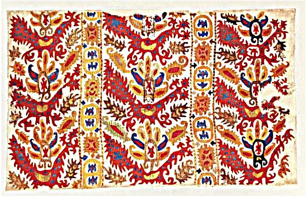
"Dragon and Simurgh" Kaitag Embroideries
Hi Folks
We did a Salon on
so-called "Simurgh and Dragon" Kaitag embroideries a few years back. It included
several examples, all with an obvious familial relationship, but fairly varied
in execution. I thought some of them might make an interesting exercise for our
purposes here.
Here they are:


Your rankings and reasons. I
don't have an external expert lined up to offer comments on these, by the
way.
Steve Price
Posted by R. John Howe on 10-24-2006 11:03 AM:
Steve -
About not having an expert lined up. That's fine, you can "be"
the expert for this thread, just refrain from giving your own ratings for
awhile.
Regards,
R. John Howe
Posted by R. John Howe on 10-24-2006 11:13 AM:
Dear folks -
I don't really know anything about Kaitag embroideries,
but I'll offer my opinion anyway.
Labelling these three pieces A, B, and
C starting with the top one:
A: Best: Rating: 8 Rationale: I think this
is the best piece in terms of color and the drawing seems nearly, but not quite,
on a par with that of Piece B below it.
B: Better: Rating: 6 Rationale: I
think the drawing on this piece is likely the best of the three but the colors
seem lacking to me.
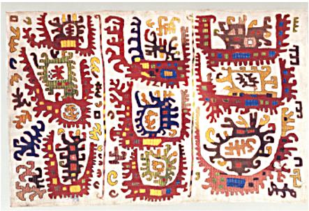
C: Better: Rated: 6 Rationale: Color seems nearly as
good as that in piece, A but not quite. The drawing seems more conventialized
and a bit cramped maybe because less well planned.
Posted by Steve Price on 10-24-2006 11:31 AM:
Hi John
Just one point: the colors on number 2 are probably very close
to those on numbers 1 and 3. It comes from a published source in which the color
reproduction looks to be far below state of the art to my eyes.
Regards
Steve Price
Posted by R. John Howe on 10-24-2006 02:23 PM:
Steve -
Then I think I need to redo a bit with my ratings hinging more
on drawing alone. That being the case my revised ratings would be.
A:
Best: Score:8
B: Best: Score:8
C: Better: Score: 6
If in additional
comparisons the poster has reason to believe that the colors on our monitors are
inaccurate, that would be good to state, since color seems likely to be a
frequent basis of evaluation.
Regards,
R. John Howe
Posted by Richard Larkin on 10-25-2006 08:37 PM:
Steve:
I have no idea what these are. I give A an 8, best, and find it
eye-popping. I give B a better at 6. Perhaps I'm penalizing it for the more
somber-appearing color, in spite of your comment. But I find the drawing less
energetic as well. It could be more "spacious," and is less so than B, but on
balance I rate them as indicated. C doesn't move me so much, and I'll give it a
better at 4 for being pretty anyway.
Are they silk on linen? Cotton?
__________________
Rich
Larkin
Posted by Steve Price on 10-26-2006 12:43 AM:
Hi Rich
The embroidery is silk. The ground textile is probably cotton
for all three, although I don't know this for certain.
Steve Price
Posted by Filiberto Boncompagni on 10-26-2006 04:08 AM:
Let’s see:
A: Best, 8 – better colors than the following and I like
the “full composition” too
B: Best, 7 – inferior to B in colors and
composition
C: Best, 8 – Don’t ask me why. I just like
it.
Regards,
Filiberto
Posted by Steve Price on 11-01-2006 10:42 AM:
Hi People
I've seen a fair number of Kaitags of this group, and my
impression is that the colors are not very different from one to another. So I
would ignore the apparent color differences in these three; the first one is
probably closest to what you'd see for each of them seen in person.
There
are several categories of Kaitags, and these belong to the group used over the
head regions of baby cradles as protection against the evil eye. The intention
was to use highly disruptive patterns and colors, which would prevent the evil
eye from focusing attention upon the infant.
For this reason, I think
it's reasonable to judge them on the basis of how well they meet their
objectives, which would be to have a riot of color, irregular forms, and
discontinuities. All of this, apparently, within the framework of a fairly well
defined design (the so-called dragon and simurgh, the layout, etc.). This,
incidentally, is the basis of their appeal to me as well. I own one of this
genre, but have not included it because it's impossible for me to judge it with
anything approaching objectivity.
I think the first two are excellent,
the first one better than the second because of the busy-ness and density of the
embroidery. The third is, in my opinion, far inferior in every respect. The
"simurgh and dragon" are nearly unintelligible, the vertical columns of
cartouches are replaced by simple vertical poles. It lacks the profusion of
details and general exuberance of the other two. I think the evil eye would go
straight for a beautiful child if this was the only distraction in its
path.
My ratings are, in the order that they appear in the first post,
A = Best, an 8 or 9
B = Very Good (Best minus?), a 7 or 8
C = Poor, a
2 or 3
Regards
Steve Price
Posted by Richard Larkin on 11-02-2006 05:45 PM:
Steve:
If the idea is to help the evil eye get lost in the scramble, A
is the winner far and away. It brings in the notion that I think Louis
mentioned, and maybe one or two others, that understanding the purpose of the
weaver may be very important, and possibly beyond our reach in many instances.
As a matter of fact, when we tell ourselves we understand the purpose of the
weaver, then I think we may really be in trouble.
__________________
Rich
Larkin


