Posted by Richard_Tomlinson on 10-27-2006 07:01 AM:
Shahsavan Bagfaces
hi folks
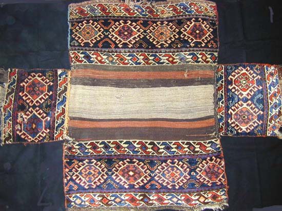
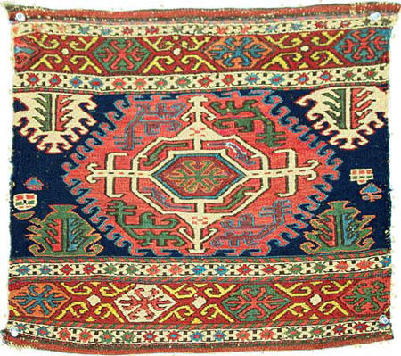
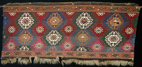
here are 3 ‘shahsavan’ (let’s just call them that) bagfaces or possibly mafrash
panels.
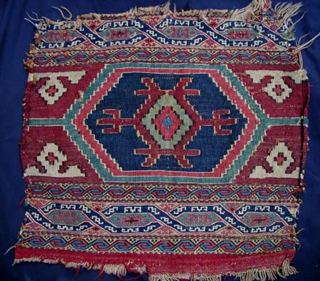
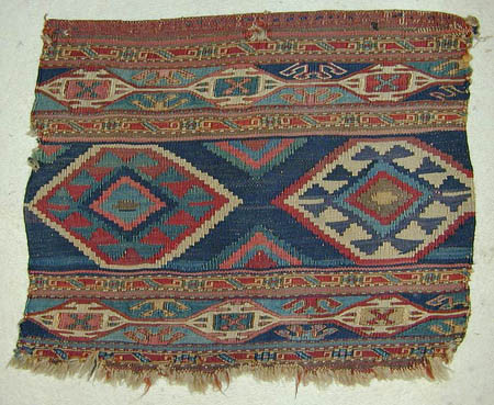
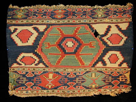
all 3 feature flatwoven centres with some soumac weaving.
I consider one of these pieces to be outstanding. my thoughts later…
opinions?
regards
richard tomlinson
Posted by R. John Howe on 10-27-2006 07:22 AM:
Dear folks -
No, No. Not "opinions," "ratings" with "rationales," please.
Richard, could you explain your expression "flatwoven centres?"
Regards,
R. John Howe
Posted by richard tomlinson on 10-27-2006 07:30 AM:
hi john
sorry - my mistake. ratings and rationales please.
the centre 'field' if you can call it a field (there are no side borders) of
each piece is kilim (not soumac, not pile)
the top and bottom borders feature some soumac weave.
does that make sense? i am not the most articulate of people :-(
richard tomlinson
Posted by R. John Howe on 10-27-2006 09:10 AM:
Hi Richard -
That's clearer.
Each panel is composed of horizontal bands woven in different flatwoven techniques.
Often the top and bottom bands are some sort of sumak but the centre bands in
all three panels are slit weave tapestry (kilim).
Regards,
R. John Howe
Posted by Filiberto Boncompagni on 10-27-2006 10:52 AM:
A - Best - Nice colors, balanced composition, very interesting borders. Rated
8
B - Best - As above but the colors look inferior (could be simply a bad photo
though). The field design is more common than in A. Rated 7
C - Better – Interesting but a too sloppy composition. Rated 4
Filiberto
Posted by Wendel Swan on 10-27-2006 01:48 PM:
Hello Richard and all,
I have trouble using the good, better, best terms for this group, although the
trouble here is not as evident as in those cases where there are pieces that
are far below the "good" class. Overall, I don’t think any of these quite represents
best in relationship to other sumak weavings, but some features are noteworthy.
A – 7 The colors are freshest in this panel and the interlaces are interesting.
In the main border we see tiny ivory devices in the interlace that look like
shrunken versions of the main border on some of the Konya Seljuk carpets at
the TIEM. I don’t remember seeing such elements in any other sumak. I prefer
the single medallion to the two in B.
B – 6 This probably has a very fine weave with silk ground wefts but, unfortunately,
the borders are compressed and the colors seem to have faded. I’m sure that
the numerous colors were at one time spectacular. In a fresher state and if
the borders had not been compressed, this could have been at least an 8. But
we have to judge items as we find them.
C – 3 This panel is poorly articulated, with the main border at considerable
distance from the standard and the drawing in the main field totters all over.
The colors look quite nice, however.
Wendel
Posted by Rob van Wieringen on 10-28-2006 06:00 AM:
When imagining to have on of these on my wall for a longer period, I undoubtly
would choose for C. It shows the best colors and graphics, despite its unbalanced
borders. It has artistic merits, with a touch of '3D'. And it would also have
the best impact of the three, when viewed from a distance.
In comparison with C., A looks dull, despite its interesting borders.
B would be my second best choice with its fine weave and good, softened color
range.
Rob.
Posted by Filiberto Boncompagni on 10-28-2006 06:11 AM:
Hi Rob,
The rationale is there but you forgot the scoring...
Regards,
Filiberto
Posted by louis_dubreuil on 10-28-2006 06:15 AM:
my choice
Bonjour à tous
I aggree with Rob.
C : the best because of the colour palette and balance and because the freedom
of the drawing, with a lot of space and dynamic balance between shapes and colours
(maybe some advantage given by the warm colour temperature of the picture)
B : better because of the honest work done on design and colours.(maybe disadvantaged
by the cold colour temp of the picture)
A : just good, too complicated design, lack of balance in the general composition
(the borders take a too great space and the central design is oppressed). The
clour palette is sad without any vibration.
Posted by Rob van Wieringen on 10-28-2006 06:20 AM:
A : 4
B : 7
C : 8
Rob.
Posted by Filiberto Boncompagni on 10-28-2006 06:29 AM:
Thanks, Rob.
Maintenant c’est à Louis…
Posted by louis_dubreuil on 10-28-2006 06:33 AM:
My quotation is done on 10 basis
A : 4
B : 6
C : 8
Bon week end
Posted by Steve Price on 10-28-2006 06:58 AM:
Hi Folks
These three are end panels of cargo bags, and it's always been my impression
that cargo bags were really done with the long side panels as the primary focus,
the end panels being derived from them. For that reason, I tend to see these
three in terms of what I imagine the longer side panels looked like. To a first
approximation, the side panels usually look an awful lot like what you'd get
if you placed two end panels side by side and did an invisible join where they
meet.
With that as background, I more or less agree with Rob and Louis.
Although C looks like the weaver was desperately trying to fit the complete
design into a height that she realized was inadequate (it becomes progressively
more cramped as it goes from bottom to top), I like the effect that results
- almost as though the thing was leaning away from the viewer. The colors are
harmonious and well balanced, and I like the partial echo of motifs between
the field and major border.
The side panels of B would look a lot better than it does as an end panel, although
the unsaturated colors reduce the appeal even in the side panel format. The
major border is very closely related to that in C, but, in my opinion, not nearly
as well done.
I find A jarring, both in terms of color balance and the border system, which
strikes me as bizarre and so far outside the traditional mainstream that I can't
help wondering whether it was woven under contract to meet specifications of
some western buyer.
I prefer not to assign numerical scores to these or to accept the use of the
word "good" as a descriptor of something that I don't think is good. My rank
order of these three, though, is C, B, A, with a fairly wide aesthetic interval
between each pair.
Regards
Steve Price
Posted by Filiberto Boncompagni on 10-28-2006 07:24 AM:
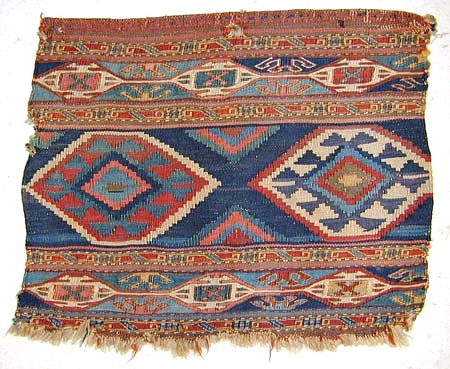
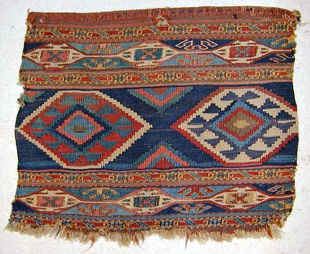
Hum, excuse me, but I feel that the colors in picture B are too wrong.
They should be more like one of these:
Regards,
Filiberto
Posted by Rob van Wieringen on 10-28-2006 07:32 AM:
Filiberto,
Excuse me, but I do not consider this ( B*: 6 ) to be an improvement.
I do prefer the original one. ( B :7 )
Rob.
Posted by Steve Price on 10-28-2006 07:38 AM:
Hi Filiberto
Do you mean that
1. you think the color reproduction of B in Richard's original post is poor
and that the piece really looks more like one of the two images you just posted,
or
2. you think piece B would look better if its colors were closer to those in
the two images you just posted.
I think it would be better than I think it is now if the colors were closer
to those in your post, but made my judgement on the basis of what was presented
(Richard made no comments about color reproduction, so I assume that he sees
them as pretty close to being what is in the sources).
Regards
Steve Price
Posted by James Blanchard on 10-28-2006 08:18 AM:
Hi all,
What an interesting contrast in opinions. John, I suppose you anticipated and
perhaps hoped that such differences would arise.
I know next to nothing about this type of weaving, but I find C to be the most
attractive by a considerable margin. Compared to A, the drawing looks less "stiff"
and the central design element is much more fine and interesting with variations
in the width of the tines. The colours really pack a punch as well. "A" also
seems to have just too much going on in the borders. I like the colour scheme
of "B", especially Filiberto's rendition. However, the overall layout seems
a bit uninspiring to me.
Ratings?
A: 5 (Better)
B: 4 (Better)
C: 7 (Best)
James.
Posted by Filiberto Boncompagni on 10-28-2006 08:46 AM:
Hi Steve,
It's #1: I think the color reproduction of B in Richard's original post is
poor and that the piece really looks more like one of the two images I just
posted.
Nevertheless, I stand by my rating.
Regards,
Filiberto
Posted by Richard Larkin on 10-28-2006 10:41 PM:
Folks,
With James, I'm amazed at the range of opinion on these. They aren't exactly
my cup of tea. I like nice flatwoven things, but they just don't rise to the
level of pile weaving for me.
C is far the most attractive of the three in my view. It's all about the color
and the strong impact of the central design. I like the lower border treatment,
including the minor trim, best of the three. The slightly goofy drawing and
the fact that the corresponding upper border is squashed doesn't mean a thing.
A is trying very hard, and the borders improve with contemplation, but it doesn't
grab me. I don't find that grouping of colors especially attractive.
B has a pleasing but not particularly exciting design. The borders, top and
bottom, are interesting.
Scores:
A 4
B 5 (6 if Filiberto's colors are right)
C 8
__________________
Rich Larkin
Posted by Patrick Weiler on 10-29-2006 12:23 PM:
A Big One
Number two has great mirror-image borders, is meticulously done, well balanced
and has nice abrash. I would give it a "better" rating only because the color
contrast is poor. 6
Number three is "good". I really like the green and the color juxtaposition
and contrast is striking. The borders, though, are not evenly balanced and the
minor white field ornaments are not well articulated - giving it a sense of
vertigo. 4
Number one is the "best" because it is well balanced, well drawn and has good
colors. The borders are a bit odd for this type, though, and overall it is a
bit busy.
If we had the long side to compare it with, number one might be even better
in the bigger format. 7
Steve mentioned that the long side panels are the primary focus of these weavings,
so here is one with a similar design:
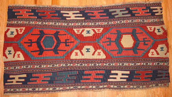
The major borders do not detract from the overall impact and note the hourglass
or "I" motifs in the arms of the minor elements of the field. The colors appear
too orangey on my monitor, but I can still make out that there are three different
reds. One is the field color and each of the two medallions has a different
red - the one on the left being more "orangey" and the one on the right more
"pinky".
There are also three blues, a dark, a light and a green-blue. Overall it is
a simple, effective use of the design.
I am curious to know what Richard thinks of his three pieces!
Patrick Weiler
Posted by richard tomlinson on 10-30-2006 06:15 AM:
Hi there
Thanks to everyone for their valued input. I think everything I would like to
say has already been said, albeit by different people.
My ratings for the pieces are as follows
Mafrash A – better 6
The piece has good colours and is well drawn. The main border is interesting
but visually unappealing to me. I find both major and minor borders too busy.
I don’t know where to look with this piece. It doesn’t really sing to me.
Mafrash B – best 7
I like this piece, despite the slightly muted colours. However, I prefer the
single medallion of A and C to the double medallion in this piece. The borders
are well drawn (Wendel doesn’t like compressed borders, but I don’t have a problem
here). There is harmony between the border medallions (if I can call them that)
and the central medallion. Overall, this piece is pleasing to the eye and well
drawn.
Mafrash C – best 9 (can I give it a 10?)
This piece REALLY appeals to me. Firstly, the colours are superb (though I agree
they are enhanced by the photo – as pointed out by Louis)
Not only does this piece exhibit good colour, but it also features wonderful
balance of colour – something I always look for in rugs and textiles.
The borders are wonderful – the design is complex and conforms to many standard
Shahasavan pieces. (sorry Wendel, but apart from being slightly sloppy, I believe
the drawing of this border is very similar to many old Shahsavan mafrash borders)
OK – the upper and lower border scale is all wrong, the field design wobbles,
BUT I feel this only adds to the appeal of this piece. I have seen so many pieces
that are precision pieces. Dull !!! Lifeless!! I have also seen pieces that
are so wonky they are abysmal. This piece manages to capture the essence of
both worlds – complex, well drawn pieces, and simple, naïve tribal weavings.
I can look at this piece for hours !!!!
What I found interesting from this thread are the following:
1.Most people appreciate colour (both dye quality and colour balance) as a very
important component in their rating
2. There seems to be a clear division between those who value precise drawing
and conformity to pieces that are considered worthy, and those who value artistic
merit above conformity.
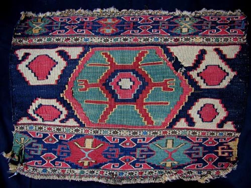
3. Photography plays an important part in our decision making processes. I wonder
if anyone who rated mafrash C as their best might think again after seeing the
following image of the same piece. To be honest, my rating for mafrash C dropped
quite a bit!! Goes to show just how important colour is….
Regards
Richard Tomlinson
Posted by Steve Price on 10-30-2006 06:30 AM:
Hi Richard
I'll be very much surprised if the colors on that last image are close to accurate
(it wouldn't be the first time I've been surprised, but it surprises me every
time it happens - I'm a slow learner, I guess).
The drawing and motifs have a look of considerable age to me, the colors on
that image look like a palette of synthetic dyes, and the whole effect is dissonant.
Have you seen the piece in the flesh? If so, which color rendition is close
to reality?
Regards
Steve Price
Posted by richard tomlinson on 10-30-2006 06:35 AM:
Hi Steve
I have not seen the piece in the flesh (though I would love to own it !!! )
I suspect the colours are closer to the first image I posted (at least I would
hope so)
There are a few dealers who have handled this piece. Perhaps they might comment
(either in private or in this thread)
Regards
Richard Tomlinson
Posted by R. John Howe on 10-30-2006 06:40 AM:
Hi Rich -
Ratings and rationales for these three pieces are indeed varied and interesting.
Some, I think, might differ with the line you draw about drawing.
They might argue that good, precise drawing (they would fight with your negative
characterization of this with the word "conformity") is something that often
enhances aesthetic quality and that variation is not necessarily an indicator
of creativity or artistic merit and can often simply be an instance of bad weaving.
More, some, with weaving experience, indicate that they can detect when the
latter is the case.
We worked these issues over (without noticeable resolution) way back in a salon
entitled "The Oops Thesis," if you recall.
http://turkotek.com/salon_00005/salon.html
Regards,
R. John Howe
Posted by James Blanchard on 10-30-2006 06:55 AM:
Hi all,
I wonder if the major discrepancies in assessments of these three pieces tells
us something about how collectors judge pieces. When there is a clear convention
that relates to "age" or "tribalness", such as with many Turkoman types, it
seems that collectors are better able to agree on which is the "good", "better"
and "best". However, when it is less easy to do a comparative analysis based
on "age" and "tribalness" because they are similar in that regard, collectors
seem to have displayed their own preferences and tastes, which naturally vary.
James
P.S. My wife, who doesn't "study" rugs and doesn't know the first thing about
the Shahsavan Confederacy, had a quick look at these and found C to be the hands-down
winner. She says it is much more "alive" than the others; another clear indication
that she's moved into the dangerous territory beyond her Dutch instincts for
neatness and precision.
Posted by Rob van Wieringen on 10-30-2006 08:09 PM:
James,
I symphatize with your concern about your wife's moving away from "Dutch instincts
for neatness and precision", into dangerous territory. I know exactly what you
are going through.
It is realy worrying!
But may I ask you : How did this started?
Did she, in an unguarded moment of course, had a look in a Pollock's painting
book?
Anyway, that is what happened with my wife......it was never the same again.
A lot of strenght to you,
Best regards,
Rob.
Posted by James Blanchard on 10-30-2006 11:18 PM:
Hi Rob,
I am pretty sure it was not Pollock's book. Instead, I think it was the result
of looking at too many Turkoman rugs over the years.  Or maybe it has been living in India
for more than 5 years, where there are no straight lines. In any case, I knew
the Rubicon had been crossed when her eyes lit up for a small "flaming boteh"
Shirvan with the botehs placed somewhat haphazardly and off-centre. Now when
we go through piles of rugs and weavings she is looking for those with a "je
ne sai quoi" quality. Over time, as we have looked at a great many rugs together,
I have gotten better at understanding what she means by that and she has adjusted
to this curious interest of mine in assessing rugs against some sort of "typology"
and "standard".
In any case, we both agree that "C" is the most desirable piece in this group,
though perhaps we are looking at them from different angles as are the various
collectors who have rated them so differently.
James.
Posted by Richard Larkin on 10-31-2006 08:11 AM:
James,
Clearly a woman of sound judgment. There's much to be said for the "je ne sais
quoi" sort of rug, like C in this group.
__________________
Rich Larkin
Posted by Sue Zimmerman on 10-31-2006 01:28 PM:
I' m not Dutch but I grew up with Dutch modern furniture which I loath almost
as much as J. Pollock's spattering so I, having kind of a head start, see storms
a brewing.
Oh Oh, Rob and James. What if your wives decide to try their hands at making
art for themselves? It's very absorbing, you know. How does the saying "My idea
of cleaning house is to sweep the room with my eyes" go down? Sue
Posted by Jerry Silverman on 11-03-2006 05:32 PM:
Sorry to enter the fray so late, folks.
Turns out I have a pretty big box filled with mostly slit-weave kilim Shahsavan
mafrash panels. I bought 'em back in about 1985 right after Parviz Tanavoli
and Siawosch Azadi and Peter Andrews put out "Shahsavan" books. I got them inexpensively
and anticipated a fabulous price appreciation after the rug world caught up
with my keen eye and adventurous taste. Apparently my rug investment skills
are about as good as my stock investment skills 'cause these things are bought
and sold on eBay for about what I paid for them 20-some years ago.
Fortunately, I like them. Having seen so many up close, I think part of the
problem we're having in ranking them stems from our differing priorities. Some
of us prefer demonstrated weaving skill. Others prefer drama - whether skillfully
created or not. Still others prefer certain colors.
I like the most masterful combination of all three. With that in mind my rating
of the pieces is:
A = 7 (based on the uniqueness of the design)
B = 8 (based on the color and skill of weaving)
C = 4 (based on the drama and relative lack of skill)
Cordially,
-Jerry-
Posted by Jerry Silverman on 11-03-2006 07:23 PM:
Sue wrote:
"I' m not Dutch but I grew up with Dutch modern furniture...."
My dad had a furniture store during the '50s, '60s, and '70s and we stocked
Danish Modern furniture. Did we miss a whole design movement?
Curiously,
-Jerry-
Posted by richard tomlinson on 11-03-2006 11:08 PM:
hi jerry
it would be nice to see your pieces, and which ones you rank as best.
perhaps you could select 3 and put them up on turkotek?
regards
richard tomlinson
Posted by Filiberto Boncompagni on 11-04-2006 03:36 AM:
Hi Richard,
I don’t know if yours is a terribly good idea.
I was just thinking that the advantage of this salon is that we discuss pieces
NOT belonging to us. This should preserve our objectivity and there’s less danger
that we go “personal”.
Just a thought…
Regards,
Filiberto
Posted by Sue Zimmerman on 11-04-2006 07:48 AM:
Hi Jerry,
I doubt it.
Maybe your father should have homed in on suburban clients in their 20's in
the '50s who thought lions are cool pets like my parents did. I was only 5 when
the stuff was dragged in so all I recall is that it came from a shop in Chicago
where the wine flowed freely and that it was fun to poke my fingers into the
rubbery lamp shades.
The next time I saw Danish Modern was in the hi rise apt. in the 70's of my
then fiancee. So in the '70s maybe your dad should have homed in on Columbian
Aeronautical Engineers. His stuff came from a shop in Evanston.
Do I have your father to blame for any of this? Sue
Posted by James Blanchard on 11-04-2006 08:30 AM:
Hi all,
Now, now, now, let's take it a BIT easy on the Dutch. For one thing, my wonderful
wife and all of my in-laws are Dutch. I even have a Dutch niece who is an interior
designer and has some pretty cool ideas.
But more importantly, in this day and age where else would you find someone
who doesn't mind putting rugs ON the furniture? It provides a whole new level
in the house for placing these woven treasures, once the floors and walls are
covered. Most Westerners would look at you a bit funny if you suggested putting
a rug on a table, but the Dutch have been doing this for ages. 
James.
Posted by Sue Zimmerman on 11-04-2006 09:00 AM:
Hi James,
I have great respect for the Dutch -- especially Vermeer. I was talking about
Dutch Modern furniture only.
You would probably be surprised at how many rugs in the US end up on top of
furniture. People are too busy, (at least this is the story I get told), to
train their kids and so they childproof their homes. Same story with pets. Sue
Posted by Rob van Wieringen on 11-04-2006 09:05 AM:
To put things straight
Hi All,
My wife is an interior designer as well, and what happens these days in Dutch
Design is really international renewing and interesting.
But Dutch design in the 50's and 60's, however, was ( is ) not interesting at
all.
On the other hand Danish design from the 50's and 60's is still famous and very
wanted for its simplicity and quality!
What you describe, James, about putting rugs on the furniture, is a long way
behind us.
You can only find these in very old people's homes, but I almost bought them
all.
Rob.
Posted by James Blanchard on 11-04-2006 09:13 AM:
SSSHHHH! Don't tell my Dutch relatives and friends in the New World that rugs
on the furniture is passé. Otherwise I might have to dispense with some of my
furniture rugs...
I think they already know, but they are humouring me.
James.
Posted by Steve Price on 11-04-2006 09:31 AM:
Hi Sue
We have a number of weavings (not rugs, but trappings, bagfaces, etc.) on top
of furniture, as do many collectors whose homes I've been in. I don't think
protecting the furniture from children and pets is, or ever was, the issue for
any of us. We simply run out of wall space on which to hang them (the rugs,
not the children or the pets), and discover that the textiles make great looking
covers and tabletops.
Childproofing a home mostly consists of making it a safe place - covering electrical
outlets so little fingers can't get into them, keeping glass stuff, poisons,
stairs, and sharp objects out of reach. By doing this, the child survives long
enough to be trained. And other people's children survive long enough to go
home with their parents at the end of a visit.
Regards
Steve Price
Posted by Sue Zimmerman on 11-04-2006 10:13 AM:
Hi Steve, with one kid,
Your idealized version of US childproofing of homes is all very nice. I'm sure
it applies to rug collectors as I know it does to Americans of resent European
and Oriental roots.
For third generation Americans with both parents working and 2+ kids -- as it
is for most, these days, havoc rules. For those in the US who are removed from
the mainstream check out child behavior in restaurants these days for a clue.
Utter chaos. Sue
Posted by Steve Price on 11-04-2006 10:55 AM:
Hi Sue,
The issue of using and displaying textiles atop furniture has obviously stirred
you up. I'm not going to allow this thread to get hijacked into becoming a discussion
of which ethnic and socioeconomic groups understand sensible child rearing and
which don't, so that subject is now closed.
Steve Price, with three kids and a working wife
Posted by Richard Larkin on 11-04-2006 11:02 AM:
Filiberto:
Your judgment is always so good, I hesitate to second guess it. But I'd like
to see a few of Jerry's panels. I'll bet he can stand the heat.
__________________
Rich Larkin
Posted by Matthias_Wohlgemuth on 11-08-2006 05:44 PM:
hello everybody,
i was surprised to see my mafrash end panel (c) in unrestored original condition
on turkotek - "coming" from anatolian kilims i would certainly have preferred
it like this! and it explains my preference for freely drawn designs, too. i
used to own the cross, the beetle... and many others of the classic shahsavan
types years ago, they are all gone... today i believe that many of the really
early shahsavan pieces, too, are executed in a rather undogmatic way - like
many turkmen ones as well. the colors of the panel are more like the 1st image
posted by richard, incredibly saturated, effectively contrasted and in perfect,
but - admittedly - wild harmony. please note, with regard to iconography, the
clear 4:1 relation between the centers of main and secondary designs. it seems
obvious that the weaver did not care too much about layout and proportions.
i belong to the band considering this as ways of artistic expression and indication
of a creation from memory and for her own use.
greetings,
matthias wohlgemuth
Posted by Sue Zimmerman on 11-09-2006 12:52 PM:
A I give a 4 to. Nice borders. Ho hum field. Too bad they aren't in separate
weavings.
B gets a 3 because it's a yawner. Nothing works together in it. Probably from
a still living culture by a way out of steam weaver. It's a "that's all folks"
piece, to me, from the Shahsavan. The white outline of a motif in the darkest
blue reminds me of a police outline of where the body used to be.
C is the one I would have eaten peanut and jelly sandwiches for a few years
to keep. (Artists are different from collectors.)
Neither border proportion fits the field and all for the best, I'd say. A great
balancing act. Despite such large field areas being in the lightest value the
borders contain them. They don't jump out into the foreground and stay back
with all the rest of what is going on in it's high energy field in a way that's
the stuff of the makings of great art. Getting monumental into a small space
with that much energy happening is this piece's triumph, in other words, to
me.
Finally, I usually hate these minor borders. But here, instead of being used,
as I usually see them handled, as a cheap easy standardized gimmick, are, in
this weaving, enlisted for a crucial supporting role for the overall success
of the piece which is a nice surprise to see. Sue
Posted by matthias_wohlgemuth on 11-10-2006 05:47 AM:
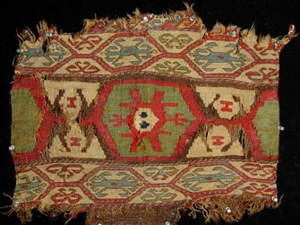
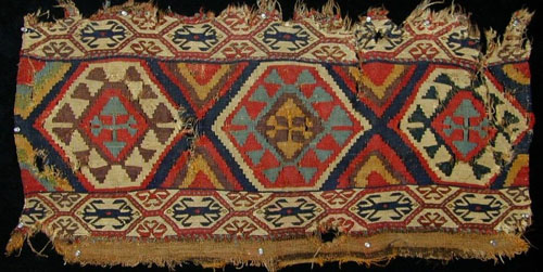
hello everybody,
steve price gave me the technical support to show you two more pieces
of the shahsavan slit tapestry/sumak mafrash panel type:


they were found together and seem to come from the same mafrash. i
would wonder about your comments regarding several issues already mentioned
in your discussion, e.g. the relationship between end and side panel,
freedom of execution vs. sloppy weaving, intensity and harmony of color,
age...
i should like to add in brackets: when judging all these panels i think
we must keep in mind that we are looking at fragments (much more so
than with faces of other bags which have borders running around each
panel, thus giving them a well defined pictorial composition). this is
clearly exemplified by example b, whose two hexagons once must have had a
rather different visual impact when seen in their continuous sequence of
the complete mafrash.
greetings,
matthias wohlgemuth
Posted by Steve Price on 11-10-2006 06:57 AM:
Hi Matthias
Are you quite sure that both panels came from the same mafrash? I would not
have guessed that, since the only thing that they seem to share is the border
design. The colors in the border, and the design and colors in the main field
seem quite different to me.
The end panel seems much less skillfully drawn, and the field design has a "child's
sketch" look about it - the side panel is more sophisticated in every way.
Regards
Steve Price
Posted by Matthias_Wohlgemuth on 11-11-2006 10:50 AM:
hi Steve,
you are right - on first sight it's just the border design which is shared by
the two panels. but then, have you, or has anybody else, seen this border in
sumak weaving anywhere else:-)? (and no minor borders, just guard stripes, Sue;-)
however, there is more to substantiate the probability that these panels are
stemming from the same mafrash, beside the fact of having come down to us together
(with the 2nd end panel, too): a complete identity of yarns (incl. warps and
wefts), dyes and weaving structures.
the side panel is featuring a strong purple in considerable amounts, this shade
is lacking in the end panel. all the other colors are present and identical
to the hue in both panels, although appearing in very different amounts and
juxtapositions.
all this may be no conclusive evidence that the panels were intended for, or
even were ever part of, the same mafrash. however, it is beyond doubt that they
were woven at one given place at the same time with the same set of materials
- by the same weaver?
Steve did advance more issues (please see his preceeding post), but i want to
stop my reasoning here - and would enjoy to read the ideas of you all!
greetings,
matthias
Posted by Richard Larkin on 11-11-2006 11:33 AM:
Matthias,
These pieces are outstanding. I love them.
__________________
Rich Larkin
Posted by Sue Zimmerman on 11-11-2006 03:02 PM:
Hi Matthias.
Your collection must be a 10 based on the 4 pieces posted so far. Extremely
interesting. I will look for these inner borders in my books and get back in
a few days as I can't get to that today. Sue
Posted by richard tomlinson on 11-11-2006 08:54 PM:
hi matthias
thanks for sharing these beautiful panels. no doubt they share some very interesting
features, especially the border.
i have not seen any other pieces with the identical border though i have seen
a couple of panels that have a somewhat related border design.
i was wondering if you knew where exactly the panels were found? (area? village?)
regards
richard tomlinson
Posted by richard tomlinson on 11-15-2006 05:56 AM:
minor borders
hi matthias
you said that these panels had NO minor borders.
however the first panel you show (end panel) DOES have a minor border BUT it
seems only at the top. (S running dog type border can be seen)
it is difficult to tell if the 2nd (side) panel would have had the same minor
border as the top is worn away.
as regards NO minor borders, i have looked through my images and found a few
mafrash panels which do not have minor borders.
one is a complete piled mafrash. most of the others are crab design soumac panels,
which generally do not have minor borders - just guard stripes.
regards
richard tomlinson
Posted by Matthias_Wohlgemuth on 11-15-2006 04:00 PM:
hi Sue, hi Rich,
it was a pleasure to read your praise - i love them, too! However, i am afraid
that they represent the best and the most ancient what is left with me in terms
of shahsavan;-) For that matter, i do not know, neither in person nor in repro,
a slit tapestry mafrash that i would exchange against that side panel.
it might be interesting to compare it with a piece in Wertime: sumak bags (pl.
76): the design of the main band is identical and the colors are basically the
same (not so the hues, of course), but the border system is much more complex,
refined and, actually, ruglike. this seems to me to be a beautiful, almost professionally
executed descendant - and wertime is dating it to the 1st half of the 19th c.!
greetings,
matthias
Posted by Matthias_Wohlgemuth on 11-15-2006 04:50 PM:
hi Richard,
unfortunately i am an IT-novice and unable to scan images. may be you can? i
would be most interested to see some of the pieces without minor borders you
mention. to which type are you referring by "crab design soumac panels? " the
ultra rare beetle design panels?
you are right, of course, there is a "minor" on the end panel. however, it is
not part of the usual symmetric border system, it seems sort of an addition
to compensate the lack in height: and still the end panel did end up some 2"
less high than the side panel.
there are remnants of the end kilim at the top of the side panel, so it never
had an additional border - and as if to reinforce the "minor-less": there is
not even a guard stripe separating the slit tapestry main band from the bottom
sumak border!
let me know your observations and see your comparisons!
greetings,
matthias
Posted by richard tomlinson on 11-16-2006 05:43 AM:
hi matthias
i am sure you have probably seen these pieces before, but i will post them for
the benefit of others and hopefully to generate more discussion.
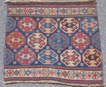
mafrash panels with just one border + guard stripes:

the first image is of one of many "crab" soumac panels. almost every example
has just one main border. guard stripes are either of the striped or sawtooth
design.

the second image is of a panel that also features just one border. it too is
soumac. i have not seen this border before in a mafrash.

the third image is of a complete piled mafrash. no minor borders either (and
in fact no guard stripes at the top or bottom!!)
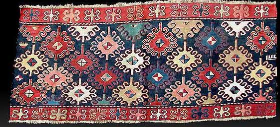
__________________________________________________
a variant of matthias' rare border?

the fourth image is of a panel from the qarabagh region. it has a very rare
(unique?) main border.
the border looks similar to matthias' two pieces, though not identical. (note
the side prongs point outward rather than inward.) there are also more obvious
differences but i get the feeling theese borders are from the same design pool.
unfortunately i am living abroad at the moment so i am unable to check my books.
hopefully there are others out there who might have something to add to this
discussion.
it's interesting to learn new things - i had never thought to look for single
borders before!!
regards
richard tomlinson
Posted by Sue Zimmerman on 11-16-2006 02:49 PM:
Hi Matthias,
Before I comment further I have some questions in regard to the end panel you
show on this page that are unclear due to lack of clarity of the photo.
In the lower border, in the top half hexagon motif to the left, there is a dark
line extending downward to the motif's bottom line. Is that line purposefully
woven that way or is it the result of the wearing away of wefts?
I also would like to know whether the red horizontal line in the field on the
left, (above the motif of the other area I question), does not run continuously,
as does it's counterpart to the right of the center motif, purposely or does
it just appear that way because of wear?
I have found a few examples which are very close to these major borders in a
few Caucasian striped kilims but not in any other bag faces. I don't have a
scanner but if you'd like I can post where they can be found in books.
The only comment I have, without further information, is that the uppermost
border on the end panel looks more planned than compensatory to me. Sue
Posted by Matthias_Wohlgemuth on 11-18-2006 11:29 AM:
hi Richard,
thank you for posting some images of "border-related" mafrash panels. i completely
forgot about those "crab"-designed pieces in "reverse" sumak technique; you
are right, they usually have their main borders accompanied by guard stripes
only.
the blue ground sumak side panel has an interesting layout giving the field
a lot of space, effectively complemented by the simple red main border with
guards. i know of another panel of similar design and layout (and presumably
qaradag origin and date as well, ca. 1900), using as a "main" an actual "minor"
border design

i find it interesting that the piled mafrash has not only the "minor-" and even
"guard-less" border, as you rightly observe, but is leading us back to the original
issue of this thread: it's featuring a kilim design.
but your real find with regard to my 2 kilim/sumak panels seems to be the qaradag
sumak end panel (the side panel in Wertime: sumak bags, pl. 58, might again
come from the same mafrash). its main border comes in deed very close to the
one in my pieces. there is the same cartouche-like organisation and a similar
main design, but the effect of the halfed secondary designs is different: they
are connected by a lozenge along the horizontal border axis and form a second
hooked ornament on a yellow ground, in line with the primary ornament. Amazing
how the change of ground color in the cartouches is producing a visually very
different border!
greetings,
matthias
Posted by Matthias_Wohlgemuth on 11-18-2006 11:42 AM:
hi Sue,
ever so carefully are you looking at and examining these images! great!
Both of the "anomalies" you noticed were un-intentional: one is caused by corrosion
of the brown ground color (the missing red line in the kilim band), the other
is an oil-like spot (the line pointing downwards in the sumak border).
i am happy to admit, of course, the additional border at the top of the end
panel is fitting very well;-)
i would be very much interested to know to which caucasian banded kilims exactly
you are referring.
greetings,
matthias


 Or maybe it has been living in India
for more than 5 years, where there are no straight lines. In any case, I knew
the Rubicon had been crossed when her eyes lit up for a small "flaming boteh"
Shirvan with the botehs placed somewhat haphazardly and off-centre. Now when
we go through piles of rugs and weavings she is looking for those with a "je
ne sai quoi" quality. Over time, as we have looked at a great many rugs together,
I have gotten better at understanding what she means by that and she has adjusted
to this curious interest of mine in assessing rugs against some sort of "typology"
and "standard".


