Three kilims scanned from different books. Although one of them is attributed to Kuba, they should be all from the Shemakha district of Shirvan.
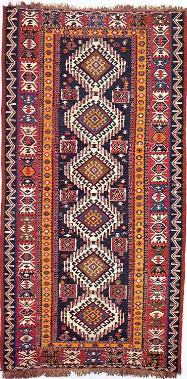
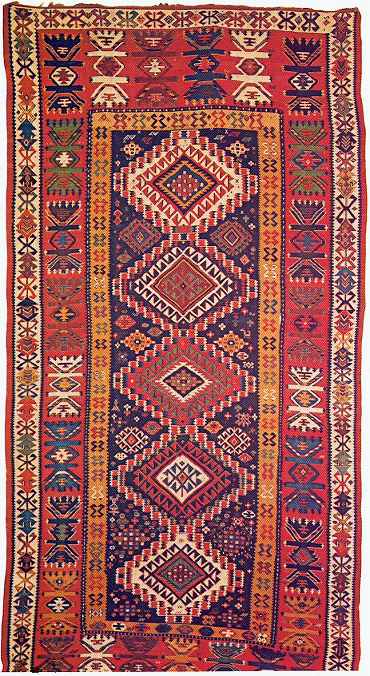
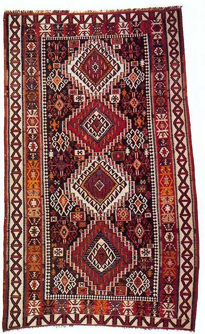
I still have to make up my rating…
 You go first.
Regards,
Filiberto
Shirvan Kilims
Dear all,
Three kilims scanned from different books. Although one of them is attributed
to Kuba, they should be all from the Shemakha district of Shirvan.


I still have to make up my rating…  You go first.
Regards,
Filiberto
Hi Filiberto -
I had to adjust my monitor to a width of 1200 pixels to get these three images
to display side by side, but I think it was worth it for direct comparison.
Labelling left to right, A, B and C:
A: Better: Rating 5 Rationale: I think the colors on A are a bit less attractive
than those of B. All three of these pieces seem pretty well drawn to me.
B: Better: Rating: 6 Rationale: Best color
C: Good: Rating: 3 Rationale: least attractive colors.
I wish I could evaluate the drawing more closely on these pieces, but they seem
similar in quality to me.
Regards,
R. John Howe
Filiberto:
B is the clear leader for me at 8, a best. Everything about it exceeds the other
two. The colors are excellent. Both the main border and the outside border are
especially strong and well done in my view. I also prefer the variation in the
minor decoration of the central field to the more static treatment of the other
two. I'll give A a 6 and C a 5, both better.
__________________
Rich Larkin
It’s difficult to choose between the first two.
While I understand why others may prefer B to A, I would choose A.
Rationale: I like its well-balanced design. It’s monumental but in a - how to
put it? - serene, mature, calm way.
B apparently has better colors, a lively composition, and perhaps better borders
yes… Overall I still prefer A. I find it relaxing.
C is nice too, but with a more “noisy” composition and (probably) inferior colors.
And I think the borders, especially the external one don’t “work” as well as
in the other two kilims.
So:
A: Best, 8
B: Best, 7
C: Better, 4
Filiberto
Hi
A 7 handsome, dignified ?
B 6
C 4
Best wishes,
Horst
Hello Filiberto,
C – 2 Good
A – 3 Good
B – 4 Better
In my view, there is little to distinguish these three kilims from one another.
I like the bold main border of B and its ivory outer border as well as the colors,
but its field is a bit cramped and lacking in contrast. However, A and C are
also crowded.
There is little sparkle to the colors in C and, more than the others, it lacks
contrast of scale and colors.
All three lack the open areas that would emphasize the pattern elements. They
certainly aren’t horrible, but they’re not distinguished either.
Wendel