Posted by R. John Howe on 10-23-2006 12:56 PM:
Turkish Yastiks
Dear folks -
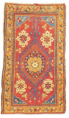
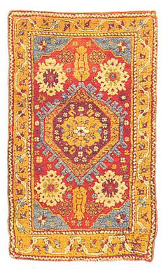
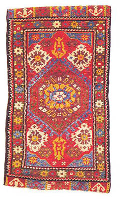
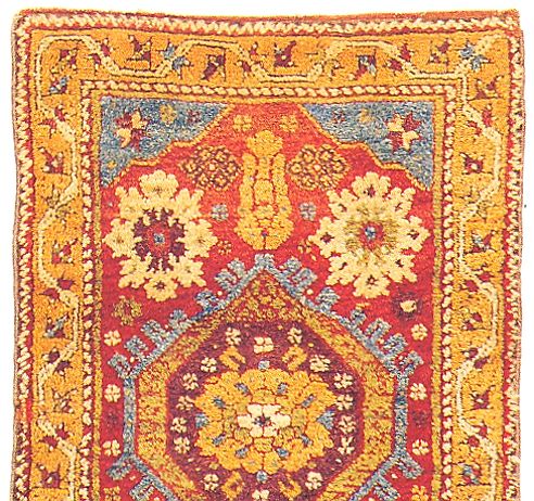
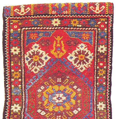
Let's start with three Turkish yastiks.
The three pieces below are attributed to western Turkey and, as you can see
have quite similar designs.
Most of the sets I will offer will be of this sort. It is often said that better
comparisons are possible among items that are more similar.
I have presented the pieces in the following way. First, there is a side by
side presentation of smaller images. This is followed by sequential presentation
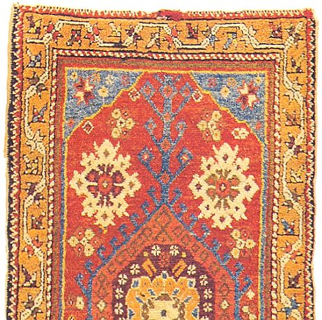
of a somewhat large image of each piece, which is followed in turn by an even
larger detail image.
Here are the three yastiks.


You're going to have to bear with me as I present this first sequence. It seems
clear that the width of the initial images I have given Steve will not arrange
themselves side by side on some screens. The total of their width is too wide
for one line. I found that on my monitor the three images will not show side
by side (which is very advantageous for comparisons) unless I reset my monitor
to 1152 x 864 pixels. If you want to make this adjustment in your own monitor,
write me at rjhowe@erols.com
Steve just trained me. 
The overall images below will not be different in size, but will be followed
by the the closer detailed ones which may help in your evaluations.
Here are the individual images of these three pieces followed immediately in
each case by the associated detail.


So now you have all the image information I will provide.
Examine these three pieces. Decide how you will rate each one: first just "Good,"
Better," or "Best."
Then for each and within the designation you have assigned it choose a score:
Good: 1-3
Better: 4-6
Best:7-9
Report your score on each piece BUT, most important, give the reasoning on which
your assessment is based in each case.
Regards,
R. John Howe
Posted by R. John Howe on 10-23-2006 06:21 PM:
Howe Scores on Yastiks
Dear folks -
OK, I'll go first, in part to "model" what I intend here and in part to demonstrate
that I am not my own "anonymous expert."
I'm numbering the three yastiks 1,2, and 3, left to right.
Yastik 1: Rating: Better: Score: 5
Rationale: I like the use of color best on this piece. I would rate it 6, if
it did not have the uneven weighting of the devices above and below the medallion.
Yastik 2: Rating: Better: Score: 6
Rationale: This seems the best drawn of the three with nice controlled balance
all round. I almost rated it five because of its pale colors.
Yastik 3: Rating: Good: Score: 3
Rationale: I initially thought the colors on this piece had more life, but as
I look at them, especially in the close-up detail, they begin to seem harsh
to me. The drawing of the white field elements shows lack of planning to let
us see all of their width. I like lappets and do not mind fragmentary ones,
but wish the color use on these contrasted a bit more with that of the field.
OK, how do others evaluate these three pieces and why?
Regards,
R. John Howe
Posted by Richard Larkin on 10-23-2006 08:49 PM:
Yastik cousins
John,
I am going to cooperate, but I need a little time to think about it. In the
meantime, I'd like to ask, do you have the pieces in hand, or are you judging
from pictures?
For my part, I find it difficult to rank the pieces on a scale, as I would consider
the overall handle and texture, wool quality, and color as judged "in the wool"
to be critical elements. I don't want to be a spoil-sport, though.
Incidentally, I'm very impressed that you've put together three yastiks that
are so obviously related. What's up with that?
__________________
Rich Larkin
Posted by Steve Price on 10-23-2006 09:09 PM:
Hi John
Funny that you should open with yastiks. There are very few that do anything
for me. I went through the yastik exhibition at Philadelphia's ICOC several
times, thinking they'd grow on me. Never happened. Out of the 30 or so in the
display, only half a dozen or so were interesting. I've acquired two yastiks
since then, both of which I like a lot, but still find most of the genre unappealing.
I don't know exactly how I'd rate these, but none of the three would make me
reach for my paddle at an auction.
Regards,
Steve Price
Posted by Tracy Davis on 10-23-2006 11:19 PM:
I'm not wild about yastiks either, and one might make the case that most yastiks
belong on the "good" category, with a couple achieving note by going all the
way up to a 5. Or maybe it would be more accurate to say that the difference
between yastiks rated 3 and 8 would be much less than the difference in Tekke
juvals rated 3 and 8, so it's not easy to apply the same standard to both.
But in the spirit of the challenge, here's my take on the three.
I like #1 for its use of negative space and color, and for the solutions the
weaver developed to work out the drawing problems as the weaving progressed.
I'd put this in the "better" category and rate it a 6.
I like the second the best of the three, despite the fact that the field is
a little too cluttered. I think it has the best use of color, and it seems to
remember where it came from, e.g. the lilies are still recognizable. I have
a sneaking suspicion that this piece might be the one I'd want to take home--
it has a certain life to it, and it might grow on me. I'd give this a 7.
The third one I really don't care for. The colors seem uncharacteristic and
somehow inauthentic or not true to type, but not in an artistic way. It's like
a visual sledgehammer. The word that comes to mind most strongly is "bastard",
and I can't articulate why. I'll give it a 3 for effort.
So now that I'm firmly established in the "I know what I like" school, I feel
the need to expose myself to more examples....
Posted by Horst Nitz on 10-24-2006 04:06 AM:
All better
Hi John,
interesting idea - lets see what the outcome is going to be.
To me they all are in the 'better' category, only because I have to I can rank
them 1st is 5, 2nd is 5, 3rd is 6 on the basis of the the red I like, als well
as the somewhat bolder design.
Perhaps I would rest better on the 1st and 2nd.
Cordially,
Horst Nitz
Posted by Filiberto Boncompagni on 10-24-2006 05:38 AM:
Hi John,
Comparing the first two is easier. I prefer the first because I find its design
more balanced. I especially dislike the treatment of the main border in the
second yastik. I’s too rough and the width is too uneven. Field is crowded…A
coarser cousin of the first.
The third is coarse too, but in a lively and spontaneous way. And I like red
too. I don’t know if the colors are “authentic” or not, I’m not a yastik fan
either.
So here’s my score:
#1: better - 5
#2: good - 2
#3: better - (painful decision: do I prefer it to #1? OK, I do) 6.
Question is: are my rationales rational or just rationalizations?
I don’t know… 
Regards,
Filiberto
Posted by R. John Howe on 10-24-2006 08:06 AM:
Richard, Filiberto et al -
No, I do not have personal access to any of the rugs I will put up. These are
all published pieces I have found in books.
Sometimes there is more information on them in the books but I will only provide
that if I think it is needed for these largely aesthetic ratings. (Of course,
some folks may be able to identify the source of a given piece and can then
access that information in their own copy. I would only ask that if they use
such information in their evaluation that they indicate that in their rationale.)
I'm glad that there are a few raters here by dawn's early light (I was beginning
to feel lonely). And a special hi to Tracy Davis who has not been seen in our
discussions here for too long.
I should also have mentioned that this is the sort of salon for which an interesting
and useful summary is possible. I will collect all the ratings by piece, name
of rater, rating and rationale in a table that I will put up at the end. Such
comparison is often very interesting. We may see things not fully visible during
our reading of the sequential rating posts.
One last thing: Marla Mallett has suggested that I label the other pieces I
put up A, B and C to avoid possible confusion with the numerical ratings and
I will do that.
Regards,
R. John Howe
Posted by Marvin Amstey on 10-24-2006 08:57 AM:
Unfortunately two of the most important qualities are missing from this on-line
assessment: the wool quality and "handle". These tactile qualities are as important
as the graphics - to me. The close-up of #2 makes the wool look dry and "dead",
thereby, decreasing its attractiveness, yet graphically it seems the better
to me.
Posted by Richard Larkin on 10-24-2006 09:06 AM:
John & Co.,
I think a combination of the best features of 1 and 2 would have made "best"
category. I like the somewhat more elegant (relatively speaking!) drawing and
less squashed layout of 1. No. 2 uses contrasting color values more effectively
in my opinion, for example the alternating colors of the centers in the four
white corner medallions flanking the center medallion. I think I prefer the
slightly lighter color tonality of 2, but I could change my mind on direct acquaintance.
I like the funky little gold thing coming from each end of the medallion on
2 and 3 (yastiks are supposed to be funky), but I don't penalize 1 for not using
it. I do penalize 1 (a tiny bit) for not stretching out the trident thing
at the bottom end of its medallion.
No. 3 is too lacking in value contrast for me to place it with the other two.
The truncated lappets do bother me, actually. I don't mind that the white medallions
don't fit. See above, yastiks need to be funky. (There's good funky and bad!)
I'll give 1 and 2 a 6, as better, with 2 considered primus inter pares;
and 3 gets a good and 4 points.
As far as yastiks are concerned generically, I always want to like them because
they present a perfect opportunity for the weaver to create an exquisite small
example of what we prize in the best Anatolian village weaving. However, most
of the ones I bump into are disappointing. All of the three in this post could
be non-disappointing if the wool, color and handle are right.
__________________
Rich Larkin
Posted by R. John Howe on 10-24-2006 10:23 AM:
Marvin, Rich -
I certainly agree that wool quality and handle are important things, especially
when one is considering buying a piece, but that information is not supplied
in Mark Hopkins' version of this exercise, either.
So this is (necessarily) a more strictly visual aesthetic comparison.
One may be able to spot bad weaving in the drawing sometimes, but excepting
for that you are restricted to what you can see in these images.
Regards,
R. John Howe
Posted by Richard Larkin on 10-24-2006 10:37 AM:
Anyway, it's not Tabachi.
Marvin,
Funny, I thought from the close-up there was hope for the wool in No. 2. I think
I'll defer to you, though.
A thing one hopes to find in these yastiks at their best is the wonderful springy
wool found on some Anatolian village products.
__________________
Rich Larkin
Posted by R. John Howe on 10-24-2006 10:53 AM:
Hi Rich -
If you rate something "Good" it cannot get a score of "4." "3" is the most allowed.

Regards,
R. John Howe
Posted by Richard Larkin on 10-24-2006 08:05 PM:
Oops!
Sorry, John. I missed that detail. Put me in for "good" on that one, and make
it a 3.
__________________
Rich Larkin
Posted by Marvin Amstey on 10-25-2006 09:39 AM:
Rich,
That's the problem with images in discussing rug qualities. Your take on the
wool, FROM THE IMAGE, may be as valid as mine: like two different radiologists
interpreting an image. Until the tissue is in your hand, its a lot of "guess
work". Have fun.
Posted by Sue Zimmerman on 10-25-2006 01:58 PM:
I haven't time today for the "why's" but #2 is the hands down winner. I'll
get back tomorrow with details and how the rug could have been greatly improved
without too much effort. Sue
Posted by Sue Zimmerman on 10-26-2006 06:16 PM:
First off since all these rugs are from the same design source which was made
for a different Sett/knots per inch than these weaver's were privy to, and so
are likely interpretations of someone else's design, I'm going to set aside
the highest ratings, as one would in music, for the singer/songwriter type weavers
who are not represented here. I think that is fair and an important point to
make.
Rug #3 I just cannot give a 1 to. I'm not a dealer and good does not = bad to
me and this rug is too bad for a 1. I give it a zero because it has no style
and has even lost the style the original designer gave to it by it's weaver's
poor choices in embellishing it with spare parts from other designs.
It is a hodgepodge of elements. I see no sense of, nor thought given toward,
establishing proportions. No rhythms are anywhere visible. The motifs are lined
up like toy soldiers and where they don't fit they are just hacked off wherever.
The colors are used with disregard of harmony with the other colors and are
just as boringly lined up as the motifs are.
Interestingly, though, of all three rugs this is the one where the outlines
and selvages are most carefully and meticulously attended to. I think this is
an important thing to point out because it is an old ugly sales trick.
People strolling about, potential rug buyers in this instance, give about 5
seconds, at most, to each potential purchase that catches their eye. First a
glance toward overall effect and then a longer one toward the "finishing work,
or "detailing" which, for rugs, would be tidiness of outlines and selvages.
This is known by sellers and they get very good mileage out of that. And it
is that trickery I would say this rug's weaver was a pro at. I don't like that
sort of thing and this rug is of that ilk. A zero.
Rug #1 is an elongated version, (with no attempt anywhere to compensate for
that problem), of the original design it was based on and is slightly more bearable
than rug #3. I give it a good/1 just for not being intentionally dishonest.
Look at it's white minor medallion's centers which seem to float on the surface,
as do all the interiors of all it's motifs with more than one color. This makes
them look like plates of food carelessly clanked down onto paper table place
mats in a greasy spoon restaurant by a gum chewing babbling waitress, to me.
Look at the color usage in this rug's center medallion. It reminds me of the
title of a golfing book I once saw, and agreed with, "A Good Walk Spoiled".
From the outermost border toward the interior each new color used kills the
one before and after it. All that is left is an abysmal slaughterhouse of colors
trampled and sunk into the mud. Even the nice burgundy breathes it's last there.
And those floating small motifs are rigid, plodding, and thunky in a most catatonic
way. Awful.
The major borders, where the only rhythm which could have been left standing
of the original design, by this weaver, I think, where were meant to be meanders
for the eye to travel have been hacked into bits, sliced and diced, in the same
heavy handed jarringly thoughtless manner in which everything else was lost.
It's dead.
Rug #2 has something that annoys me just as it does in the other two rugs. Too
much unrelieved area of white which makes the motifs they are used in pop way
to far out into the foreground. Why bother with borders if they can't contain
the contents? Although I have seen borders spatially jumped effectively it doesn't
work with this design even on this rug which I really like. I also have a problem
with the use of crustaceans as motifs in rugs but put up with looking at them
if they are well done or unobtrusive neither of which is the case in this rug.
I would have liked to have seen most the white and the crustaceans moved to
lower values. I would have liked to have seen this weaver compensate for the
vertical compression of the design by expanding the width of the rug far enough
to let the motifs have some more breathing room by uncrowding them a bit. I
also would have liked to have seen the reddish-blue hooked medallion border
be of the more greenish-blue seen in the field's corners as it doesn't clash
at all with the other colors. I don't blame the weaver for what was probably
not available though.
I'm not concerned with the selvages or red and white borders as the weaver probably
was letting a student child do that part. This weaver was really good. The top
inner red and white border is flawless and the cares she took in every aspect
of weaving this rug other than those makes me think she didn't want this rug
to be sold at least as much as the weaver of rug #3 wanted to sell hers.
I have changed my mind and am giving to give this rug a Best/9 because I think
the weaver improved so on the original design that she has made it her own and
it is probably better or at least equal to the original, which happens sometimes.
I like this rug because the colors are used to their best advantage and their
flow, one into the other, is just a pleasure trip to follow. I really like the
burgundy and golden yellows used together especially in the major medallion
where the red outline separates them and makes the edge glow. I like the widened
burgundy lines used in the top and bottom of the gold medallion border for shading
and don't mind that in the thinner lines on the sides the resolution goes over
the line of what the knots per square inch can accommodate and dissolves some.
I like the lacy but still substantial secondary medallions for their style which
is in keeping with the robust but delicate style shown in the major borders.
The colors and the qualities of the main border's meandering "outgrowths" add
punctuation, support, and enhance the meander's movements very skillfully.
I really like the way the weaver lengthened the lower golden border and expanded
it's meander into a swaged garland that underlines and balances the rug. All
this without loosing the rhythm and harmony of the border's trail or skipping
a beat despite it being totally disconnected from the rest of the border. I
think that's quite something. As is the choice to have the side meanders both
start their course from the right side which helps with the transitions.
I really like the little white motifs in the burgundy of the major medallion.
They look like little humorous gestural character critters with each one different
but all contributing to the quite, upbeat, harmonious tempo. Now would a weaver
of this caliber leave off this little rug ditty without some bass for accompaniment?
Of course not, that would be found in the right in sync lively blue hooked oom
pha section! At least that's how I see it. Sue
Posted by Richard Larkin on 10-26-2006 08:02 PM:
The Iliad
Sue:
I believe you achieved a legitimate Homeric simile there in the 7th paragraph
of your comment, about the gum chewing waitress.
__________________
Rich Larkin
Posted by R. John Howe on 10-27-2006 07:52 AM:
Anonymous Expert Ratings and Rationales
Dear folks -
There may be others who intend to rate these three yastiks yet, and I encourage
that, but I thought it might be useful to uncover some of my anonymous expert's
evaluations as we go along, since they may be the occasion for further discussion.
My anonymous expert has provided me ratings and rationales for these three yastiks.
Here they are:
--------------------------------------------------------------
Anonymous expert:
At first glance, these yastiks seem to be similar (especially #1 and #2), but
#1 is clearly more graceful, better drawn and has a better use of color to achieve
a balance of scale. Its spacing is superior to the others. It is very nice.
In summary, my rankings would be:
#3 – 3 good
#2 – 5 better
#1 – 8 best
I may have seen all three in the flesh at one time or another, but I cannot
recall having done so. Therefore, my comments are based solely on the images.
Unfortunately, those images aren’t particularly good and fail to convey any
real sense of wool quality, luster or the quality of the dyes. I suspect that
all the dyes are very good.
In the close-up, the border of #1 seems to show quite a range of color and that
border is probably much nicer in the flesh than it seems in these images. Here,
the borders on both #1 and #2 appear a bit weak. They need not be, and perhaps
should not be, particularly bold, but the impression of them from these images
(perhaps false) is that of weakness.
ON YASTIK 1, THE DRAWING AND EXECUTION ARE CLEARLY MORE COMPETENT.
Here specific examples. In #1, the four white crenellated medallions surrounding
the center medallion are quite precisely drawn and nearly symmetrical, whereas
they become less distinct in #2 and become merely blobs in #3, where they are
jammed against the edge of the field.
The hooks around the center in #1 are quite regular, whereas in #2 it is apparent
that the weaver couldn’t execute them consistently and they are also irregular
in #3, again extending to the edge of the field. In #1, the extension of the
hooks to the ends of the field makes a nice contrast in scale.
The small six-lobed medallions that are scattered in the field have alternating
colors in #1
The set of diamonds inside the hooks are a nice contrast but it’s hard to tell
what they are in the other two yastiks.
The bottom border of #2 is too large and poorly drawn.
The weaver of #3 had many problem, including getting the yastik straight and
executing the blue squinches. Even the simple star border isn’t well done.
IN #1, THE OVERALL BALANCE IS SUPERIOR.
The better execution of #1 results in more space around the center medallion
and serves to set off the medallion and otherwise creates a feeling of spaciousness
that the other two lack, particularly as the red ground seems more open and
without as much filler. #1 has the feeling of a much larger rug.
The use of orange in the ring in #1 brings in another color and a nice touch
to the color balance.
I prefer the somewhat narrower border of #1, finding its scale adds to the overall
better balance of the yastik.
One’s first impression is that #3 is more colorful than the others, but that
may be due to there being more red. On reflection, #3 seems to be a bit “too
red. While I like the border of #3, it doesn’t balance the field as well as
does the meander border of #1 and #2 and it contributes to an overall feeling
of crowdedness.
The lappets in #3 are a curious variation and not particularly well done. #3
might well have its own appeal in the flesh, but the rendition is amateurish.
-----------------------------------------------------------------
That is the end of my anonymous expert's ratings and rationales on these three
yastiks.
Regards,
R. John Howe
