Posted by R. John Howe on 12-13-2005 05:44 AM:
Ground Color Ambiguity
Dear folks –
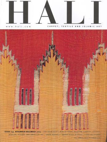
The current issue of Hali has this cover.

This is a detail from a kilim in the Caroline and H. McCoy Jones Collection
published in a volume in 1990 in a volume edited by Catherine Cootner, with
comments by Garry Muse who assembled collection.
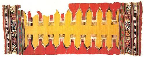
Here is a full shot of this fragmentary piece.

Hali calls attention to part of Muses’ comments on this piece in the Cootner
book. Muse says in part:
“…It is a feature of early kilims that the positive form is very carefully delineated.
Here, the band of red at the top and bottom of the field is very narrow, but
it has a particular effect: it indicates that the yellow form is floating on
a red field and has a separate meaning of its own. This is not a yellow kilim
with red sides…”
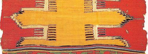
Mr. Muse has a very good eye. Here is a closer view showing the “band of red”
at one end of this piece that he feels functions to indicate definitely which
color is the ground color.

I don’t think I would ever have noticed this narrow band of red without his
guidance but I would still have read this piece as yellow on a red ground because
color theory suggests that lighter colors are closer.
But Mr. Muse’s alert indication suggested to me that it might be worth searching
for, and examining pieces in which it is, in fact, difficult to discern what
color is intended to function as the ground color. I have found a few possible
examples.
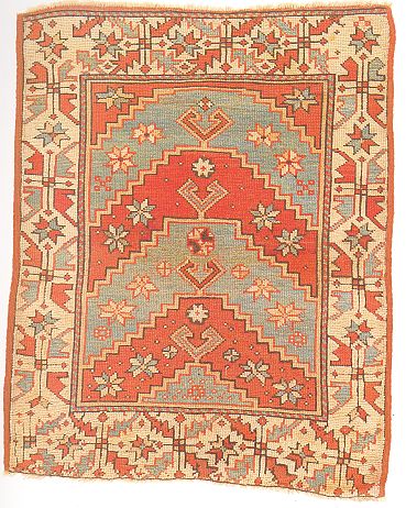
The first is a western Anatolian rug, Plate 50 in the ICOC VIII, “Atlantic Collections”
catalog.

It is estimated to have been woven about 1800. I think the tendency would be
to see red as the ground color of the field of this piece and color theory would
suggest that, but is it? Might it not equally be that the ground color of the
field of this piece is the light green? For me, it’s hard to tell.
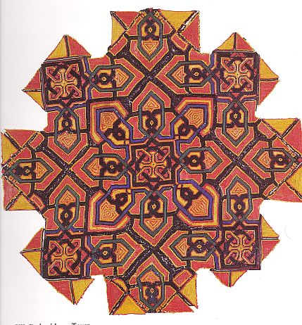
Later in this same volume, Plate 331, there is unusually shaped piece of silk
embroidery attributed to the town of Chechaoeun in Morocco.

The dominant color is clearly the red and that might seen to be the ground.
But, again, is it? Might it not be that the yellow serves as the ground color
in this piece, or that it is even the very dark color that we initially see,
I think, as outlining? I think ambiguity about ground color is more frequent
in pieces like this one with “overall” designs.
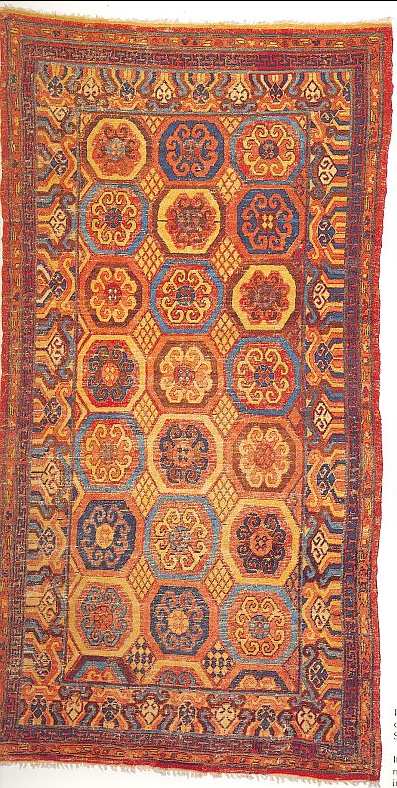
One last example and then it is your turn. I don’t read Gantzhorn’s famous volume
much, but he does supply a lot of color images for the $15 I paid for my copy.
The is his Ill. 662 and is an East Turkestan long rug.

As usual, Gantzhorn wants to talk about “crosses,” but I want to ask what the
ground of the field portion of this piece is? One might initially say that the
“lattice” design in between the medallions of the field is the most likely candidate
and this is so, excepting that the weaver has not used it consistently and somewhat
different designs occur in two instances at the bottom and especially all along
the sides.
I invite at least two kinds of posts in this thread.
First, what other instances of ground color ambiguity can you find and how does
color operate to make this the case?
Second, do you agree with my indications that these pieces are instances of
ambiguous ground color and if not, why not?
Regards,
R. John Howe
Posted by R. John Howe on 12-13-2005 08:08 AM:
One More Example
Dear folks -
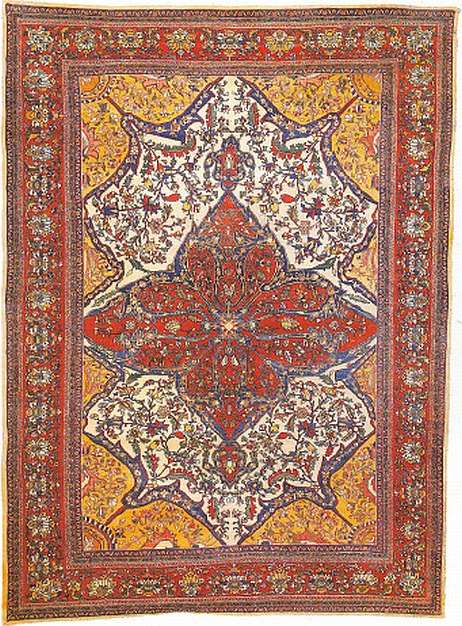
Here is one more possible example of field color ambiguity.

It is Sarouk rug in the Eiland and Eiland "Comprehensive Guide," Plate 81.
I think most would say that the ground color of the field in this piece is yellow.
Maybe so but I can see it also as either red or white. In terms of color theory
it should be a red ground, I think.
Regards,
R. John Howe
Posted by Filiberto Boncompagni on 12-13-2005 10:07 AM:
Hi John,
It seems to me a matter of semantic: it has to be decided if the rugs above
have something than can be defined as “field” or “ground”…
In the last rug, I would define the composition as a red medallion on a white
field with rather pervasive yellow spandrels 
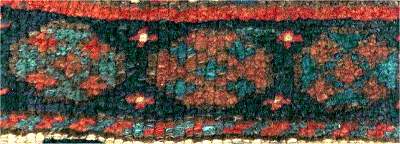
I can think at least of an instance of ground color ambiguity. Peter Stone calls
it “reciprocal ambivalence” in his last book (page 21):

You can read the rosettes inside the border of this Jaff Kurd bagface either
as diamonds or cross-like polygons inside octagons.
I “see” a blue background, so to me it appears like a red polygon between to
sets of red stars. But, if one chooses the red as ground color, it’s the other
way around (two blue polygons with a set of blue stars in the middle).
I hope this diminutive example isn’t too off topic.
Regards,
Filiberto
Posted by Steve Price on 12-13-2005 10:57 AM:
Hi
I agree with Filiberto - the issue is semantic.
With a painting or an embroidery, it makes sense to talk about the ground color.
It was there first, covering the whole item, then other stuff got put on top
of it.
With a rug or a kilim, the colors are put on at the same level, not one, then
another atop it at various places, and so on. So, in the sense that the term
is used for paintings or embroideries, there is no such thing as the ground
color on a rug or kilim.
Conventionally, we look at rugs and kilims and often read them as we would read
a painting, and our brain interprets one color as the ground. But this is entirely
within our minds - it is not a property of the object.
Regards
Steve Price
Posted by R. John Howe on 12-13-2005 12:59 PM:
Filiberto, Steve -
It may sometimes be as you say, but I think you wave this aspect away as only
semantic a bit too quickly and easily.
Notice that Mr. Muse spent a little ink pointing out why the ground color on
the kilim at the beginning of this thread is red not yellow. So he must be concerned
about a possible misreading.
While it is true that rugs and textiles usually have designs that are, in fact,
all placed on a single surface (corrosion and mixed technique aside), it is
also true that often the weaver wants us to experience effects of dimensionality.
These effects do not always reduce to language.
Here again is the Moroccan embroidery.

There are places where devices of one color "cross over" or "under" another
color clearly, suggesting dimensionality. In some instances the dark color "pierces"
some "horse-collar-shaped" red devices.
Some Mogul rugs have very complex "cross-overs" of this sort suggesting "levels"
and "levels." Such uses and the ways that we talk about them seem more than
semantic.
And do you reject the color theory notions that lighter colors appear closer
and that darker ones seem further away? Those effects are visual, not semantic.
And would we not usually see a ground color as flowing on the "deepest" level
of design?
Last, I would point to the widespread use of the expression "ground color" when
we talk about both fields and borders. We seem to be able to communicate with
reasonable accuracy using this expression. If the character of the ground color
can be clear sometimes, why can't it be ambiguous in other instances?
Regards,
R. John Howe
Posted by Steve Price on 12-13-2005 01:41 PM:
Hi John
I don't disagree with your statement that we use the term "ground color" pretty
freely, and most of the time I don't think it confuses anyone. Even as we can
look at a painting and see depth resulting from the use of perspective, even
though the object is only two dimensional. Escher's drawings are often wonderful
plays on this illusion, since impossible arrangements of depth become possible
when it is represented this way.
But when the "ground color" of a rug or kilim reaches our brain as ambiguous,
I think it's time to just call it that and stop worrying about it. Why? Because
it has no existence except in our perception, and looking for it "out there"
can't succeed.
The argument that the weaver wants us to see something as the ground color doesn't
take us very far if we don't see it. That's assuming that this really was the
weaver's intention.
You mention various artistic conventions that suggest dimensionality. They are
real enough, and we perceive them with almost no difficulty. That is, they are
usually unambiguous. But when they are ambiguous, maybe we just have to put
up with that being the case. Not only are we unable to determine which color
is the ground in such cases, we aren't even able to determine if there is one.
You cite Gary Muse's comments on the kilim at the beginning of the thread, in
which he asserts that the predominant color (yellow) is not the ground, but
that red is. He bases this on the red completely surrounding the yellow. Fair
enough. Once that feature is pointed out, my perception is just like his, as
yours apparently is, too. It's a nice illustration of one of the cues we use
in arriving at the perception on which color is ground.
This doesn't change the fact that the existence of a ground color on this (or
any other kilim) is a result of our brain processing the information and interpreting
it that way. None of the colors is applied over any other, so there really is
no ground in the same sense that there is one in every embroidery and many paintings.
A point in passing: The first post also shows an early Anatolian prayer rug,
and you wonder aloud whether the red or the blue, which are the predominant
colors and are present in more or less equal amounts, is the ground. But if
you look again, you'll see that the white completely surrounds them. Once I
noticed that, my brain insisted that both colors float on a white ground. The
same principle that Gary Muse articulated for the kilim works here.
Regards
Steve Price
Posted by R. John Howe on 12-13-2005 07:30 PM:
Hi Steve -
You say in part:
"...The first post also shows an early Anatolian prayer rug, and you wonder
aloud whether the red or the blue (ed. green), which are the predominant colors
and are present in more or less equal amounts, is the ground. But if you look
again, you'll see that the white completely surrounds them. Once I noticed that,
my brain insisted that both colors float on a white ground..."
Me:
Now you're coming my way. I don't think many of us would notice initially that
this is perhaps a piece with a white/ivory ground. It takes a little alert looking
to detect what the weaver intended in this regard.
And some might yet argue. Muse makes his argument for a darker color over a
lighter one. That's congruent with what color theory posits and is why I found
his point somewhat unneeded. You are suggesting that white is the ground here
(and it may be) but that ignores the dimensional effect the colors apparently
have in and of themselves. The red would (in theory) still be the furthest away,
the green at a middling distance and the white/ivory would be closest. So the
latter color would have to "frame" the "deeper" parts of the field rather than
serve as the "ground" color.
Now I'm not sure how important this entire point that I have raised is, but
I'm glad to see you make an analogous one, if only "in passing." For a minute
there I thought you and Filiberto were set on destroying threads faster than
I could compose them. 
I haven't entirely given up in this regard yet.
Regards,
R. John Howe
Posted by Steve Price on 12-13-2005 08:06 PM:
Hi John
I said, ...the white completely surrounds them. Once I noticed that, my brain
insisted that both colors float on a white ground... You respond, I don't
think many of us would notice initially that this is perhaps a piece with a
white/ivory ground. It takes a little alert looking to detect what the weaver
intended in this regard.
I think the leap from what my brain interprets to what the weaver intended to
represent is a pretty substantial leap. If accepted, it can become the entrance
ramp to a long, slippery slope.
Some people see trumpeting elephants, sailing boats, and great birds in some
Turkmen details. I've never subscribed to the view that these represent the
weaver's intent, even though my brain can see them when they are pointed out
to me.
Regards
Steve Price
Posted by R. John Howe on 12-14-2005 06:01 AM:
Steve -
No, no. My language drifted badly. I don't mean to introduce "weaver intent"
(although Muse did pretty explicitly).
What I intended to say was that once you notice the "surrounding white" there
is still the color theory effect (that "white is seen as closest") to overcome
if we are to see white as the ground color (I'm still assuming that needs to
be the color furthest away).
Regards,
R. John Howe
Posted by James Blanchard on 12-14-2005 03:18 PM:
pushing white to the back...
Hi John,
You point to two interesting observations regarding how we perceive the field
colour.
1. Dark colours are usually perceived as being at greater depth than white and
other lighter colours.
2. Colours that surround others generally give the impression that they are
the field or ground colours.
A third factor in creating a "field" is probably the overall surface area covered
by that colour, with those colours covering the most area being more likely
to be perceived as the field.
I was thinking about a couple of Shirvan rugs of mine wherein these rules of
thumb seem to be superceded by the design layout. (I apologize for the repetition
to those who have already seen these on "Virtual Show and Tell").
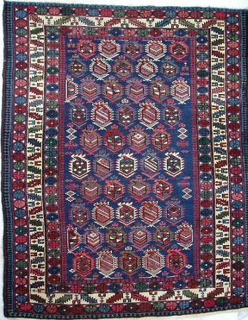
The first example is a Shirvan "boteh" design rug wherein there are two minor
borders that have oval ornaments and white triangles. When I look at those borders,
I perceive the white to be the ground colour, with the darker coloured ovals
on top. In fact, Vincent Keers pointed out that the weaver started the first
border (lower left) with dark triangles and switched to white, with the resultant
effect of pulling the ovals "forward" (at least to my eyes). The obvious explanation
is that the dark oval ornaments are different colours, so we don't see them
as the "ground". The occasional white centre in an oval accentuates the effect.

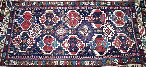
The second example shows a field where there is a dark blue that dominates in
overall surface area, and also surrounds all of the field elements. And yet
when I look at the rug I have the impression that those white patches that surround
the "guls" are beneath the blue. In fact, the visual effect that I see is that
the white areas have been "punched through" the blue, and the guls are seated
in those spaces. I think the issue of which has greater visual depth is at least
ambiguous. Maybe it's just me though. Does anybody else see it the same way?
I think that one explanation for this visual effect is that the white areas
leave a lot of space around the guls, and the guls are "broken up" within them,
so it looks like the guls are on a white ground.

Cheers,
James
Posted by Tim Adam on 12-15-2005 07:53 PM:
Hello John,
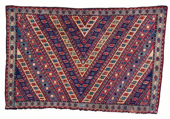
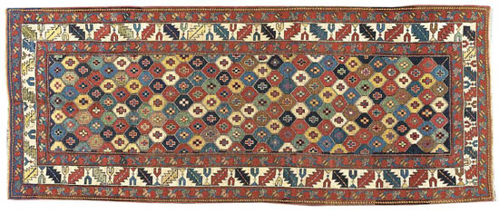
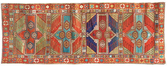
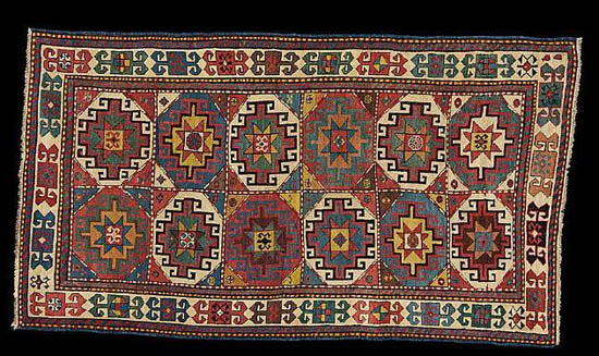
Here are a few more examples of ambiguous ground colors, no ground color, or
changing ground color.


Regards,
Tim
