Posted by Tim Adam on 12-09-2005 10:43 PM:
Color Harmony
Hi John,
I find it personally impossible to define color harmony, even
though I have somewhat of a concept in my mind of what it is. I think the idea
that “colors are harmonious when no one color jumps out at you” is a good one. I
would like to add “in an unpleasing way.” For example, the green in the Baku
long rug might jump out on you, but it does so in an effective manner. So, I
would not say that this rug has no color harmony.
I also think one needs
to distinguish between color harmony and pleasing color. One can have a
preference of some colors over others, but even a rug with unpleasant colors can
display color harmony. Here are two examples:

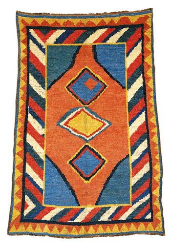
I think both rugs have color
harmony, even though I like the tonality of the first better than that of the
second. If one were to make a rug with the dyes of both rugs, the result would
probably be quite unharmonious. But I realize that it can be very hard to
distinguish between pleasing colors and color harmony, as the next example might
demonstrate.
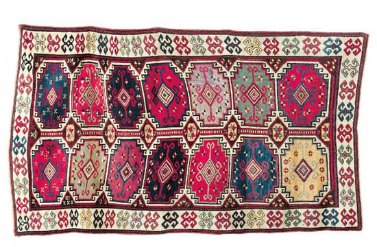
Are these just ugly colors, or is there no color harmony? I
don’t know.
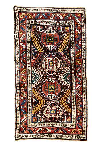
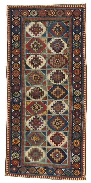
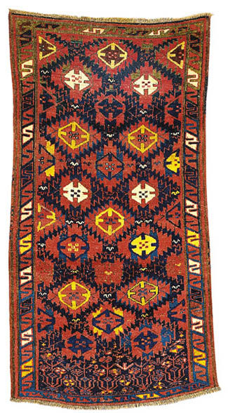
Here are some examples, which I think have no color harmony.
All of them fall into the category of a color that jumps out at you in an
unpleasant/unexpected manner.
Regards,
Tim
Posted by R. John Howe on 12-10-2005 07:24 AM:
Hi Tim -
Thanks for these thoughts and these examples.
You
point to the "no color jumps out" and the "pleasing" color notions as central to
your own sense of color harmony.
How would you say the use of "accent"
colors fits with the "no color jumping out" criterion? Does the use of accent
colors intrude on and reduce color harmony in some way precisely because they
are performing their assigned function of drawing the eye to particular parts of
the weaving?
And what would you say about the use of white generally? I
notice that in my own examples of color harmony, I sometimes seem to say that
the whites used do not infringe on color harmony and in others that it may. Take
your first two pieces. Does the use of white in either or both of them "jump out
at you" relative to the other colors? I think some may argue that it does and
that white is generally problematic in this sense.
What do you
think?
Regards,
R. John Howe
Posted by Tim Adam on 12-10-2005 08:55 AM:
Hi John,
I think an "accent" color must break the harmony, otherwise
it wouldn't be an accent. However, this can be good or bad. Think about
classical music. There may be an occasional dissonant, which breaks the harmony
of a piece, but it can surely make things more interesting. There can be lots of
dissonants, like in contemporary classical music, and it is still ok. In either
case, however, a dissonant can destroy things if improperly used.
The
same may apply to rugs. A color that sticks out can be good or bad, depending on
how it is done. In music there are some rules that guide you on how to use
dissonants properly. I bet there are also some rules in the visual
arts.
I don't think of white and black as colors. They never clash with
other colors. So, while I agree that the whites in the first two pieces I posted
stick out I don't find that disruptive.
Regards,
Tim
Posted by Filiberto Boncompagni on 12-10-2005 09:27 AM:
Dear Folks,
Bearing in mind that appreciation of colors may vary
between cultures and, inside the same culture it can change with time
…
(Down-to-earth example: I will NEVER wear a the tie of a certain
American brother-in-law of mine. On the other hand I may not like anymore one of
my old ties) 
…
I propose here two examples about color harmony.
Both scan are from Ian
Bennett and Aziz Bassoul, “Rugs of the Caucasus, 2003, Plate 16 and 15. Both are
Borjalou Kazaks.
The advantage of having two rugs from the same exhibition
and book/catalogue is that they share the same photograph and typography, so we
can safely assume that the apparent diversity between them should be rather
close to reality and not due to different technical rendition.
First,
plate # 16:
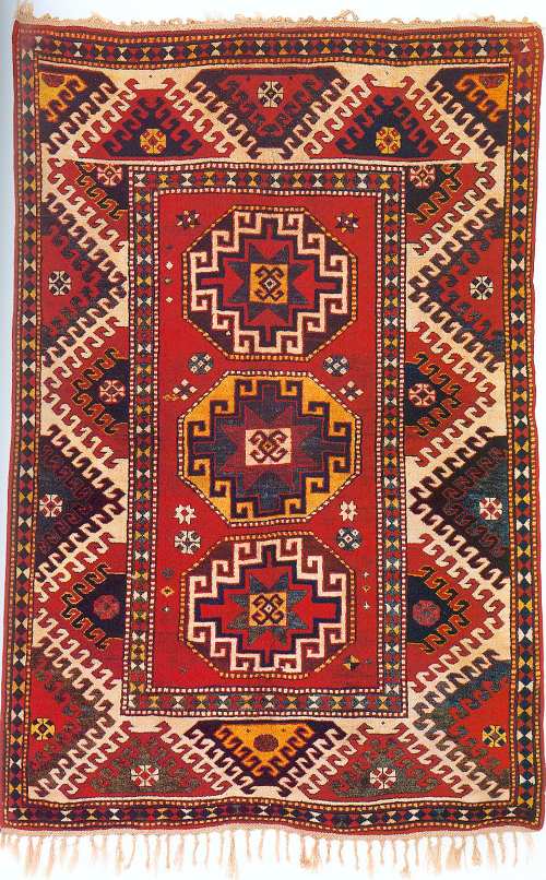
Not bad colors, really, if you look at this rug alone. Rich
saturation, no clashes… A nice Kazak.
Now see plate # 15:
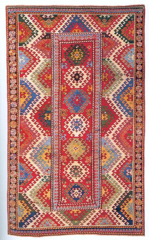
This one
belongs to another sphere: colors are simply wonderful, a real symphony for the
eyes. The harmony in them is that they enhance each other, no one jumps
out.
It has to be said that that the range of colors in plate # 15 is wider
than the other. Some blues and green are NOT saturated but pastel-like, with a
delicate abrash.
So, not being able, like Tim, to describe color harmony,
this is the closest example I can get, better illustrated by comparing it with a
similar good specimen of its type.
John’s third photo, the “Moghan-Savalan”
saddle bag half from John Wertime’s book is also quite a good
example.
Regards,
Filiberto
Posted by Tim Adam on 12-10-2005 10:40 AM:
Hello Filiberto and John,
I did a little experiment, and extracted the
main colors in the two rugs Filiberto posted. Here are the results (first #16,
then #15).
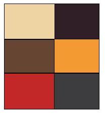
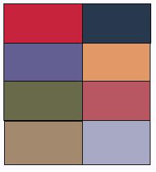
I'd say in terms of color harmony both rugs are very good. The
yellow in plate #16 seems to stick out a little, but in the color comparison, it
fits in just perfectly. I think what this shows is that it is extremely
difficult to consider color harmony in a rug in isolation. Maybe like it is
difficult to judge a dissonant cord. It depends on the
context.
Regards,
Tim
Posted by Tim Adam on 12-10-2005 11:26 AM:
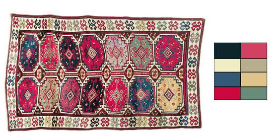
Here is
another color analysis, of the 'ugly' rug. The pure colors don't look that bad,
actually. What do you think?
Tim
Posted by Filiberto Boncompagni on 12-11-2005 02:48 AM:
Hi Tim,
Good experiment. Unfortunately it gives us only pure colors,
leaving out the “vibrating” effect caused by the abrash… which makes rug #15 so
successful – for me, at least.
No, I don’t like the palette of last rug
(Zakatala?) either. Especially the bluish red. I don't know from where you got
that image, but I bet that the original colors are better, though.
Now,
let's try another experiment.
John wrote: “For me, this green violates the
color harmony of this piece simply because it demands so much attention for
itself. But notice that the green does not seem to clash particularly with the
colors in the rest of the rug.”
I agree with John too. I don’t like it,
but I cannot say why. I tried to change that green with blue and red:

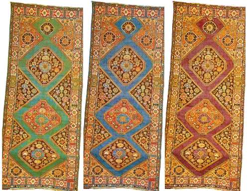
Now, which background do you
prefer? I like the blue, followed by the purplish red (I tried to get a warmer
red but it couldn’t).
Regards,
Filiberto
Posted by R. John Howe on 12-11-2005 06:13 AM:
Tim, Filiberto -
These are both useful experiements to try to sort out
the basis for our experience.
Tim, I think that with the squares of color
(which is very imaginative) an objection might be not only that the colors in
the squares are "pure" as Filiberto points out but that they give equal weight
to the various colors, and they don't have that as we experience them in the
rugs. Still a useful thing to do.
Filiberto, your comparison suggested to
me that your conception of color harmony is tied up with "range of color" and
the questions of "dominance and proportionality." It also seems to me that you
would tend to rate a more "graphic" a rug lower on "color harmony" (character of
the colors being about equal) than one with less graphic impact. This suggests
that graphic impact, like accent effect, intrudes on color harmony for you. As
long as the color "go together" and are scattered about the rug in small
proportions, color harmony is high, but if there are bigger graphic units
perhaps with less range of color the graphic effect begins to intrude on such
harmony. Is that approximately right?
Regards,
R. John Howe
Posted by R. John Howe on 12-11-2005 06:26 AM:
Filiberto -
I forgot to respond to your experiment with the long rug
with a lot of green in its field (Schurmann places it in his "Baku District"
section and describes it as "Surahani," an attribution that is less familiar to
me).
I think the one with the red seems to have the best color harmony
for me and I wonder if we are not on the edge of saying that color harmony is
more likely between analogous colors than between complementary colors.
This because there is a relationship between this distinction and degree
of contrast. Analogous colors have less contrast with one another, while
complementary colors have higher contrast. If contrast operates like, color
effect and graphic impact, then higher levels of it should be expected to
intrude on color harmony.
Does this seem right?
Regards,
R.
John Howe
Posted by Filiberto Boncompagni on 12-11-2005 06:42 AM:
Hi John,
quote:
It also seems to me that you would tend to rate a more "graphic" a rug lower
on "color harmony" (character of the colors being about equal) than one with
less graphic impact.
I’m not sure if understand correctly what you say… Let me put
it this way: if the two Borjalou of plate #15 and 16 had exactly the same
design, I still would prefer the one with a wider and more abrashed range of
colors – that is, #15.
This doesn’t mean that I dislike bold and
“graphic rugs, like the first Gebbeh posted by Tim Adams. But, speaking of color
harmony, plate #15’s the one!
Regards,
Filiberto
Posted by Filiberto Boncompagni on 12-11-2005 06:52 AM:
Hi John,
Well, concerning Schurmann’s "Surahani", I prefer the blue
backround.
Blue should be a complementary color in this case… Isn't it? 
Regards,
Filiberto
Posted by James Blanchard on 12-11-2005 07:01 AM:
Dear John and all,
This should be an interesting Salon, that is likely
to go off in a number of directions. As John mentioned in his introductory essay
most people who collect rugs, and even those of us who are not collectors per
se, put a lot of emphasis on "colour" in rugs.
When I think more
carefully about my own response to colour in rugs, here are at least three
potential "attractors". They are entirely subjective, but maybe others will
recognize what I am describing from their own experience.
1. The quality
of a particular (dominant) colour itself, not necessarily in relation to the
other colours. An example might be a particularly "rich" or "glowing" red in a
Turkoman rug. There might be few other colours on the rug, but the best of these
rugs can make everything else around them look dull in comparison.
2. The
"sparkle" created by certain colours and colour combinations. Often rugs have
colours in certain combinations that cause a particular contrast which creates a
"jewel-like" sparkle. This is different from a garish effect, mostly because it
usually takes very good dyes to create this effect well.
3. The visual
dimensional effect created by the colour combinations. John has already
mentioned this, but I think it is an important attractor. The way in which some
weavers choose and use colours can create a "third dimension" of depth wherein
some design elements "float" or "recede" compared to the ground or to other
elements. So one often sees rugs with seemingly similar designs, but the overall
visual effect is very different because of the way in which colours have been
chosen and combined.
Finally, I am less confident than Steve seems to be
that we will be able to find an objective way of describing or measuring colour
harmony. And if we do, I expect that a high level of "measurable harmony" will
be found in both attractive and unattractive rugs. So to be aesthetically
pleasing, I expect that harmony might sometimes be necessary, but rarely
sufficient.
I look forward to seeing a lot of pieces ('the great, the
good, the bad and the ugly') in this Salon. This topic might break some Turkotek
records.... I hope Steve has plenty of disk space available. 
Cheers,
James.
Posted by Tim Adam on 12-11-2005 09:33 AM:
Hello all,
I think one should destinguish between color preference and
color harmony. The three rugs in Filiberto's experiment all display color
harmony in my opinion, but you may have a preference for one of them simply
because you prefer the blue (the complementary color for orange) over the green
or the purple.
I think we might also want to destinguish between abrash
and color harmony. I agree that it is often the abrash that makes a piece
oustanding, and this might be good topic for a different thread, but I see
abrash and color harmony as distinct issues.
When we say that a rug has
"good color", we mean a variety of different things.
Color
harmony
Abrash
Contrast
Degree of light reflection (sparkle)
Color
spectrum
Saturation
To have a meaningful discusion I think we need to
keep these issues apart, and above all define what we mean by 'color harmony'
first.
Regards,
Tim
Posted by Lars_Jurell on 12-11-2005 03:04 PM:
Friends
I think tasteful colors and color harmony are difficult to
discuss.
Difficult as to tell how long time an egg shall boil for best
result.
Ask 10 persons about it: Put the egg in cold water - in boiling water
- how many minutes? And you will get about 10 different answers - all saying
their instructions are the best for the egg.
We are all different also in
color taste and when I buy a rug for my own collection I only care about my own
taste.
But, if you buy a rug for to sell then you have to think like the
presumtive customers.
And don´t forget that the weaver had chosen the colors
for her rug - it was her opinion ( if we talk about real tribal rugs ) that
later became the result of her work. Just the same as with the
pattern.
Sometimes we accept naive pattern, and not perfect harmony in
pattern, but it´s more difficult to accept colors pointing out.
What rules
shall we follow?
Regards
Lars Jurell /Akrep, Sweden
Posted by Tim Adam on 12-11-2005 06:28 PM:
Hi Lars,
If we were to discuss preference of colors, I would
completely agree with you. Color harmony is different, however, if there is a
set of objective criteria. Given the webpages John cited, it seems that there
are objective criteria for judging color harmony.
Best
regards,
Tim
Posted by James Blanchard on 12-11-2005 10:30 PM:
Harmony or balance?
Dear Tim and all,
I wonder whether there is a tendency to mix the
concepts of harmony and balance when we look at rugs. It seems to me that if one
is to develop an objective yardstick for colour harmony in rugs then it will
have to extend beyond an analysis of the colours chosen. I can imagine two
weavers using exactly the same dyed wool lots making carpets that we perceive to
have varying degrees of "harmony". If as Tim mentioned "it all depends on the
context", then how hopeful can we be of developing reliable measures of harmony
based on the colours themselves? Whether or not a particular colour "jumps out
at you" depends on the extent to which it is used, and how it is juxtaposed with
other colours.
When I look at a rug, I think I often conflate the issues
of harmony and balance. If I like the colour scheme in a rug, it is usually
because I like the colour combination (harmony?) but I also like how they've
been arranged on the rug (balance?). I think colour balance probably relates to
ensuring that no one area of a dominates the others within a section (i.e.
within the field, or in the borders). Of course, sometimes it is desirable to
have the field have colours that dominate the borders, or vice-versa to create a
particular visual effect.
I guess what I am saying is that I am not sure
that I am getting any closer to objective criteria to understanding an objective
way to judge colour harmony in woven rugs.  But that won't prevent me from saying
I like the "colour harmony", or the "colour balance" in a particular rug.
Curious.
James
Posted by Steve Price on 12-12-2005 05:22 AM:
Hi James
I see nothing wrong with discussing what we do or don't like
in terms of color usage, but if there is such a thing as "color harmony", it's
probably best not to use the term without knowing what it
means.
Regards
Steve Price
Posted by James Blanchard on 12-12-2005 09:47 AM:
Hi Steve,
Okay, but I'm not very confident that we'll even know when
the term "colour harmony" has been adequately defined in terms of describing
rugs. For any such definition to be useful, it should be at least reproducible
by either applying specific objective criteria or by the judgement of
individuals studying carpets.
Until then, I suppose we can use other
words to try to describe what we mean, but then we might not be much further
ahead.
Cheers,
James
Posted by Steve Price on 12-12-2005 10:58 AM:
Hi James
In reading my post again, it can be interpreted as a pretty
hostile response to you. That wasn't my intention, and I apologize for the way
it came out.
My point is simply that if we (and, I should emphasize, WE)
don't know whether there is some objective definition of color harmony (as there
is for auditory harmony in music), we are likely to generate confusion by using
the term, especially if we go very far and then find out what the definition
really is (if there is one).
I'm more comfortable with discussing in
terms of what color usages I like and why I think I like them than I am with
making up ad hoc definitions for things that may already have accepted
definitions in other circles.
Regards
Steve Price
Posted by James Blanchard on 12-12-2005 12:27 PM:
Hi Steve,
No worries about the tone or balance of your comments. I
think everyone is still in harmony on this thread.
I completely agree
that using words for which we only have subjective and personal criteria doesn't
help us communicate without subsequent clarification (i.e. "I like the colour
harmony on this rug, by which I mean, etc."). But I find that I often use
descriptive words and then have to explain or qualify what I mean when
describing rugs. I do agree that "colour harmony" is still almost too undefined
to be of much use in our lexicon, until someone on this thread or elsewhere can
come up with either objective criteria that can be widely applied and
understood, or come up with a good enough definition that a large proportion of
people would "know it when they see it", and agree with most others when it is
there and when it is not.
Cheers,
James.
Posted by Tim Adam on 12-13-2005 10:38 PM:
What is color harmony?
Hello everyone,
It seems like web designers have a very clear grasp of
what is color harmony. Basically, colors that don't clash are harmonious. Seems
pretty obvious, no?
And here are some guidelines of colors that tend to
go well with each other:
Analogous Colors
Complementary
Colors
Color Triads
It's not really rocket science, and I see no
reason why it should not be applied to rugs.
Regards,
Tim
Posted by Steve Price on 12-14-2005 05:44 AM:
Hi Tim
I don't see any reason why those rules shouldn't apply, either.
I'm glad to see something reasonably objective introduced as a set of criteria
by which "harmony" can be defined.
Regards
Steve Price
Posted by Detlev Fischer on 12-15-2005 04:26 PM:
"Colour harmony" to me is not easily pinned down with objective criteria.
Definitions are only really useful if they have a chance of becoming accepted or
enforced by a community, which is probably not the case here (or may be there is
more of a consensus than I think - at least I found a few of the rugs posted as
"less successful" examples quite harmonious such as

- perhaps it is just that I like
cooler palettes and positively revel in shades of rose, pink, mauve, violet,
etc. which many find not so pleasing. of course I prefer these to be natural
dyes and have some abrash / life in them)
The test for Tim's sugestion to
import some terms from the use of colour in web design would be to see whether
these terms can be usefully applied in discussing rugs, whether they can support
*your* description of colour harmony. One common experience with those pressing
for sound definitions is that they are sometimes more interested in the act of
definition than in the benefits in employing the terms.
Personally I
think it is OK and convenient to let colour harmony be what each of us perceives
to work well together, and not try too hard to get to the bottom of it. Then,
explaining what leads to this personal perception immediately brings out all the
small differences of aesthetic sense or temperament that make this a largely
individual (and of course culturally formed and educated) judgment.
On
another note: Perhaps it makes sense to separate the realm of the "pleasing"
(which seems broadly analogous with the way most of you have used the term color
harmony) from the realm of the "outstanding" or "striking", the "theme that
talks loud and clear", rather than sing as "well-balanced colours" do.
Outstanding could literally mean that a few highlight colours stand out
against large areas of surrounding colours to great effect, as in some Baluch
work. I recognise this relates to the term "accent colour" that has been used
here, but it is somewhat more - most likely there is an uncommon design feature
that is brought into relief by clever use of contrasting colour.
I feel
not even a balanced use colours is necessary to accomplish a colour harmony - it
all depends on the design, the position, definition, saturation of the design
elements involved. One needs to get very specific to find out what kind harmony
it is. Regarding the green ground Baku district rug, I think the green works
very well and I definitely prefer it to the red and blue variants.
If
the notion of colour balance is used, I think it can work with various sets of
color, from black and white, to turkmen red and a little white and dark blue,
and it may even work with a rug with the most outrageous shades of pink, green
and orange (all naturally dyed and abrashed, of course  .
.
Posted by Filiberto Boncompagni on 12-16-2005 03:07 AM:
Hi Detlev,
A well-balanced posting with excellent points. 
I disagree only with your color
tastes. Which demonstrates, once and again, that de gustibus non est
disputandum. How boring could be this planet,
otherwise?
Regards,
Filiberto


 But that won't prevent me from saying
I like the "colour harmony", or the "colour balance" in a particular rug.
Curious.