Posted by R. John Howe on 12-14-2005 05:46 AM:
Color Versus Other Aspects in "Best of Type" Pieces
Dear folks –
Most of us are familiar with the expression “best of type” as that is encountered
in the rug collecting world. It is used there to point out pieces that are seen
to be the acme of a particular format, design or other variety.
Here are four examples.
First, a few years ago, John Collins put out the weighty article in an issue
of ORR on Bidjar pieces. In it he presented some important and very beautiful
Bidjar rugs of different types.
One of these was of the “split arabesque” variety with lots of “strapwork.”
First, here it is overall:

Here, also, is the detail of it that appeared on the cover of this issue.
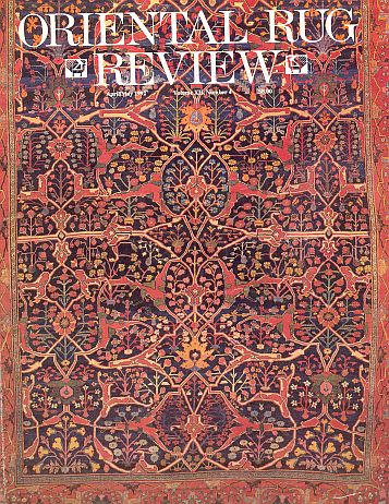
This is the best of the “split arabesque” type Bidjars (Collins places it in
an older “Type A” category) I have knowledge of. It has both wonderful colors
and an elaborate, dramatic design.
A second piece is much smaller and one of a pair of complete Shahsavan saddle
bags.
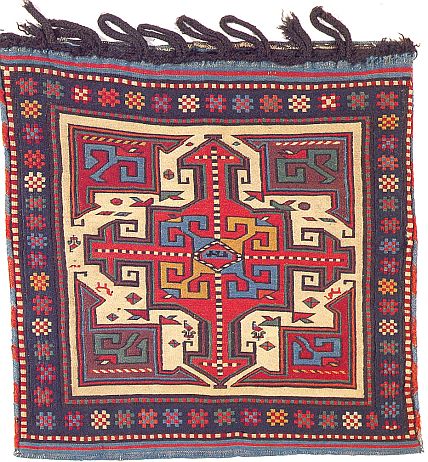
Again, beautiful color, but wonderful graphics and drawing as well.
A third example is of a Salor engsi.
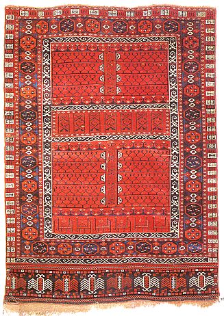
Robert Pinner analyzed the few Salor engsis that were known a few years ago,
and designated this one as a “Type B” (there is also a Type A, held likely to
be older).
It has always seemed to me that this particular Type B example is better than
the Type A examples I have seen. Precise detailed drawing and a “lit from within”
red ground color.
Last is an instance that may not, strictly speaking be a “best of type rug.”
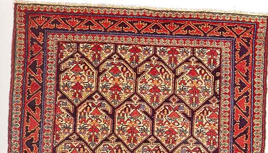
It is a piece that appears in the Willborg catalog “Hammadan.”
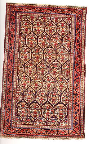
Willborg places this piece (it is single-wefted) in Meraban or Enjilas and says
that it is “rare” and the “star” of his catalog. So while we may not be able
to claim that it is the best Hammadan we have seen, it is a very beautiful rug.
Here is a closer look at its features.
So what? you say. Well, I thought it might be interesting to examine what role
color plays in our assessment of “best of type” pieces, as opposed to other
aspects to which we might point.
The bases on which we say something is a “best of type” might be a particularly
good place to determine whether the old saw that the three most important things
about rugs and textiles is “color, color and color” is true.
What do you think? How important is color to our "best of type" evaluation and
how much does this assessment require consideration of other aspects?
Do you have other examples of “best of type” pieces that might show color (and
other aspects) operating in distinctive ways to support that evaluation?
Regards,
R. John Howe
Posted by R. John Howe on 12-14-2005 08:56 AM:
Dear folks -
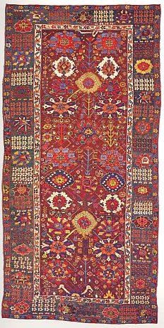
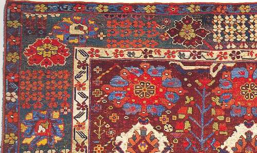
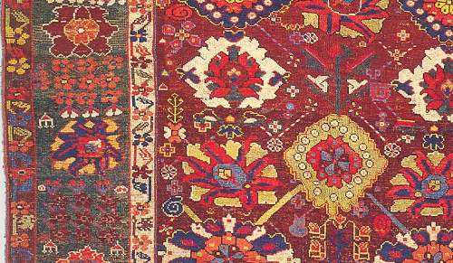
Let me add one more piece that seems to me arguably a "best of type" piece.
This is an urban Kurdish rug attributed to northeast Kurdistan that is one of
those, in Jim Burns' collection and book, that made us reconsider our basic
picture of what Kurdish rugs might be.
Again the colors are wonderful, but the designs are elaborate.
I have provided several images for your enjoyment.
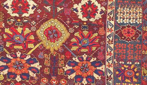
To what extent do you think color "carries" the excellence of this piece and
to what extent do you see it as importantly dependent on other aspects?
Regards,
R. John Howe
-----
Posted by Steve Price on 12-14-2005 09:55 AM:
Hi People
Nice selection.
I don't think anything can make it into the rarified air of "best of type" without
having wonderful colors, but I think it's obvious that it takes more than that.
The nature of the "more than that" will vary with type.
For that reason, I think it might be worthwhile picking out one type and exploring
it in some detail, then moving on to another, and so on. Trying it on too many
at once can lead to us making the first recorded pedagogical error: Moses' giving
the Israelites all ten commandments at the same time. One a day for ten days
might have led to a much different world today.
Regards
Steve Price
Posted by Filiberto Boncompagni on 12-14-2005 10:42 AM:
Right.
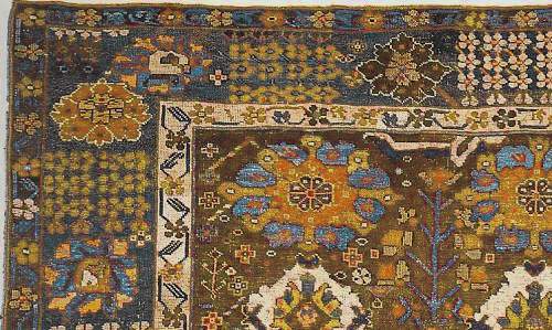
Let’s pick up one type only. Better, a detail of that wonderful Kurdish rug.
John asked To what extent do you think color "carries" the excellence of
this piece?
My answer: To a HUGE extent! See what happens if I change a bit the colors.

Regards,
Filiberto
Posted by R. John Howe on 12-14-2005 02:23 PM:
Hi Filiberto -
I think this is an excellent demonstration of what is lost if the colors are
made less pleasing.
You've acknowledged in your earlier post that the excellence of such pieces
is also a product of color plus other factors like design.
This might be a place for Tim Adam (or someone else who knows how to do so)
to extract the colors used in this Kurdish piece and show how they look without
the support of the designs.
Regards,
R. John Howe
Posted by R. John Howe on 12-15-2005 03:36 AM:
Dear folks -
Filiberto's demonstration above of the result if one changes the colors on a
great Kurd piece is pretty dramatic.
What I want to offer here is perhaps a more modest demonstration of holding
the colors pretty constant, but modifying the design.
Here is a chuval owned by Peter Hoffmeister, the German Turkman collector, whose
very large collection, in its current state, was recently exhibited in its entirety
in Germany.
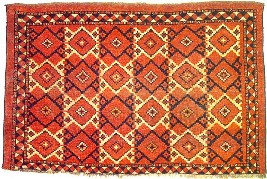
It was declared the "star" by A.S.B Crosby, his English co-editor, of a series
of Turkmen pieces that Peter published once.
I have always lusted for it.
Unfortunately, (for me) Peter owns it.
So a few years ago I had it copied.
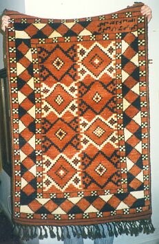
In truth, the colors came out pretty well, but the person who made the cartoon
or the weaver, decided that this "American" could not possibly want a bag face.
What I clearly wanted, in his/her view, was a rug based on this bag face design.
So, he rotated the design 90 degrees, reduced the number of rows in the field
and blew up the scale of field design and that of the major and minor borders,
and lost all of the original proportions that were very much part of what made
Peter's piece successful for me.
I waited until Peter came to a TM convention and then brought it to the "show
and tell," confessing publicly that I had made a "knock off" of his wonderful
antique piece.
Peter was a good sport about that and took a picture of the piece held by his
wife and me.
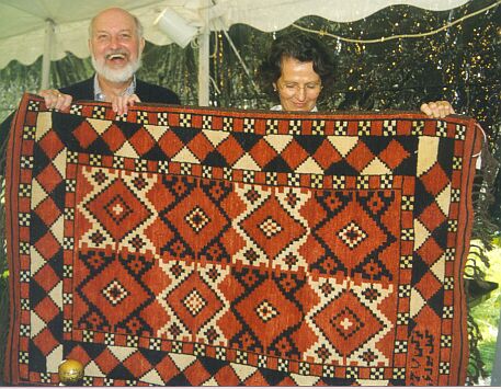
When he sent me a copy, he wrote on the back, "Happy rug."
I think it a good, but modest, example of the fact that color is not, in fact,
everything. That you can have the same approximate colors and mess things up
pretty badly by altering the design.
Regards,
R. John Howe
Posted by Filiberto Boncompagni on 12-15-2005 04:21 AM:
Hi John,
Yes, this is an instance where graphics plays more importance then color. The
main quality of the original chuval was its design, the palette being rather
limited.
As a side digression, one can also electronically improve the colors of a digital
image.
Here are two examples of textiles with bad colors, each one followed by its
improved version:
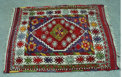
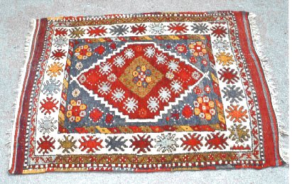
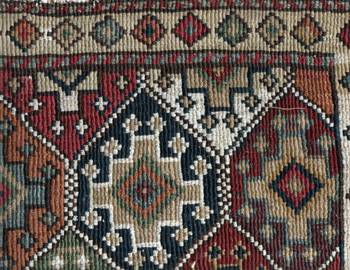
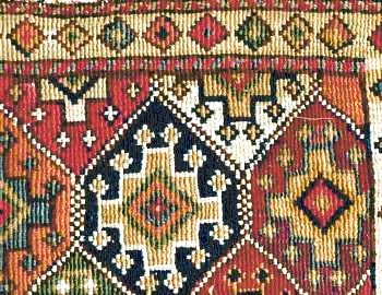
A further demonstration that one should be careful in judging colors from a
digital photo… especially, say, when buying on e-bay or the likes. 
Regards,
Filiberto
Posted by Wendel Swan on 12-15-2005 07:48 AM:
Hi John and all,
There are many aspects to the use of color, including proportion and scale,
specifically so that some elements of the pattern are emphasized. I’ll try to
comment later on other aspects.
The Willborg Hamadan is a wonderful rug. The relative crowding of the motifs
is not unexpected in NWP rugs; one can see it in many Senneh boteh rugs, for
example. But we may have different opinions on the crowding of elements.
Following is a demonstration of how the use of color scale, proportion and contrast
can make a tremendous difference in how we react to a rug. I have, I think,
changed the aesthetics of the rug and, at the same time, virtually removed it
from its tradition. There are now 2/3 as many botehs.
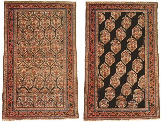
I ask these questions.
Is it easer to see that the botehs are botehs and not a lattice?
Do the botehs appear larger or smaller?
Does the open space cause a change in our perception of the proportions of and
in the rug?
Does the reciprocal border become a less dominant feature?
Are the graphics now more “memorable”? More pleasing?
If Willborg’s Hamadan is one of the best of type, is the modified version an
improvement or not?
I’ll provide my own comments later.
Wendel
Posted by Amir_Aharon on 12-15-2005 12:04 PM:
Hi,
I am posting two Bordjalu rugs of similar design but different combination of
colors and a third typical zig-zag bordjalu. All the three were sold lately
at auctions.
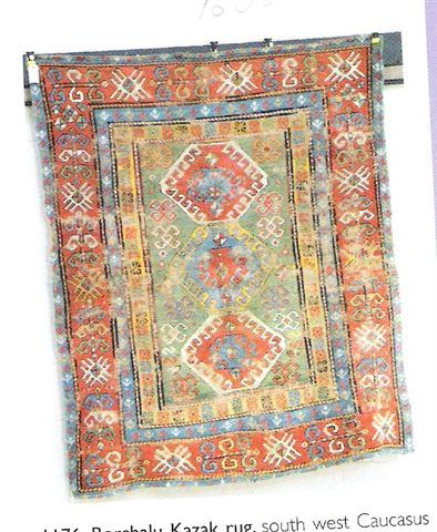
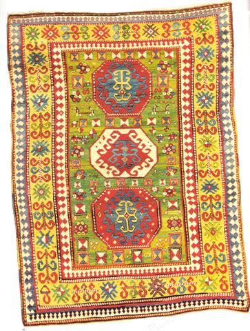
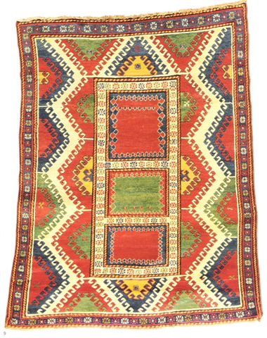
Comparing the two similar rugs, putting aside condition and size, we see that
the main difference is in the COLOR of the wide border (the Sotheby's London
27th April 2005 piece has a wide yellow border, while that of the last Netherhampton
UK sale is red). There are other negligible differences too, of course.
What is interesting is that the Sotheby's Bordjalo fetched an incredible price.....
140 times that of the Netherhampton. How do you explain it? I believe that it's
not only the choice of the colors but the way you combine and juxtapose them
to produce something "PLEASING" to the eyes. You can always come out and say
that "pleasing" is subjective and normally changes with time (trendish colors
etc.). I still think that there must be something such as a "PLEASING COLOR
COMBINATION". It would probably have different meanings at different periods
of time.
The third 'zig-zag' design Bordjalu sold at the same Sotheby's auction for an
enormous (relatively) price too. This time there is an interplay between design
and color. The 3 empty squares in the center are extremely appealing, but without
the right color combination it could have been lost. I am positive if we put
up this rug for rating among Turkotek members it would get a high score for
"pleasing".
Amir Aharon
Posted by Filiberto Boncompagni on 12-15-2005 12:38 PM:
Hi Wendel,
Is it easer to see that the botehs are botehs and not a lattice? Yes
Do the botehs appear larger or smaller? Hmmm… smaller?!
Does the open space cause a change in our perception of the proportions of
and in the rug? Yes, the virtual one seems a bit narrower... I think.
Does the reciprocal border become a less dominant feature? I would say
no…
Are the graphics now more “memorable”? More pleasing? More memorable,
yes. Pleasing? No. Perhaps with a different background color… I know, you are
speaking of graphics, and I insist on color 
If Willborg’s Hamadan is one of the best of type, is the modified version
an improvement or not? See above.
Regards,
Filiberto
Posted by R. John Howe on 12-15-2005 05:25 PM:
Dear folks -
I want to answer Wendel's questions. I see that Filiberto has but I have not
yet looked at what he said.
Here's my effort:
W: Is it easer to see that the botehs are botehs and not a
lattice?
J: I didn’t have any trouble recognizing them as botehs but their
character is clearer in the more spacious layout.
W: Do the botehs appear larger or smaller?
J: Color theory suggests that they should seem smaller but I’m
not sure.
W: Does the open space cause a change in our perception of the
proportions of and in the rug?
J: I’m not certain of the questions. The increase in open space
uncovers a great deal of black and makes that the clearly
dominant visible color. That was not the case before. The
palette was much lighter.
W: Does the reciprocal border become a less dominant feature?
J: I think that I notice it more in the revised piece, because it
contrasts with the black of the field and has less competition
from the “busy” botehs.
W: Are the graphics now more “memorable”? More pleasing?
J: The graphic impact of the rug is greater, but I’m not sure I see
it as “more pleasing.” I rather liked the softer effects of the
original.
W: If Willborg’s Hamadan is one of the best of type, is the
modified version an improvement or not?
J: I think this experiment is interesting but I don’t see the
revised rug as an improvement. There's something disjointed
about the character of the revised field.
J: Last thought: I don’t think I would have described the botehs in the original
design as “crowded.” That’s too conclusionary (may not be a real word) for me.
I would admit to “close together.” 
Regards,
R. John Howe
Posted by R. John Howe on 12-15-2005 05:39 PM:
Dear folks -
I hope the effects of this post will not be too tangential, but I need to make
it.
Someone has written me on the side to ask whether knowledge that one or more
of our best of type rugs had been heavily restored would affect our judgment
of the extent to which "color 'carries' the excellence" of it/them.
That is, must the color we are assessing in a "best of type" judgment be the
result (only) of the work and efforts of the original weaver? (I suppose the
argument goes that if there is heavy restoration, the piece is no longer a candidate
for "best of type" since it is now heavily the work of someone outside the target
tradition. It is no longer a legitimate member of that type.)
Regards,
R. John Howe
Posted by Filiberto Boncompagni on 12-16-2005 02:45 AM:
Hi Amir,
I agree with everything you said - but tell me, is the first rug you posted
badly worn out or it is simply a bad scan?
John, you did well in not reading my answers. It turned out we disagree only
on the dominance of the border.
And… you are right on the restoration matter: a ”best of type” cannot be heavily
restored.
Regards,
Filiberto
Posted by R. John Howe on 12-16-2005 05:22 AM:
Hi Filiberto -
You said in part:
"...a ”best of type” cannot be heavily restored."
Me:
Then one of my examples (I do not want to say which one) may have to be withdrawn.
Different subject:
You seemed to say that the effect of design in likely greater on pieces in which
the range of color used is narrower. I guess what is happening there is that
because of the narrow range of color, the graphic aspects of the piece are likely
more prominent and therefor more influential, possibly more than the color.
Regards,
R. John Howe
Posted by Filiberto Boncompagni on 12-16-2005 05:45 AM:
Hi John,
quote:
You seemed to say that the effect of design in likely greater on pieces in which
the range of color used is narrower.
No. I said that, as this “instance” had a limited palette, its quality resided
in its graphic.
There are pieces that have great colors and appealing graphics.
Regards,
Filiberto
Posted by Amir Aharon on 12-16-2005 08:58 AM:
Wendels Bottehs
Hi Filiberto, John,......
The first rug in my last post is probably just the way it looks, badly
worn out; that's how it looked when I scanned it from the catalogue. This fact
still doesn't justify such an enormous difference of price, compared to the
magnificent Sotheby's piece.
I wish to join the Wendel questionnaire, although I admit I have
already seen Filiberto's and John's answers 
ANSWERS:
1) In the left rug you see an allover picture at a glance, probably
skipping the very pretty design and color of the botteh itself.
This would be unfortunate.
2) The bottehs appear smaller, but they probably are the same
size in both rugs.
3) The open space make me feel the whole rug is somewhat
larger. As for the effect on the inside, see (2) above.
4) The reciprocal border obviously becomes MORE dominant
in the spacious rug. In the "crowded" rug the border seems
like an extention of the field design. On the rug to the right
the border stands out by itself, and does look like a dividing
component as a border is meant to be.
5) For me the graphics of the "messed up with" rug are more
"PLEASING". But I must admit that I am biased......I usually
prefer open space and spacious designs in general ( I do
like the busy Kurdish rugs though).
"Memorable?" .....hmmm.. with my memory, I will probably
forget both. No offence meant to Willborg or others.
6) In my opinion IF (IF at all!) Willborgs rug is "one of the
best of type", it must be because of it's exquisite individual
botteh (including the design and color combination inside
each botteh). So I wouldn't rule out the possibility of the
second rug being an improvement. And probably I have
made more enemies by admitting that 
Filiberto....when you said : [a "best of type" cannot be heavily restored .],
did you mean [ a heavily restored, cannot be a "best of type" ] ?
Regards,
Posted by Filiberto Boncompagni on 12-16-2005 09:02 AM:
Yes Amir, I mean a heavily restored rug cannot be a "best of type". IMHO.
Regards,
Filiberto
Posted by Steve Price on 12-16-2005 09:18 AM:
Hi Folks
I disagree with the assertion that a heavily restored rug can't be "best of
type". It depends on how good the others of its type are and on the criteria
of "goodness" for that type.
Something that's the only specimen of its kind is "best of type", no matter
how much restoration it's had. The Pazyryk rug, for instance, would be best
of type no matter what happened to it. Even being burned beyond recognition
in a fire would leave it as the best specimen of that type.
While restoration can reduce the desirability of a piece, it can also increase
it. Otherwise, no sane person would restore anything.
Regards
Steve Price
Posted by Marvin Amstey on 12-16-2005 09:36 AM:
With its significant restoration (made up of two rugs), one could arguably
state that the Ardebil carpet is a "best-of-type".
Posted by Filiberto Boncompagni on 12-16-2005 09:42 AM:
Hi Steve,
Yeah, I admit that this matter of restoration is going out of the path it was
intended for.
Originally John wrote That is, must the color we are assessing in a "best
of type" judgment be the result (only) of the work and efforts of the original
weaver?
In this contest I assume that if we judge a rug as a best of type for its
color and most of that color is the result of a restoration – call it “non
original color” or simply “fake” – then I have serious doubts in defining that
rug a "best of type".
Huh, and shouldn’t the Pazyryk rug be a unique of type?
Although I remember having read that they found some rug fragments in the same
region. 
Regards,
Filiberto
Posted by Amir_Aharon on 12-16-2005 12:44 PM:
Hi everyone,
Here is a type-D Star Kazak before and after restoration. It can be a candidate
for "best of type". On the other hand the colors in the restored piece are somewhat
different from the original.
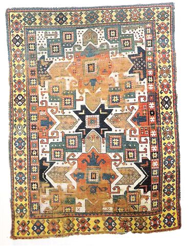
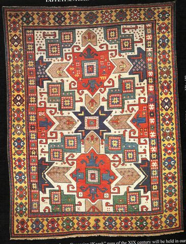
Filiberto is wondering, and so am I, if we can still place it in the "best of
type" category 
Regards,
Amir Aharon
Posted by Tim Adam on 12-16-2005 01:05 PM:
Hello all,
In Wendel's virtual rug the botehs are more easily discernable, the field becomes
narrower, and the reciprocal border more dominant. According to color theory
the botehs should appear larger - objects on a dark backround appear larger
than objects on a light background (or am I misreading the theory, John?) -
but this effect doesn't seem to be very strong here.
I find the concept of "best of type" is not compelling. Who defines what is
"best of type?" I think it is mostly dealers who are advertising their own rugs.
Given their obvious biases, such assessments are not really interesting.
I agree that all the rugs that John presented are outstanding. But for someone
to judge that these are the "best of type" he/she would need to know the universe
of rugs (for that particular type). That's not feasible, IMHO. It's all just
dealer hype.
Regards,
Tim
Posted by Steve Price on 12-16-2005 01:11 PM:
Hi All
One of the things that strikes me in this thread (and in some of the others,
too, if this is one of those rare days when my memory is functional) is the
reaction people seem to have when their experience doesn't match the predictions
of "color theory". In my world, when experience and theory don't match, it's
the theory that's in trouble.
Regards
Steve Price
Posted by Tim Adam on 12-16-2005 01:15 PM:
Hi Steve,
I generally agree with you, but keep in mind that the sample here is very small.
One would not want to reject a theory based on a couple of responses.
Tim
Posted by Filiberto Boncompagni on 12-17-2005 02:30 AM:
Hi Amir,
Well, I cannot assess exactly the percentage of repiling on the Star Kazak.
Twenty per cent? Perhaps thirty?
In any case, I would say “the colors in the restored piece appear different
from the original”. That is, because – unless the Kazak was also painted, which
I doubt – the difference we see is only due to the different hue and saturation
of the two photos.
The usual damned rendition problem.
Regards,
Filiberto
Posted by R. John Howe on 12-17-2005 07:12 AM:
Hi Steve -
Small aside. You say in part:
"In my world, when experience and theory don't match, it's the theory that's
in trouble."
Me: But frequently one's experience has to be arranged carefully and observed
from very particular perspectives to tell what is in fact going on. "Common
sense," and old teacher mine used to say, "suggests that the world is flat."
Tim -
The "best of type" is not a rigorous thing at all. There is often debate among
collectors (who do use the expression) about whether a given piece is or is
not such an instance (questions have been raised about, and criticisms made
of more than one of the examples I have offered).
I don't think the expression is entirely sourced in the market, although in
a recent issue Hali described one engsi sold at auction as likely a "best of
type" piece. So it is used in that context as well.
But the general reference is to the example(s) estimated knowledgeable rug folks
to be the best of a particular variety of rug or textile.
Regards,
R. John Howe
Posted by Tim Adam on 12-17-2005 02:02 PM:
Hi John,
I think it's like searching for the holy grail. Failure is guaranteed.

Regards,
Tim
P.S.: Is there any other art class, which talks about "best of type"?
Posted by R. John Howe on 12-18-2005 09:33 PM:
Hi Tim -
You ask if any other "art classes" use something like "best of type."
Not that I know of, but the "formalists" in art theory, who believe that we
are all basically hard-wired with regard to our aesthetic judgments do seem
to believe that there are such things as "best of type."
Their position includes the belief that properly interrogated we would all choose
the same works of art as aesthetically superior.
We examined this position in some detail in way back in Salon 11.
http://turkotek.com/salon_00011/salon.html
The notion is not unknown some other aesthetic arenas. Conformation judging
of animals of various sorts resorts to the notion of "best of class," for example.
Also "best of variety" and even "best in show."
So it's conceptually not a notion that some feel is beyond useful application.
Regards,
R. John Howe
Posted by Richard Farber on 12-19-2005 03:50 AM:
dear mr h
there is also a question of how the arts are taught.
it is easy for the teachers and for those that write the lesson plans if there
are a set group of pieces that are the canon. these are the pieces that the
student or pupil must know to be an "educated" product of the system. so we
have a small group of symphonies that are the symphonies taught . . . a small
group of piano sonatas etc etc etc
it is the same for paintings of the renaissance
the tragedy
the comedy
impressionism
you get the idea
regards
richard farber
Posted by David R.E. Hunt on 12-19-2005 06:15 AM:
Quest for the Best...
Hi Folks
Seems to me I use the term "Best of Type" all the time, especially thinking
to myself. And this designation seems to change as my experience broadens. Much
like "color Harmony", seems more at adjective, and I for one am constantly looking
for the "Best of Type". Isn't everyone? 
Dave
Posted by Richard Farber on 12-19-2005 06:30 AM:
i think the term is a fiction
dear mr hunt
i for one am not looking for "best of type". i think the term is a fiction --
either to simpify the amazingly difficult job of understanding and catagorizing
cultural phenomenen or as a selling ploy.
i dont think that there is a best of type berber or turkish village or mamluke,
just as i dont think that there is a best of type early twentieth century opera
or late 19th cent. symphony. . . i might like some more then others but calling
one a best of type tends to preclude the experience of others
i believe that one can collect rugs without the need to put them in some hierarchy
other than what you love about them.
if we were to believe this best of type business then there would only be a
very few possilbe concerts or recitals -- and unforturnately there is this trend
because people are being taught that there is a limited canon of best of types.
sincerely
richard farber
Posted by Steve Price on 12-19-2005 06:54 AM:
Hi Richard
In addition to the objections you raise, I'd add that the term, "best of type",
makes sense only when there is some specific set of criteria on which the type
can be judged (as there is, for example, in dog breeds). No such criteria exist
in rugs or textiles, and when the phrase is used it's usually a shorthand for
"the one I like better than any of the others of this kind that I've seen" and,
in more effusive moments, "I really like this one a lot."
The late George O'Bannon began trying to generate criteria by which specimens
of certain genres could be scored, but abandoned the effort after awhile.
Regards
Steve Price
Posted by James Blanchard on 12-19-2005 11:14 PM:
Dear all,
I thought I would give my entirely novice and "non-collector" view of the "best
of type" issue. I tend to feel that an attempt to define the "best of type"
might be an interesting and enlightening exercise because it would elicit some
proposed criteria for such a definition. But for most people who purchase rugs,
be they collectors or decorators, this distinction will not have much practical
relevance for them. I think that one difference between art appreciation and
rug appreciation is that many people have collected many examples that are within
the specific genre (e.g. 19th cent. Turkoman torbas and chuvals, Caucasian rugs),
so the definition of a "best of type" becomes a matter of degree, and then ultimately
a matter of preference. This is not to say that rug experts might not be able
to pick out a handful that are truly wonderful compared to others. But even
in those cases, I wonder how much their assessment is also influenced by relative
age, rarity, and ultimately price. I think there might also be some "peer bias"
introduced, whereby individuals' opinions are unconciously swayed by the views
of other "opinion leaders".
As for many of us who appreciate textiles more for our interest in having lovely
woven pieces, the issue of "best of type" seldom arises, because we usually
don't get around enough to see a huge selection and the "best of type" are usually
more expensive than we are willing to pay for a weaving.
That does not mean that we don't try to find as good examples as we can of given
types. So, for example, we have a smattering of Caucasian, Persian tribal, Turkoman
and Baluch rugs of various ages and genres (from 19th century to modern). For
the ones we have purchased, we usually say something like "this is a really
nice one of this type", so we do some of our own ranking. But we know that we
are not trying to get a "best of type". Having said that, we have two or three
pieces that we think are as nice as any of the published ones we have seen.
But that is a matter of our taste.
Cheers,
James.
Posted by David R.E. Hunt on 12-20-2005 10:15 PM:
Quest for Grail, Part II
Hi Folks
Speak for yourselves  . I myself, ultimately, am constantly
searching for and reassessing my perception of the best of type. The sine qua
non of collecting, as it were.
This is the process by which I go about deciding what to buy, seeing as many
examples as possible, selecting that which appeals most to myself, and establishing
this, in the minds eye, as the ideal to which my prospective acquisition should
aspire. Maybe that's why I like Turkmen rugs, so many variables to collate,
and hence easier to formulate an ideal.
There is more to the formulation of this "best of type" than just appearence,
of course, the background reseaearch as to structure, authenticity, type, all
add up to an entertaining diversion.
I realize that this is not the "best of type" which the balance of this discussion
has addressed, but I think it's relevent. I would agree that many of these "best
of type" designations might be better discribed as "best of hype", but Iv'e
seen this appelation used for some rather striking rugs, and won't turn down
a chance to view one of these such labeled. If the person making the "best of
type" designation is sincere, in the least, and hopefully informed as well,
it's a good idea to take a look. Who knows, you may be of kindered taste.
But as yardstick, standard, ect., I would agree that the "best of type" designation
is too subjective to be of much use. But if you've got one please let me see
it!
Dave
Posted by Jerry Silverman on 01-01-2006 06:18 PM:
For those of you interested in "best of type" distinctions, I recommend attending
ACOR8 in Boston this April.
In addition to an especially bountiful array of exhibitions and international
dealers there will be another episode of the conference session that Mark Hopkins
made popular at previous ACORs "Good Rug: Great Rug". Pictures of two similar
but different rugs are projected, the audience votes which one they prefer,
and a panel of opinionated ruggies weighs in.
Nearly every point that has been made in this thread was made at one time or
another at a "GR:GR" session.
Hoping your New Year is happy, healthy, and prosperous,
-Jerry-


 . I myself, ultimately, am constantly
searching for and reassessing my perception of the best of type. The sine qua
non of collecting, as it were.