Posted by R. John Howe on 12-14-2005 09:16 AM:
Examples of Less Successful Use of Color
Dear folks -
I wonder whether it might not be useful to collect some
examples of pieces in which we think color has been used less successfully and
then to talk about why we think so.
Here is a first example.
This
is a Kurdish piece from a major collection that looks less good in its book
version than it does here.
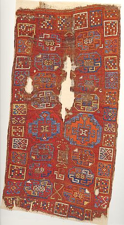
The light blue, that is very visible here, is a darker
gray-blue in the book and a much less attractive shade there in and of
itself.
This piece is of a more "tribal" sort and a certain freedom of
expression with regard to drawing is to be expected to some extent. The color
palette is apparently also typical.
But, for me, the color combinations
are not attractive. First, the colors used for the devices placed in the field
make them vague rather than impactful. The orange is close to the red ground
color and so doesn't contrast, but even the light blue, that does, doesn't seem
to have much contrast or accent effect.
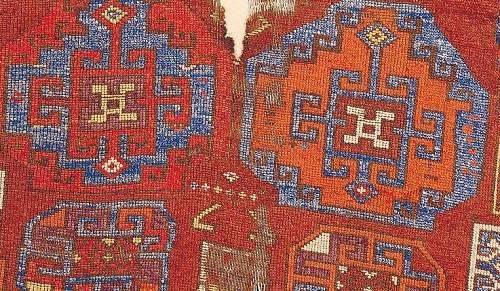
Another problem I can specify has
to do with the close uses of light blue and orange in some areas. This
combination is simply not attractive to me. And the orange seems not the best
for this red ground that has a blue-ish cast.
There are clear yellows and
purples in this palette, two shades that we are usually glad to find, but again
they seem not to have been used very skillfully. The yellow seems largely wasted
in its outlining chores.
Anyway, this is a piece in which it seems to me
that the use of color is less than successful.
Do you agree?
Do
you have an example or two of your own?
Regards,
R. John Howe
Posted by James Blanchard on 12-14-2005 03:25 PM:
Hi John,
I agree with you. I don't find that the colour palette has
been used to create a pleasing visual effect.
As an aside, if we were to
apply any of the "rules" of colour harmony, might we find that this rug has
"good harmony", even though we don't like it very much?
James.
Posted by Tim Adam on 12-14-2005 11:00 PM:
How do you like the following color scheme?
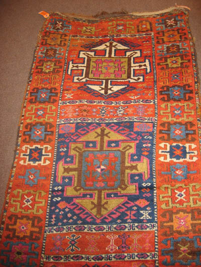
Even though it is a natural dye, I
have not been able to make friends with cochenille. I'd be interested if someone
had an example where this dye was used
'successfully.'
Regards,
Tim
Posted by R. John Howe on 12-15-2005 08:47 AM:
Hi Tim -
Here are a few possible more successful uses of
cochineal.
First, Eiland and Eiland point out that Kerman rugs are noted
not just for their sophisticated designs but for their wide color range and that
the dyes used to achieve the latter in part include cochineal. They offer one
example which they says has several cochineal shades in it.
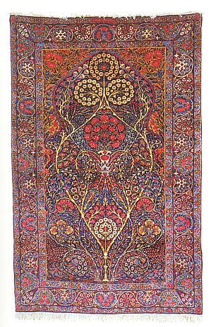
Central Asian rugs and textiles
often have cochineal dyed silk in them. Here is a suzani that was shown during a
recent TM rug morning that Steve Price did.
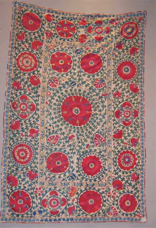
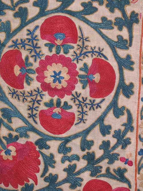
Notice in the close-up below
that there are two shades of red in the blossoms. At least the more blue-ish one
is likely cochineal.
Third, I have a Beshiri chuval fragement that has opulent silk
decoration.
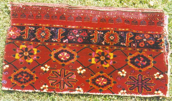
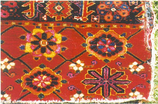
I don't know how you will rate its color usage, but it is a
very sumptious piece. Wonderful wool and lavish use of a cochineal-dyed pick
silk in its pile.
Regards,
R. John Howe
Posted by Tim Adam on 12-15-2005 05:59 PM:
Hello John,
Thanks for posting these images, especially the Persian
piece. Although the resolution is too small to really tell, I can imagine the
cochineal to work well in that piece. Would you have a higher resolution
scan?
Coming back to harmony, I find a warm red and a bluish red
(cochineal) most unharmonius. I have not seen a Turkmen piece which used pink
silk succesfully. At best, the use of pink silk looked impressive if used
extensively, or unobstrusive if used sparingly. But it never looks pleasing, in
my opinion.
In the Suzanni, the cochineal works quite well. It is
actually the warm red that doesn't fit in.
Regards,
Tim
Posted by R. John Howe on 12-16-2005 08:09 PM:
Hi Tim -
You said in part above:
"...Coming back to harmony, I
find a warm red and a bluish red (cochineal) most unharmonius. I have not seen a
Turkmen piece which used pink silk succesfully. At best, the use of pink silk
looked impressive if used extensively, or unobstrusive if used sparingly. But it
never looks pleasing, in my opinion..."
My thought:
Without
attempting to tamper at all with your dislike of particular color combinations,
let me at least give you another Turkmen example to examine in which
cochineal-dyed silk is used extensively.
Such a piece occurs as Plate 14
in the Mackie-Thompson catalog "Turkmen," published in 1980. The piece is a
large, rectangular Salor bridal camel trapping. It is 80.7 X 238.7 cm (31 3/4 X
94 in.) It is presented in two full-over-sized pages and is for that reason
difficult to scan. But here it is in two parts:
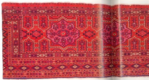
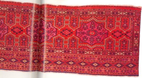
The cochineal-dyed silk is in
the center of each of the three medallions and when I had it once in my hands I
thought it the most luxurious Turkmen piece I had encountered.
Although
the color in this volume is often not accurate I have given you a close-up of
one medallion for more detailed inspection.
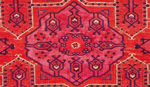
What do you think about the
color usage here? Is this still an unattractive brick red and pink silk usage or
is this an attractive use of cochineal silk in a Turkmen
piece?
Regards,
R. John Howe
Posted by Tim Adam on 12-16-2005 09:40 PM:
Hi John,
This is undoubtably a great piece, but I'd still maintain
that the red and the pink clash (are not harmonius). This is not meant to be a
statement about my own color preferences. Some color combinations are harmonius,
while others are not, in my opinion, and there is probably some scientific
explanation behind this, just like there is for music. And while our preferences
for color harmonies may change over time, color harmonies themselves are
static.
![]()
Four of the red hues of the Salor
trapping
What the Salor trapping shows is that color harmony is not
necessary for a piece to be outstanding. It depends very much on how it is used.
I have a Tekke main carpet, in which the purple-brown ground clashes with the
red of the guls. This creates an interesting tension between the two colors, and
makes the red seem to glow from within.
Color harmony is also just one of
the criteria by which to judge a rug. Drawing, craftsmanship, quality of wool,
dyes, etc. are other important aspects.
Best regards,
Tim
Posted by R. John Howe on 12-16-2005 10:50 PM:
Hi Tim -
This time you seem to go a little further. You say in
part:
"...I'd still maintain that the red and the pink clash (are not
harmonius). This is not meant to be a statement about my own color preferences.
Some color combinations are harmonius, while others are not, in my opinion, and
there is probably some scientific explanation behind this, just like there is
for music. And while our preferences for color harmonies may change over time,
color harmonies themselves are static..."
Me:
This seems
tantamount to claiming that not only is there such a thing as absolute color
harmony, but that you can identify it on sight. This seems to include the claim
that others who might have alternative experiences with particular sets of
colors are simply mistaken in their beliefs about what colors they see as
harmonizing.
Such a claim would seem to require evidence, else it would
need to be treated as a mere personal assertion, something we do encounter
frequently in the world of rugs. 
Regards,
R. John Howe
Posted by Tim Adam on 12-16-2005 11:41 PM:
Hi John,
From what I have read about color theory it seems to me that
one can think of color harmony as something absolute. However, I would not claim
to be able to indentify it in all cases. Sometimes it is pretty obvious if
colors clash. But the spectrum of colors is infinite. So, it can become
difficult to tell. No wonder then that there is disagreement among people about
what is harmonious and what isn't. Another reason why people might disagree on
color harmony is because sometimes it is difficult to disentangle color harmony
from color preference, but I see these two as very different
concepts.
Tim
Posted by Amir_Aharon on 12-17-2005 04:26 AM:
Hi John, Tim.......
It seems to me that in the suzani with the big
roundels and bottehs, the embroiderer tried her best to combine the worst
possible colors. We all agree that this isn't exactly a successful choice of
colors. But then, maybe, at that period (19th century) In the town of Karschi,
Uzbekistan, that woman believed the colors were pleasing.
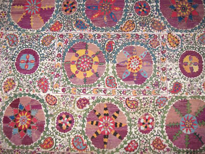
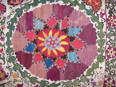
In a perverse way I am
beginning to enjoy the unconventional and crazy use of color in this suzani,
despite the obvious fact that the "color harmony" theory may not have been part
of the embroiderer's school syllabus.
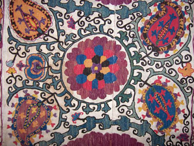
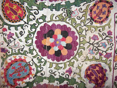
The second (lattice) Bokhara suzani
is probably much more successful in the use of colors. I deliberately picked up
some flowers to show how you can combine seemingly disharmonious colors
(wave-length wise) such as magenta, grey, olive, madder and out of the blue,
blue to produce an attractive flower.
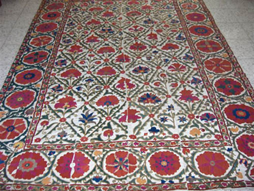
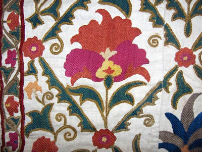
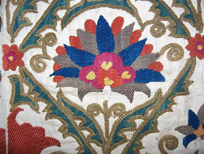
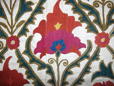
Tim... notice the
magenta (cochineal?) silk so delicately matching the rest of the colors. Please
correct me if you don't agree. This is MY opinion, anyway.
Amir
Aharon
Posted by R. John Howe on 12-17-2005 06:16 AM:
Hi Amir -
You say in part above:
"...It seems to me that in the
suzani with the big roundels and bottehs, the embroiderer tried her best to
combine the worst possible colors. We all agree that this isn't exactly a
successful choice of colors..."
Me:
I think you are referring to
this piece:

I hope I won't seem perverse if I admit that I picked this
piece as a possible candidate for having a possibly attractive use of cochineal
in it. More, while it's color palette is not nearly as wide as one nice piece
you offer,

(I like the other one too.)
I don't find its colors to
be "the worst possible choice."
And when it comes to the actual side by
side use of close colors (including the cochineal-dyed areas) I think I prefer
the usage in the one you don't like.
Here is the close-up of the suzani I
offered:

And here is the close-up of the piece you prefer:

To me, I think
the piece you don't like is more successful in its "harmonious" use of the
cochineal close to another red because the other red is closer to the blue-red
side of the spectrum and your (admittedly better piece overall) is lacking in
its color usage in this area precisely because it puts the cochineal shade next
to a real orange (precisely the sort of thing that Tim finds less than
harmonious. and I join him in this instance).
Interesting stuff our
varied experiences with color.
Regards,
R. John Howe
Posted by Filiberto Boncompagni on 12-17-2005 08:31 AM:
Yes, interesting.
Actually I like the two Suzanis. That reminds me
something I said in Vincent Keers’ mini-salon 6, “The natural colors itch”:
the criterion used by rugs collectors seems to change when we go to textiles
like Turkmen chyrpys or Uzbek Embroideries.
I’m going to re-elaborate my
point.
Some years ago John posted on Show and Tell a thread called
“Western and central Asian embroideries” on a Rug Morning presentation by Steve
at the Textile Museum.
The thread showed photos of Tajik, Uzbek and Caucasian
embroideries. The first Suzani here is the same shown at the time, I
think.
See again a few pieces:
An Uzbek bag
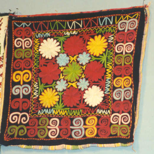
a Lakai piece
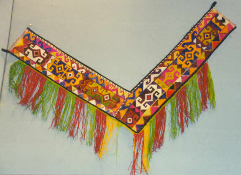
a Turkmen Koran cover
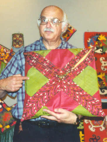
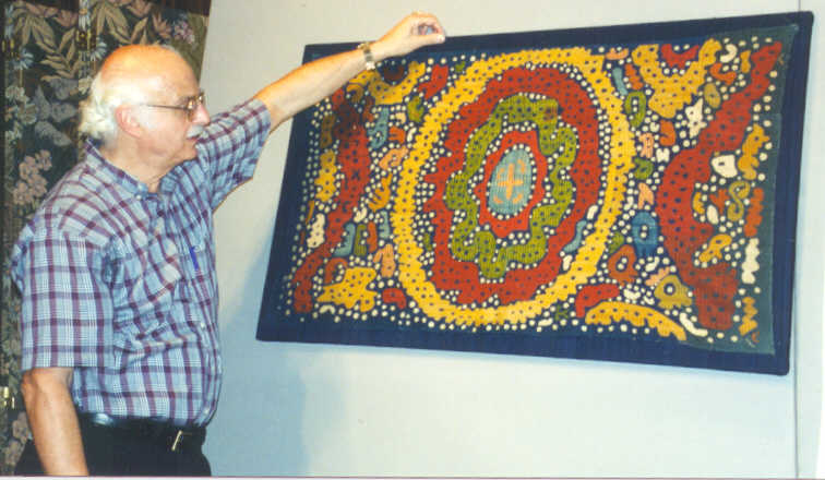
and a Kaitag
embroidery.
There were many more but these four are enough for my
needs.
I thought that these colors were harsh and dangerously close to
what we perceive as synthetic dyes but no mention was made about that and I
assumed they are all natural. I also assumed that natural dyes on silk can give
a different palette than on wool.
In the following postings on the Show and
Tell, nobody commented about the colors.
Now I ask you:
Do you like
these colors and their juxtaposition?
Would you TOLERATE them on a knotted
rug?
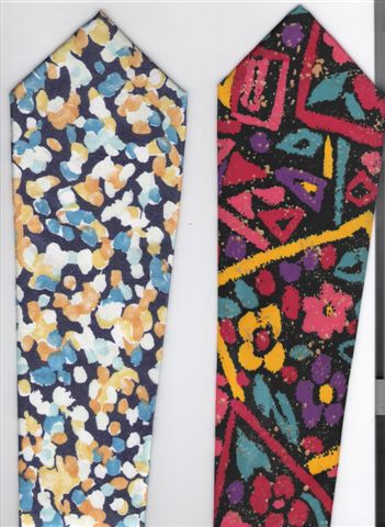
Would you wear a tie with the same colors and
motifs?
Regards,
Filiberto
P.S. On a second thought, Americans
are dispensed from last answer.
Posted by Amir Aharon on 12-17-2005 08:36 AM:
Adjacent colors in harmony
Hi John,
It's not that I "don't like" my suzani with the bottehs; if
so, I
would not have bought it, would I?
I only think she had an odd
way of choosing the palette. Perhaps it's because I'm not used to see these
colors often enough on
suzanis. Having said this, I totally agree with you
that there is
an appeal to suzani guls with adjacent complementary
colors.
I have seen that done (as in your suzani) many times,
specially
with different hues of red. When I first noticed this
combination
on my yellow silk ground Lakai (I think I posted it in some
other
thread once) I thought it was a BRILLIANT IDEA.
As for the
flowers of the lattice piece. despite your saying that
the colors are not so
harmonious (placed one by the other), I'm
still very pleased when I
look at the flowers (individually) as a whole. We wouldn't be enjoying this
discussion if we had to
agree on everything. 
__________________
Amir
Posted by Tim Adam on 12-17-2005 11:30 AM:
Hi Amir,
Your first Suzanni has an interesting array of colors,
indeed. Actually, the different purple shades, which work extremely well with
the yellow, look great. Too bad the weaver wasn't able to choose different
shades of blue and red, which I think don't fit well.
Your second Suzanni
is nice too, but I think John's piece is better, in terms of use of color and
drawing. I am surprised he sees it the other way around.
Filiberto: The
Kaitag embroidery is the most acceptable in terms of color, but I would not wear
a tie with any of those colors of the four pieces. Not really my cup of tea. The
Lakai piece is the worst. Someone must have been color blind. 
Best,
Tim
Posted by Steve Price on 12-17-2005 12:01 PM:
Hi Tim
The color rendition on those four embroideries is pretty awful.
I think the problem is that silk is so reflective that photographing it with
flash results in glare that washes out the colors. At least, I've never been
able to use flash to photograph them successfully.
The Lakai does have a
palette of synthetics, but isn't nearly as ugly as it looks on my
monitor.
I think all of this illustrates the extreme case of one of the
big difficulties of dealing with color via images viewed on monitors. With silk
floss, in addition to the usual problems of color accuracy, we have the problem
of glare if they are photographed by flash lighting.
Regards
Steve
Price
Posted by Amir_Aharon on 12-17-2005 03:28 PM:
Hi Filiberto,
My answers to your questions on Uzbek
embroideries:
Q. Do you like these colors and their
juxtaposition?
A. I don't fancy the choice of colors; they are too
flashy. I'm not sureif changing the position of the colors will do any good
either.
Q. Would you tolerate them on a knotted rug?
A. I
wouldn't. But it seems that a Kermani weaver from 1910 would:
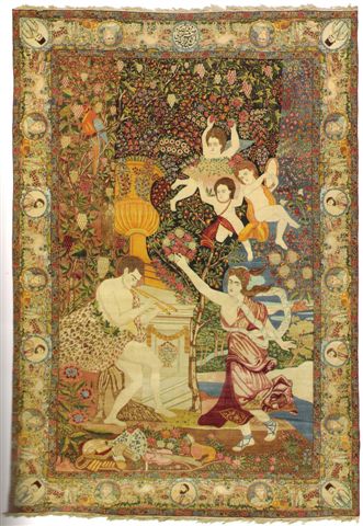
462X310 cm. Carpet, sold
at Christies NY Dec. 14, 2005 for the highest price among all the rest of the
lots (the runner up rug sold for only 1/5 of this Kerman carpet!!!) There was a
period in Iran at the end of the 19th century when it was fashionable to
commission European designed carpets ("FARANGI"). The drawing of this one has
been attributed to Raphael. I wonder what HE would have thought of the choice of
the colors in this carpet were he alive!?
Q. Would you wear a tie with
the same colors and motifs?
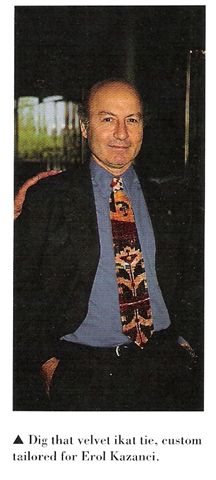
A. I woudn't. But here is someone who
could afford a VELVET IKAT tie from Hali issue 99 (Parting Shots-ACOR 4 Denver).
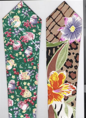
I
have also posted 4 ties belonging to my brother, the back of all
four has a
tag saying "MADE IN ITALY". So we will have to exempt the Italians not only the
Americans from the last question. 

Tim.....Thank you for expressing your appreciation for my two
suzanis. I believe that John actually said that the juxtaposed similar hues in
his suzani are more pleasing than those of my lattice flowers, and not
vice-versa. I agree with him. But it's not fair to compare my old stained suzani
with a pretty young one.
 (modern with natural dyes--correct me if I am wrong!)
Amir Aharon
Posted by Filiberto Boncompagni on 12-18-2005 01:57 AM:
Hi Steve,
quote:
The color rendition on those four embroideries is pretty awful
You are right. I searched the Net for other examples and I
found these, from a very professional website. All Lakai pieces, all said to be
19th century.
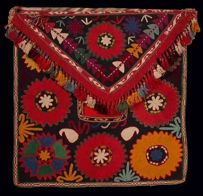
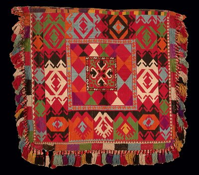
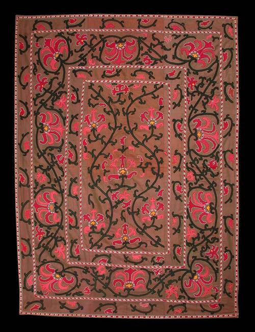
The rendition of these colors should be much better than in the
previous photos I posted.
It’s also quite obvious that these are highly
collectable Oriental textiles.
Personally, I find the colors pleasant in
their contest of Lakai embroideries but I wouldn’t definitely accept them on
a Caucasian rug.
So, does anybody agree with me on the point that our
taste on colors may vary in relation to the nature and provenance of
textiles?
These three pieces are for sale, so, please don’t comment
directly on them. They are presented here only for the sake of discussion on
colors in Oriental rugs.
Amir, I find the quality of colors in the
Kermani rug perfectly acceptable!
I don’t see the image with the four
ties “Made in Italy” and if you want to send it to me I will be glad to post it.
(I have to warn that if the ties have ugly colors, they were probably made for
the American market…  )
)
Regards,
Filiberto
Posted by Filiberto Boncompagni on 12-18-2005 02:59 AM:
Here are the photos of the Italian ties:


Ha-hum…
Definitely for
exportation… 


Thanks Amir,
Filiberto
Posted by Chris Countryman on 01-24-2006 09:14 PM:
Oh those wacky 60's
Folks,
It looks like many of you are channeling the spirit of Peter Maxx!
Those poor peasant weavers may have been stuck with some odd colors given the
dying technology of the day. But really, do you need to show off your affection
for the 60's pallet?
Thanks for the show.
Chris
Posted by Chuck Wagner on 01-25-2006 08:50 PM:
Hi John, et all,
I wouldn't be too hard on the Uzbeks and
their choice of colors (we'll conveniently ignore the fact that I collect their
stuff...).
After all, if you lived in a place that looked like
this:

Photo: Becca Bassingthwaighte
...you
might want to brighten the place up a bit yourself.
Regards,
Chuck
__________________
Chuck
Wagner
Posted by R. John Howe on 01-26-2006 06:12 AM:
Hi Chuck -
You are right.
An associated discouraging thought is
that there is some evidence that not nearly all Central Asians who might have
had weaving skills coiuld decorate their yurts/huts with the sorts of textiles
we collect.
Although many of the Uzbeks were urban folks, I suspect that
the phenomenon reported by some 19th century travelers who visited the Turkmen
might be true for Uzbeks as well. I've read more that one description of a visit
to a Turkmen yurt in which it was clear that the occupants did not display any
rugs or textiles other than the felts of the yurt.
This suggests that we
are likely collecting items owned and used primarily by more prosperous folks in
Central Asia.
I read somewhere else that many weavers of Caucasian rugs
could also not afford to own the rugs they wove.
Regards,
R. John
Howe
Posted by Chuck Wagner on 01-26-2006 09:39 PM:
Hi John,
Yes, I fear that if we actually knew more about Central Asian
life in the pre-1830ish period, we'd all be "disturbed" by the information.
Sometimes, ignorance really is bliss.
Given the long, long history
of intensive trade across that region, I have to believe that a meaningful
percentage of the older piled work that is collected today may well have been
made for the purpose of barter or sale rather than for personal use, and that
the pieces were frequently kept aside for special occasions by their
owners.
One need only observe the condition of the many late-1800s/early
1900s Tekke & Yomut pieces in the market today to see that pile weavings can
get pretty beat up. Clearly, there are some that have actually been on the floor
of some collectors house, but most show the kind of wear one would expect from
being lashed to flexible wood frames and ornery pack animals.
Felt is
still in heavy use by the nomadic folks, and it wears out relatively quickly
with regular use; there are plenty of photos showing people making new felt to
replace the ratty looking stuff on the yurt behind them. That is not a new
phenomenon, and it shows that an organized family can generate a very large
surface area of felt in far less time than that required to build a piled
weaving.
It's interesting that the designs found on the yurt felts are
quite similar (at least, they seem so to me) across ethnic boundaries. They are
probaby very archaic motifs. That is somewhat at odds with the theories
regarding tribes and designs on piled weavings. I'm not that well read on the
topic, but that might be an interesting conversation to have with a Central
Asian ethnographer.
Regards,
Chuck
__________________
Chuck
Wagner


 )
)