Hi Folks,
Steve's link to the earlier
treatment of low contrast coloring in Baluch rugs is very interesting. I
note that in one post, Tom Cole cited Ronnie Newman for the proposition
that often, the simplest and most mundane reasons account for what might
seem mysterious in rugs. I have often wondered whether the appearance of
low contrast coloring in Baluch rugs was usually a conscious aesthetic
decision; or merely a reflection of the fact that they only had so many
colors to work with, and made the best of them. The following piece is
exemplary of the issue.


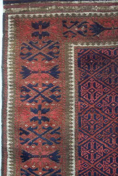
The two very low contrast reds
are apparent from the repeating lozenge design in the field. This is a
very familiar design in the Baluch group repertoire, and it often appears
utilizing two shades of red, presumably madder. Sometimes, the effect is
similar to the image I've posted, and sometimes the contrast is much
sharper. For example, a similar looking Baluch appears in a black and
white illustration in the Hajji Baba Club's Christmas Exhibition catalog
of 1973 or 1974, in which the effect is described as "sunlight breaking
through clouds." On the other hand, I have a khorjin employing the same
pattern, and the madder reds are quite distinctly dark and
light.
The aesthetic choice to mimic sunlight breaking through
clouds is appealing. However, I wonder if it wasn't just a case of the
weavers of this rug I've posted carrying out two madder dyeing projects in
anticipation of the upcoming weaving season, and having the results come
out very close. By all accounts, they lived their lives in very stark and
harsh conditions, and were generally poor, and perhaps they couldn't
afford to scrap the results and try again.
I have had a fondness
for Baluch weaving for the more than forty years I've been a ruggie, and
I've always had a notion of the Baluch as poor, hard-pressed, and living
under very difficult conditions. The fact that they could produce spare
but often very beautiful textiles under those conditions is part of what
has attracted me to their work. The triumph of the underdog. That may be
somewhat idealistic and unrealistic, but that's the way it is in
rugs.
A related issue involved with the use of low contrast yarns
is the technical challenge of successfully drawing and weaving intricate
patterns. The detail shot of my piece illustrates a fairly complicated and
intricate border treatment. Essentially, it consists of the indigo and two
reds as the primary components of the design, with background and accent
colors of brown and white. I would imagine the challenge of keeping the
reds straight in the execution of this border to be
difficult.
Notwithstanding my comments above, I find the various
comments about the intentional use of low contrast colors for aesthetic
reasons, as exemplified in early Turkoman rugs and earlier Mamluk rugs, to
be interesting and compelling.
Rich
Larkin