Which ones are the shiniest?
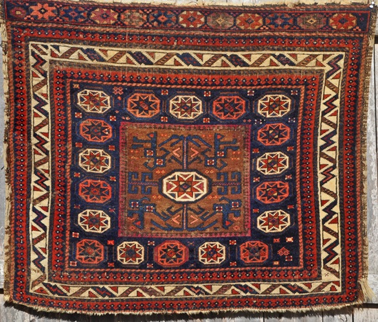
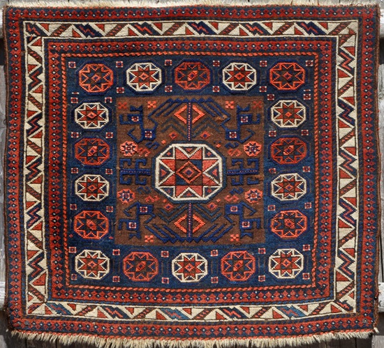
Hi all, In the mini-salon essay, I expressed the hope that the denizens of this site would venture their opinions about the aesthetic appeal of the range of 'Baluch' star-in-octagon bags. Some evaluative comments have been made along the way, but it's been mostly 'show' and not so much 'tell'. :cry: Looking back into the Turkotek archives, there seems to have been a bygone era when someone would post pictures of a number of weavings in a particular genre and invite others to make comparative evaluations on the pieces, explaining their reactions a bit along the way. In the spirit of that 'Golden Age', I offer eight bag faces that are iterations of one of the classic drawings on 'Baluch' star-in-octagon' bags. I think that all of them are, at the very least, quite good. But, which are the better ones? Which the best? C'mon, have a go at it. :cheers: 1 2 3 4 5 6 7 8 Joel |
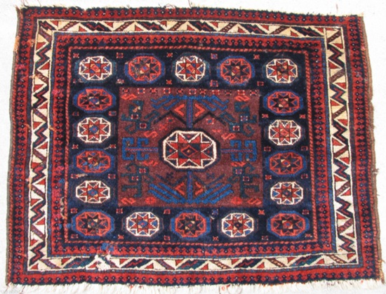
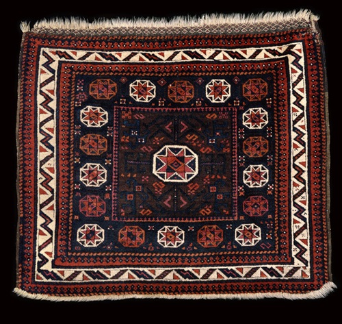
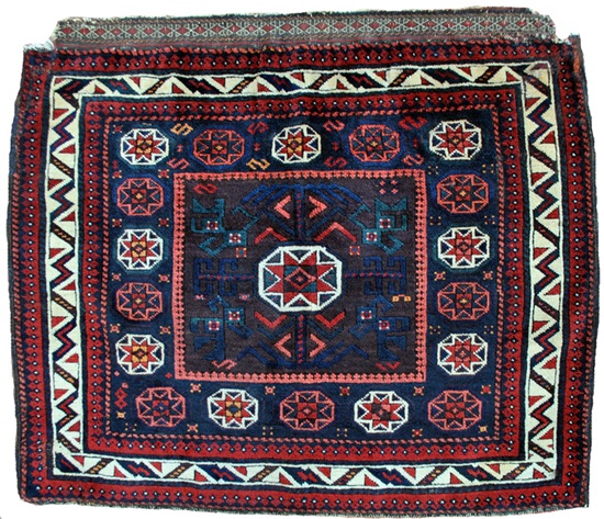
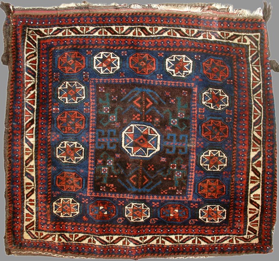
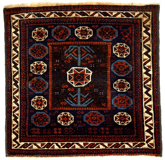
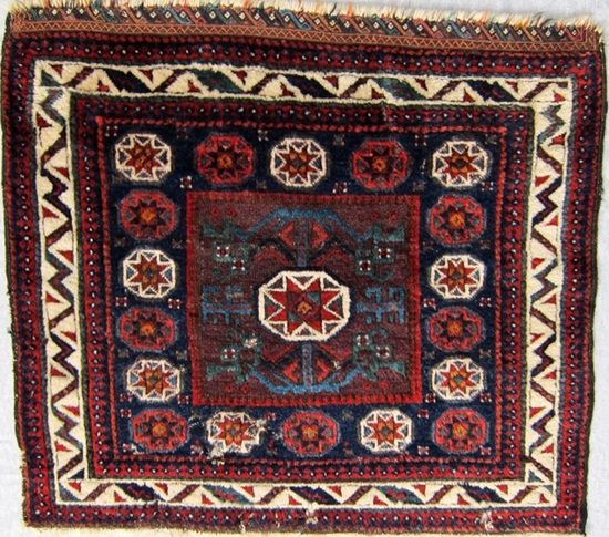
Joel I'm attracted by the Belouch group use of adjacent colors with little contrast between them, "hiding" some motifs. Numbers 2 and 6 reach out to me more than the others. Steve Price |
Hi Joel, Well chosen collection of very similar, great quality bags. I would welcome any of them with open arms, just so you know. For me the one that stands out is #8. Great balance in the elements, harmonious colours, and a lovely embossed effect in the inner field. That corrosion helps separate the inner and the outer field, as there is no minor border to do that. I also usually like a little touch of irregularity, here the light blue in the lower part of the lightning border. A close second would be #4, again balance and harmony, here with more varied colour. I had trouble deciding between 4 and 6, but then I saw I did not have to: they are the same rug :laughing_2:. I would go for its #4 incarnation though. The double rug once more shows up the dangers of choosing rugs on the basis of pictures. Feeling and seeing the quality of the wool might make us change our minds too. But a fun and useful exercise it is. :dancer: Dinie |
Good eye, Dinie… Joel, is that a mistake or an attempt to trick your readers? :felix: Anyway, there’s the rub: photos have their limits. Having to choose between the best pictured bag face (as opposed to the real ones), I would go for photo # 4. I like the use of the two hues of blue. Regards, Filiberto |
Oh my!
Quote:
Quote:
To answer Filiberto's question, it was a slip of the...brain. I've edited the initial post and inserted the intended #6. Unfortunately, this commits Steve in post #2 to a choice that he didn't actually make. Sorry, Steve. :rainy_day: Quote:
Joel |
Overkill?
Hi Joel et al, perhaps it's Baluch bag face overkill that's holding people back - I posted four bags of mine a mere month ago and got not one comment ... so I'm not digging out any more right now. Frank ... quietly crying in his stuffed bag pillow ... |
No Clear Winner
There is a problem rating Baluch material because pictures do not
provide tactile aspects nor the ability to discern fine differences of the
pieces and the colors can often be too dark to appreciate. These are
categories which I would normally use in comparing pieces in hand. #7 is more colorful, brighter, and has a nice top end finish. The two light blue and green colors add some flavor and the lighter ground color allows a greater appreciation of the overall design. On the other hand, the wool looks heavier, the weave may be coarser and the wear detracts from the overall impression. These issues lead one back to a Colonel Boucher approach; condition, crispness of weave, adherence to the design. This would favor #8, where the design is clear, the lines straight and there are no condition problems. I like #6, but the rectangular central box is less appealing than the more square version to me. Patrick Weiler |
If the magic wand let me acquire one piece, I would choose #7.
The reasons: brightness of white lightning border, vivid colors in the white star-in-octagons , the remnant flatweave at the top, and- #1 reason- to my eye, the impression of three concentric layers of 'squares’ created by placing the central square (aubergine?) within the blue ground 'square’ which contains the row of star-in-octagons, which is then surrounded by the lightning border. Taken together, I think this color combination creates a pleasing sense of depth. (I think I am less attracted to central squares which are brown or which do not show much contrast with the surrounding borders/fields.) I agree with Pat that there are probably wool and condition issues with 7th. If I were asked to pick the one piece that I thought would be most likely to hold its value over time, I would choose #8, for the reasons Pat-THE SEATTLE KID- already cited. |
Sorting Bag Faces...
Hi Folks I remember some time ago in the Souk in Marrakech, I was presented with a two-foot high stack of traditional Atlas weft face bag faces, and asked as to how many I wanted to buy. I told them I would take a look and flipped through the stack quickly, picking out the few that seemed to have some age or better quality(i.e. finer drawing and more detailed in general, better colors)and set them aside. A second stack was proffered, and ditto again. Curious as to how far my money would go, I asked how much per bag, and was told $50. At the time the dollar/durham exchange rate neared 1 to 10, so I would have been paying the equivalent of $500 per bag face in Durhams. Besides my wife was requesting I move along, so I passed on the transaction. A mistake I still regret. True, you can buy a Moroccan flatweave bag face for $50 here in the states, but old/quality stuff is of an ever dwindling supply, and it would be a good thing to have these pieces in my collection now. Let's assume these Baluch bag faces seen below were presented to you in a pile, and you were invited to flip through and set aside the best bag faces for yourself. This process of deciding which is "better", or more accurately which one better suits one's taste, would be greatly simplified, as variances in texture and color would be readily apparent, given the direct visual and tactile input which such an examination affords. In the end we would be left with two stack, a stack of the most desirable and a stack of the less so. But would they be? I suspect here in lies the dilemma faced by us Baluch collectors, namely that we don't know a lot about what we are dealing with in regard to baluch rugs in general, let alone among the specifics. Have we at all gotten past the traditional dichotomy, which posits a Baluch/Tiemuri assimilation? This is what I see when viewing the bag gaces. #2, #4, and #6 would be my choices, assumption taken from photos in regard to texture. These three weavings, at least for myself, seem more to fall within the Tiemuri "school" if you will than the others, which not surprisingly exhibit a more Baluch orientation. For myself, condition is a big thing in baluch weaving, not that it is reflected in my collection. But I believe that condition is an important factor. It seems that there is so little in really good condition. It is a good thing to see remnants of flatweave on a baluch of age, it seems, and these flatweaves can be intricate and delightful in themselves. Yes, you have a great assembly of images her in this salon, but I suspect that the reason why it has been so quiet on this board more a reflection of the status of our knowledge in regard to Baluch rugs in general. Dave |
Quote:
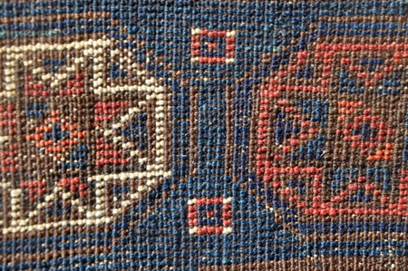
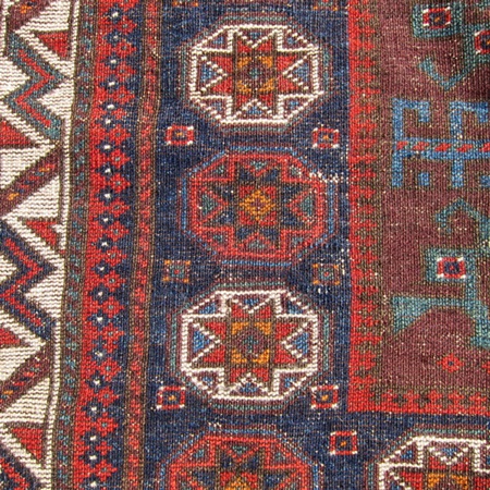
What about those three bags (#2, #4 and #6) do you see as more suggesting 'Timuri'? BTW - for more details on #2 and #6, both come from Col. Boucher's collection and are Plates 33 and 35 respectively in Baluchi Woven Treasures. Ike, Patrick and Dinie - Since you cite #7 and #8 as possibilities, here are a few more pictures that can help a little in judging the weave. The back of #7: The dealer who sold this described it having "amazing wool quality" and "long silky pile". As far as we know, its new owner was satisfied with the description :jester: A detail and the back of #8: Quote:
But couldn't we just get a quick look at the pillow? :laughing_2: Joel |
Now that's better.
Dave, Maybe a different way of looking at the question is which would you choose after seeing each of the pictures on ebay, but only the 8 photos, not the close ups? Perhaps your rug fund only has enough for one of them. :money: I hate it when that happens. :( Number 8 looked, from the small picture, too rote, boring and dull. Now that I see the closer pictures of the front and back, I am trading in BOTH number 6 AND 7 for number 8. The details show delicate and subtly different light and dark blues. The milk chocolate, lightly oxidized brown field is succulently scrumptious. And the delicate orange/red is a pleasing contrast to the brick red. None of these features were apparent from the small picture. And I get some money back! :thumbsup: Patrick Weiler, THE elderly SEATTLE KID |
Hi Joel I guess what I mean is that the colors in #2,#4 and #6 seem to tend more at blue, and the remainder more at red. But of these colors and drawing shown in the back of #7? Hard to tell from photos, but I would suspect the weave to be a little finer and the wool to be of better quality in #'s 2,4,and 6. My personal favorite is #2. The drawing is crisp with an apparent delight in detail,for instance as seen in the variants of the lightning border. Colors more limited but much can be achieved by contrast. Remnant of an interesting flat weave at the top. Borders and elements are well balanced in proportion and placement, which results in a mature and sophisticated composition. I would think that #6 has the best quality wool, but once again judging from a photograph... Dave |