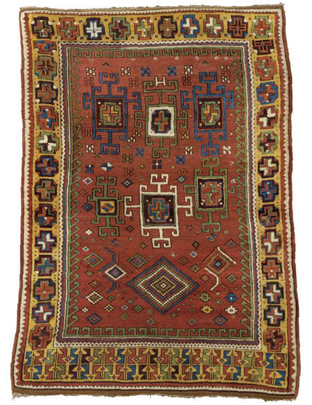
Posted by Tim Adam on 03-30-2006 08:54 PM:
Aksaray and Bergama
Hello all,
Here are two more rugs from the exhibition. The first is attributed to the Aksaray
region and from the 18th century. The second is a well-known design from Bergama,
and dated ca. 1875. Both images are from Cloudband.
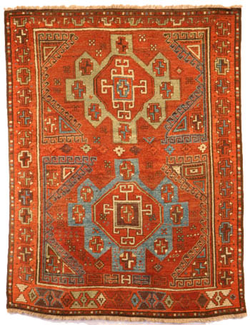
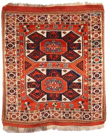
In terms of colors, the Aksaray is a little less orange (more brownish) in reality.
Otherwise, the colors are quite accurate.
In my opinion the Aksaray was one of the best pieces in the exhibition. It has
good colors, and the overall composition is well-balanced. It’s a real joy to
look at it. The Bergama didn't impress me. The busy, small scale border didn't
complement the bold center motives well, and some colors in the minor border
were actually quite ugly, e.g., a bright, almost fluorescent yellow.
Tim
Posted by R. John Howe on 03-31-2006 07:44 AM:
Hi Tim -
I also liked this Aksaray piece. It has a nice meditative quality about it that
would be soothing to look at at the end of a long day.
Now if we decided to pick on it a bit, we might notice that this weaver did
not "plan ahead" in two senses. First she changed her main border once she turned
the corner at the bottom and she ran out of warp at the top end and so couldn't
complete the top border in a full-faced way.
Do you think she made a good decision moving away from the border on the bottom
of this piece to the one she eventually adopted for the rest of it? I'm not
sure. The bottom border has more crispness and graphic punch, but might have
competed somewhat with the field. The rather indefinite character of the border
she moved to (especially its colors) seems to me to work better with the field
by allowing the medallions to thrust forward more prominently.
Regards,
R. John Howe
Posted by Tim Adam on 03-31-2006 01:19 PM:
Hi John,
There are ‘mistakes’ that make a rug more interesting, whether intentional or
not doesn’t really matter, and mistakes that make it worse. The fact that the
Aksaray has three different borders enhances its character in my opinion. Which
one of those borders is ‘better’? Difficult to say. I decided to do a little
reknotting. Here is the result.
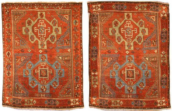
Which makes a better impression on you?
Once you tinker with an original, it’s hard to come up with an improvement.
But this time may be different. The ‘new’ border is darker than the field, which
gives the rug more depth. Graphically, the new border also provides a more interesting
contrast. The main axes in the field are vertical and horizontal, while in the
‘new’ border the main axes are diagonal. The old border is also vertical and
horizontal, and now looks a little dull in comparison.
Tim
Posted by R. John Howe on 03-31-2006 08:20 PM:
Hi Tim -
Nice demonstration.
Yes, I tried to indicate that I thought that the borders she ultimately used
were more effective than the more graphic bottom border all round would likely
be.
Seems to me you demonstrate that.
I'm glad you got to see this exhibition in the wool.
You and Wendel are making me think I should have been more aggressive. I was
allowed to take photos only with Dennis' explicit permission and they sent me
the gallery labels, but you guys had your hands all over this material and Wendel
even took a photo of a back!!!
Regards,
R. John Howe
Posted by Tim Adam on 04-01-2006 08:44 AM:
Hi John,
I was actually trying to demonstrate the opposite, that the more graphic bottom
border all round would likely be more effective.
I wish I could have had my hands all over the exhibited rugs. I touched the
yastic only briefly when the guard looked the other way.  The sensation was phenomenal. It gives
you a new understanding of what soft wool feels like.
Tim
Posted by R. John Howe on 04-01-2006 09:07 PM:
Hi Tim -
Well then, we disagree.
I think the fact that the bottom border has more explicitness and more graphic
punch also works to make it compete with the nice field medallions which I rather
enjoy as the most noticeable feature of this piece. A crisper more noticeable
main border makes that less likely for me.
Regards,
R. John Howe
Posted by Chuck Wagner on 04-01-2006 10:03 PM:
What he said..
Hi Tim,
I'm with John on this one. To my eyes, the border elements from the bottom border
are too big to be appropriate for this rug. They are roughly the same size as
the "spokes" on the medallions in the center of the rug. When distributed around
the entire perimeter of the piece, they overwhelm the medallions. This effect
is acentuated by the unused open space between the large border elements, and
the eye is drawn from the middle to the edges of the rug. It pulls my left eye
to the left, my right eye to the right, and my brain starts to hurt.
Regards,
Chuck
__________________
Chuck Wagner
Posted by Tim Adam on 04-01-2006 11:31 PM:
Hi John and Chuck,
I agree with you that the bottom border is a bit too dark and therefore competes
too much with the main field. Notice, however, that this is only the case on
the sides and the top, where I replaced the original border. The bottom segment,
which is original, is harmoneous with the field. I think it is this relationship
that one needs to imagine.
Anyway, it's also largely just a matter of taste. One thing I am wondering about
is whether in rugs like these the weaver indeed changed her mind? Rugs with
two, sometimes even three, borders are not that uncommon. I recently even saw
three different border designs a Turkmen carpet, and it looked quite planned.
Any thoughts?
Tim
Posted by R. John Howe on 04-02-2006 06:19 AM:
Tim -
Yes, borders get changed often in pieces. There seem to be very frequent changes
in about the first third of a piece sometimes including the width of the border
and even of the nature of the field.
I don't think we can tell why this happens. It often looks experimental, but
who can tell.
It does seem to me that often weavers look at changes like this differently
than we do.
Some say that weavers are more reluctant to change borders than they are to
change field designs (one is often advised to treat minor borders, especially,
seriously in attribution decisions) but here is what seems like a counter example.
Maybe others will have notions.
We are here in the slippery world of trying to estimate weaver intentions. I
doubt that most of us are very good at this but folks like Marla Mallett (who
is herself a weaver) seem often to be able to detect a great deal of what went
on for a weaver from looking at a piece.
Regards,
R. John Howe
Posted by Tim Adam on 04-05-2006 10:31 PM:
Hello all,
Here is another rug from the Aksaray series.

Regarding the borders, looks like they are planned rather than accidental.
Tim


 The sensation was phenomenal. It gives
you a new understanding of what soft wool feels like.