Posted by Filiberto
Boncompagni on 05-23-2005 12:36 PM:
Orange
Dear All,
Vincent wrote in the current Salon. Maybe the reason that we do not
like orange in our rugs is because this orange color is difficult to
get with natural (not pure)
ingredients and easy to produce synthetically.
I don’t know if he’s right on the “reason”… But I also don’t like
orange in my rugs.
Unfortunately, budget exigencies make me rather flexible on the matter.

Perhaps we’ll come to that later.
For the moment let’s consider the Central Anatolian Yastik that John
offers to our comments in the Show and Tell section. Being a practical
person, it seems to me an excellent way to discuss practically of an
otherwise abstract subject. I copy here one of John’s photos:
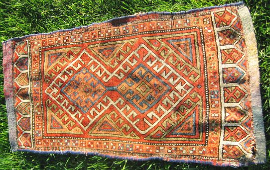
John seems to have doubts on his purchase, especially regarding its
colors. I agree:
the drawing is OK, but the colors are rather weak. I dislike also the
light orange.
John thinks that the dyes in his yastik are natural.
What do you think?
What is your basic standard for natural color?
And what do you think of the orange dyes in John’s yastik?
Regards,
Filiberto (alias Philibert d’ Orange  )
)
Posted by Steve
Price on 05-23-2005 01:10 PM:
Hi Filiberto
Orange is a terrific example. Ruggies find it attractive in Qashqa'i
textiles. The Qashqa'i used natural dyes to make orange, so it is in a
traditional context and, therefore, acceptable.
The horror with which many ruggies view orange has to do with the early
synthetic orange dye(s), which are vivid and stubbornly resist the
"mellowing" that the surrounding colors take on with time.
Regards,
Steve PRice
Posted by Vincent
Keers on 05-23-2005 05:48 PM:
Hi,
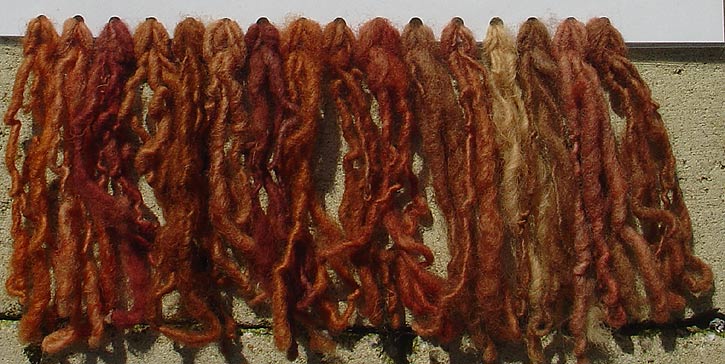
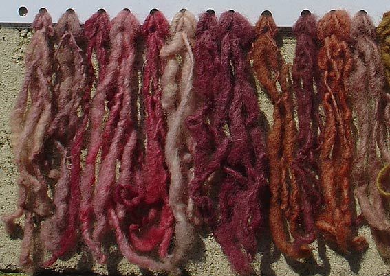
All natural "oranges":


The "orange" to the right in the last image is cochineal with madder
overdye.
First image is all madder.
I think Johns rug orange can be natural because I see the reddish
background color shining through in the field. A synthetic orange is
pure orange. No yellow or reddish background color.
Best regards,
Vincet
Posted by Vincent
Keers on 05-23-2005 09:17 PM:
Hi again,
This is what I meant:
I resized 1 cm2 x 60. So a few k's became ± 15mbites.

I played with 2 images from "orange colors".
One is from a madder and one is from a Russian Kazak (Hammer and sickle
knotted in) rug from the 60'ties.
Obvious the orange/orange is synthetic and Russian production.
The reddish/orange is madder.
One problem: I think most browsers use 256 colors, so if you this at
home the result shows better quality on your screen.
Best regards,
Vincent
Posted by Chuck
Wagner on 05-24-2005 10:22 AM:
A matter of
balance
Hi all,
First, a quick comment about your upscaling technique, Vincent. It is
an interesting approach, but you have to make sure the sensing and
lighting technology is consistent. Camera or scanner, and illuminating
light conditions, must be the same. Also, use the right tools: both
Filiberto and I have noted, somewhat bitterly, that our Nikon digital
cameras have excessive sensitivity in the red bands and as a result our
reds always look too hot.
Now, on to ORANGE. Or, and more to the point, ORANGE.
And to really make the point, ORANGE
.
Note that the ORANGE in black is by far the easiest to read (i.e.
detect) of the three ORANGEs, because the contrast between black and
gray is much higher that between orange and gray. Only when the surface
area of the orange ORANGE is increased do we see it more clearly.
Thus, when the surface area of the space covered by orange is
relatively small and the reflectivity of the surrounding areas is
roughly the same, the orange does not leap out at us. It is in
balance with its surroundings.
Here are textile equivalents, showing that (essentially, the same)
orange can take on a vastly different character depending on how it is
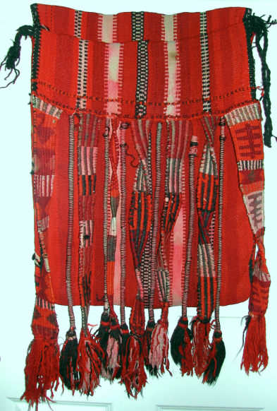
used. First, a Saudi camel bag, with ivory, dark brown, red and orange.
The red is very close to the orange, spectrally. This is a transparent,
not opaque, dye. So Vincent should like it. Regardless, this is a real in-your-face
orange bag:

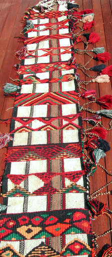
Next, a panel used along the leading edge of a tent, also from Saudi
Arabia. While containing the same bright orange, the presence of other
colors and large areas of ivory wool put it in much better balance.

Here, in this Qala-i-Nau kilim, the orange is done in small areas and
placed widely:

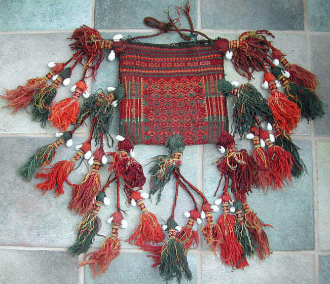
And in this little Baluchi chanteh, although there is actually quite a
bit of orange, it is generally done in small areas that are surrounded
by green or red, As a result, the whole thing is nicely balanced:

So Filiberto, even without the budget exigincies, there are plenty of
reasons not to shy away from orange, which is clearly a "weapon of
choice" in the nomadic world. It's really more a matter of balance.
Regards,
Chuck
__________________
Chuck Wagner
Posted by Filiberto
Boncompagni on 05-24-2005 03:00 PM:
Hi Chuck,
As I said, I’m rather flexible.
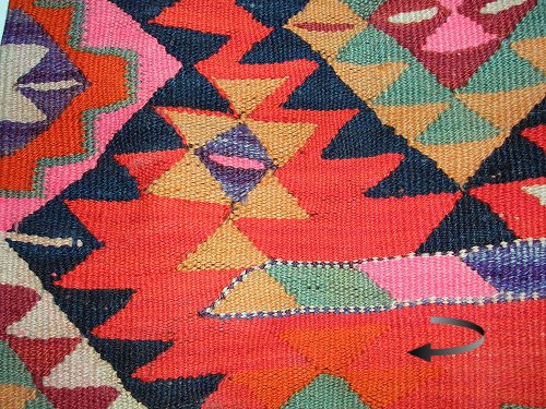
Detail of my Iraqi-Kurdish kilim:

The brick red of the field is almost orange. That didn’t prevent the
weaver from using orange on it, as we can see at the bottom of the
photo.
The kilim is quite recent and so the dyes should be synthetic. The
indigo, synthetic or not, looks quite OK.
Nice chanteh, by the way.
Regards,
Filiberto
Posted by Vincent
Keers on 05-24-2005 10:57 PM:
Hi,
I love them all.
All happy and airy.
Yes Chuck, your right.
Everything needs to be done under perfect conditions. And I'm not at
all convinced that it might work. But........as I'm doing this during
the very short nights, I had hopes I could seduce? someone into it.
Best regards,
Vincent
Posted by Chuck
Wagner on 06-04-2005 07:23 PM:
Hi Vincent wa
Filiberto,
We don't seem to have a lot of compaions here in the orange thread, do
we ? Strange... 
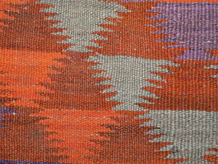
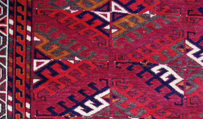
So, here's a closeup of a Hazara kilim that is probably about 35 years
old, with mostly synthetic dyes (I think the deeper red-brown is
madder):

Why show it ? Because all the colors, even the brilliant transparent
orange, have an abrash of sorts, partly due to the variable dye job and
partly due to the use of mixed light brown and dark gray Karakul wool.
So I guess the small batch - rustic preparation rules for vegetable
dyes apply to synthetics as well.
Regards,
Chuck
__________________
Chuck Wagner
Posted by James
Blanchard on 06-05-2005 01:22 PM:
Hi all,
We (my wife and I) also tend to shy away from orange in rugs. But there
are always exceptions.
Here is one of them. It is a not-old Yomut rug, which is clearly in the
"decorative", not "collector" category (goes on the floor, not the
wall). I would guess that most if not all the colours are synthetic,
though I am not a good one to judge.

Still, we like the orange in this rug, perhaps because of the way it is
blended and contrasted with the other colours. Also, the wool is
lustrous (not flat), so even though the orange is quite warm, it
doesn't look harsh. The orange in the minor border and the dyrnak guls
is the same, though it looks different because of the surrounding
colours.
The Yomuts seemed to like orange, and developed a knack for using it.
Cheers,
James.
Posted by Lloyd
Kannenberg on 06-06-2005 11:51 AM:
Hello Filiberto and
all -
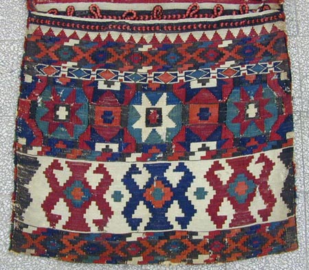
Here is one face of a Zakatala bag with a nice juicy orange (I think):

The other face is similar, the back shows the usual narrow colored
stripes.
Hope I'm not the only one who thinks orange works in this case!
Lloyd Kannenberg
Posted by
Valerie_Justin on 06-06-2005 08:21 PM:
nice bag. nice
colors
Re: the orange in the Lloyd Kennenberg Zakatala bag - I think anyone
picking on those orange details in the bottom figures is foolish. The
color intensity, the design and the use of white is beautiful. I would
call the reds - dark brick red, lighter brick red and call the lightest
one orange or whatever..it doesn't matter.
Valerie Justin
Posted by Chuck
Wagner on 06-09-2005 12:14 PM:
Hi all,
As I mentioned before, the context in which a bright color is used has
a great deal to do with whether we percieve it as ghastly or
interesting. So far, we've been looking at the "macro" view: how the
color fits with (or ruins) the whole piece. Partly because I'm so
nearsighted that I have two microscopes for eyes, and partly because
it's where the interesting stuff really is, I really enjoy looking at
the small details of a weaving. Steve has often mentioned the term
"micro-abrash"; up close is where you see it.
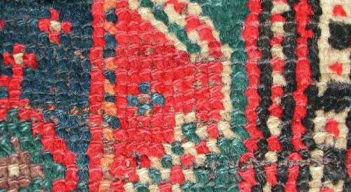
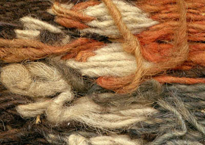
So, let's take a look at how some orange fibers look, up close.
First, a turn of the century Bahktiari runner (Filiberto used this
image in another thread). Note the orange nodes along the vertical line
(and, notice the difference between taking a flash picture and an
ambient-light picture. The flash (and the Nikon Corporation) have
really overstated the colors) :

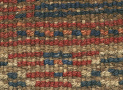
Now, a direct scan of the back. I'm not convinced that this is the same
bright orange seen in the other pieces, or that this is a synthetic
color :

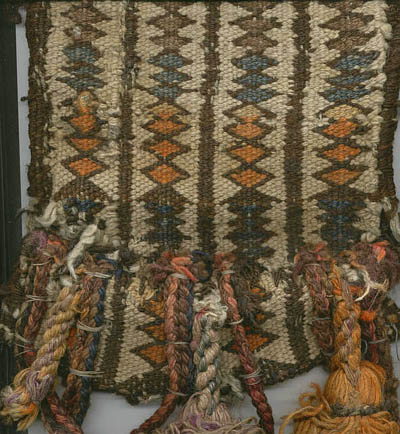
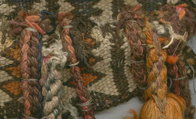
Next, we'll look at direct scans of the end of an old Baluchi camel
trapping, a strap about three feet long and eight inches wide.

Definitely done with mix of dyes, mostly synthetic. And yet, to my less
jaded eyes, the combination of fading, weathering, and abrasion have
left a softened rustic look that is actually quite interesting.


Regards,
Chuck Wagner
__________________
Chuck Wagner
Posted by R. John
Howe on 06-09-2005 09:12 PM:
Dear folks -
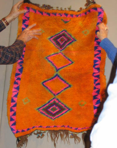
Did someone ask for an "orange?'

Of course, it needs a good asssociated pink to bring out its true
radiance.
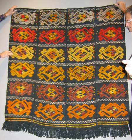
This piece was shown at The Textile Museum one Saturday morning and the
place did not burn down.
Regards,
R. John Howe
Posted by Chuck
Wagner on 06-09-2005 10:49 PM:
Yowzers
Hi John,
Well, that should certainly keep the demons out of the camp...
Now, where's that orange sample from your collection ?
Regards,
Chuck
__________________
Chuck Wagner
Posted by R. John
Howe on 06-10-2005 11:07 AM:
Hi Chuck -
Well, as someone who collects predominantly Turkmen things, I'm pretty
exposed to having objectionable oranges around.
But it seems likely that you have most specific reference to my nice
Siirt horse cover in mixed technique.

You can actually take your choice between an orange and three shades of
yellow-gold.
My wife hates this piece and I quite like it.
At the end of this session, I said to Wendel that my horse cover has
"unusual colors." He said "Yes." 
Regards,
R. John Howe
Posted by Vincent
Keers on 06-10-2005 02:47 PM:
Oi John,
It's for the horse!
Not the wife.
I like the orange, orange, orange, orange, orange, orange, orange,
orange.......orange thing.
Best regards,
Vincent
Posted by Steve
Price on 06-10-2005 03:00 PM:
Hi John
How does it look if you remove the batteries?

Regards
Steve Price
Posted by R. John
Howe on 06-10-2005 04:16 PM:
Vincent -
I'm not too quick, but I got that one. My wife doesn't like looking at
it, and the thought of her wearing it has not been raised in polite
company here.
Steve -
Batteries??? No one said anything about batteries.
You mean it could be brighter?
I need to look around.
Best,
John


 )
)