Posted by Richard Farber on 05-22-2005 07:19 PM:
how the eye sees color
dear all
i remember vaguely from anatomy either in high school or at
the university a million years ago that the eye "sees' color differently that
the three primary color camera . . . .
perhaps somebody out there could
report on this
best
r
Posted by Steve Price on 05-22-2005 08:01 PM:
Hi Richard
I believe that current thinking is that there are three
kinds of cones in the retina, each most sensitive to a different color
(wavelength of light). There was a brief period when a hypothesis was floated
that there were only two, but as far as I know this has been abandoned.
Regards
Steve Price
Posted by R. John Howe on 05-23-2005 09:19 AM:
Dear folks -
What is being discussed under this rubric seems to focus
primarily on how the eye operates as it sees colors.
There is a related
aspect that might be seen as "why" colors are experienced as they are but
without much accent on the mechanics or physics of the eye. This latter aspect
has to do with the frequent claim that dyes made with synthetic dyes tend to
harmonize better and that jarring discordant (wrong word, wrong arena, but you
know what I mean) effects do not seem to occur much in pieces made with
them.
But one of the tests we apply as we try to identify natural dyes
visually is whether such harmony is achieved or whether some colors "jump out"
at us. References to "hot" colors seem of this sort.
In a conversation
here sometime back I quoted an article (perhaps something written by Harald
Bohmer himself) in which the author said that such color harmony does occur in
naturally dyed colors and that color "clashing" is rare (although look at some
of the color usage in more recent DOBAG production which I often find does clash
for me).
More, the reason given for the likely harmony in synthetic
dyes, overlaps with the references to "impurities" in other thread in this
salon. The impurities of particular interest in this article were those of the
colors themselves. It was claimed that the reason that colors produced with
natural dyes tend not to clash, is that they all contain shades of each other
and especially of black. That one reason why some synthetic colors conflict is
that they are too "pure" and do not contain aspects of one another. I don't know
if this is true, but it is interesting.
This position drew opposition in
this prior conversation with Yon Bard, a person who thinks carefully, checking
in to suggest that there in fact may not be such a thing as "color harmony," or
at least it seemed unlikely that we could demonstrate with objective data what
it is we are pointing at with this expression.
Nevertheless, this claim
and explanation retained some appeal for me.
Regards,
R. John
Howe
Posted by Chuck Wagner on 05-24-2005 09:52 AM:
The visual approach
Hi all,
There are several online resources available that cover the
physiology of the eye, and in particular, sensing color. Of those I reviewed,
this is my personal favorite:
http://webvision.med.utah.edu/
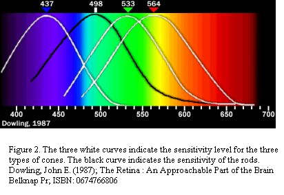
A good visual summary
of the average human eye response to color is shown by this
chart:

The summary function of all three cone responses puts the mean
high sensitivity just to the left of the yellow band. Nighttime sensitivity is
somewhat different and shifts to the left. Note that orange is just to the right
of the yellow sensitivity peak; one reason that it, and light green, really
jumps out at us when we look at a rug dominated by reds and blues (both of which
have much lower sensitivity).
In addition to color sensitivity, the
albedo (spectral reflectivity) of the wool/dye system also contributes to what
looks garish and what doesn't. Transparent dyes rarely look as strident as
pigmented or opaque coating dyes, and vegetable dyes rarely have the narrow
spectral response of chemically formulated dyes. The one exception is when the
underlying fiber is a clean bright white; in that case, even transparent dyes
can be pretty bright; have a look at Uzbek ikat silks dyed with madder. They're
almost as bright as the Saudi orange bags (I'm going to put the rest of my
"orange" comments in Filibertos "Orange" thread).
Having worked on the
development of graphic user interface software at one point in my life, I can
testify that the general rule has always been: When you want to get their
attention, use yellow on a dark background. And, it has been understood for a
long time that pixel luminosity for red and blue tones must be boosted beyond
those of green and yellow to achieve consistent image balance.
The
SIGGRAPH (a computer graphics special interest group; for professionals)
organization has a good review of eye physiology and its relationship to color
& computing:
http://www.siggraph.org/education/materials/HyperGraph/color/coloreff.htm
Regards,
Chuck
Wagner
__________________
Chuck
Wagner
Posted by Filiberto Boncompagni on 05-24-2005 03:10 PM:
Hi Chuck,
Interesting. From the site of your last link:
A
related effect is called chromostereopsis, which is that pure colors located at
the same distance from the eye appear to be at different distances, e.g. reds
appear closer and blues more distant.
That’s also why blue is used very
often as background on rugs, so red designs seem floating on it.
Guess green,
which contains blue, works in the same way…
Regards,
Filiberto
Posted by R. John Howe on 05-24-2005 04:07 PM:
Hi Filiberto -
An interesting thought, but one that it appears that
Turkmen weavers didn't hit on much.
Does this suggest that the old Jim
Allen thesis that some Turkmen rugs are actually drawn to produce
three-dimensional effects needs to be revised to indicate that such effects on
red-ground rugs are properly seen as cratered?

Regards,
R. John Howe

