Posted by Richard_Tomlinson on 08-27-2004 06:11 AM:
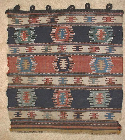
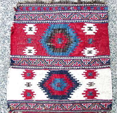
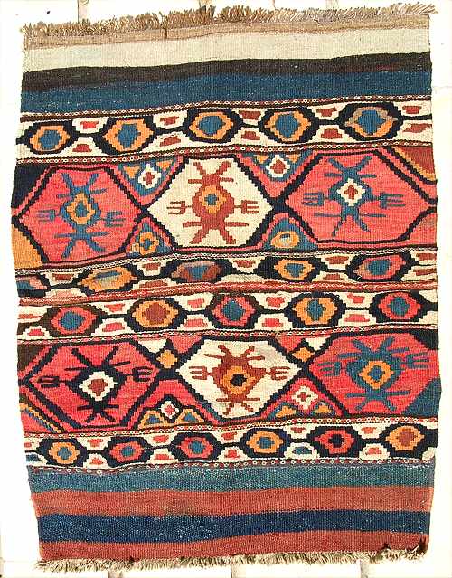
Two Shahsevan Bagfaces
Hi all
I have always been attracted to flatweaves with a simple
design. Here are 2 examples that are quite similar in size, design and colour.
Both were woven by the Shahsavan.

The first is a bagface, as
evidenced by the closure loops (woven with goathair). This piece has quite a
fine weave, with comb motifs (toothed lozenges?) decorating the field. The
colours are all natural but the red has actually faded front to back. The faded
red is actually a much nicer, mellower shade. The yellow, blues and greens show
some slight fading as well. I am not sure how old this piece is but it is
reminiscent of some older mafrashes. (See Azadi and Andrews Mafrash, page 88-89)
Also, I have not seen any other bagfaces similar to this.

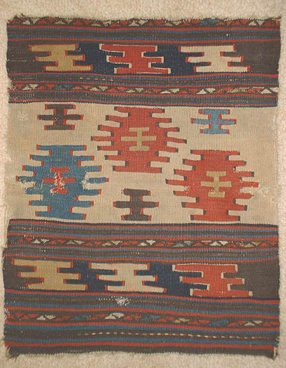
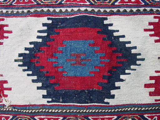
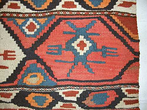
The second piece is an end panel
from a mafrash. An almost identical example can be seen in Tanavoli's Shahsavan,
plate 118. The colours are all natural though the weave is not as fine as the
first piece. This piece also has larger comb devices than the first bagface.
They are nicely arranged on an ivory field. What I like about these combs is the
outline. Note that the outline is quite wide and only found on the sides of the
combs (not the bottom or top) This gives them a fantastic 3D look and adds great
depth to the design. I would guess this piece is early 20C.
Which do I
prefer? I prefer them both ;-)
Best regards
Richard Tomlinson
Posted by R. John Howe on 08-27-2004 08:35 AM:
Hi Richard -
I can see why you like them both.
I think I prefer
the aesthetics of the first one, but agree that the outlining of the edges of
the second one gives it a nice richness.
A student of perspective might
quibble that the outlining of the second one cannot been seen to produce a
three-D effect since it occurs on both sides.
If we see depth on one
side of an actual object, we would not usually be seeing it at the same time on
the other side as well unless its shape is like a blunted "pie slice:" narrower
in the front than in the back, and I don't think that is this weaver's intent.
I suspect that the outlining is just that, without any three-D effect
intended or produced. It does add complexity and richness and that may be
enough.
Regards,
R. John Howe
Posted by Filiberto Boncompagni on 08-27-2004 12:05 PM:
Hi Richard,
They are both nice and they gain in being displayed
together. I guess this is the way you display them, side by side. Right?
Regards,
Filiberto
Posted by Jerry Silverman on 08-27-2004 03:22 PM:
In a lame movie from the '70s, "Butterflies Are Free" the blind protagonist
was fond of saying, "None are so blind as though who would not see." (I told you
it was lame.)
But the saying is true here, apparently.
So far
you've all missed the important distinction between these two pieces. No, it's
not the relative fineness of the weaving or the outlining of the motifs. Nope.
Nothing like that at all. And it's so ridiculously obvious that it makes me
wonder whether anyone is actually looking at these pieces.
As anyone can
plainly see, the first piece shows pregnant millipedes. The second shows
pregnant centipedes.
Sheesh! Do I have to do ALL the
work?
Cordially,
-Jerry-
Posted by R. John Howe on 08-27-2004 03:53 PM:
Good work, Jerry.
I knew there were good reasons for your presence on
the management team.
Regards,
R. John Howe
Posted by Patrick Weiler on 09-05-2004 05:40 PM:
Borders
Richard,
This is a handsome set of weavings. Is there any cotton in
either of them?
The first piece reminds me of a three-lane freeway with only
a single person in each vehicle. The second looks like three boats in a river,
with the six-armed trees lining the banks.
In both of your pieces, each of
the main motifs has a single "driver" inside. A piece I own has motifs with
three "passengers" inside.
The first bag has these six-armed devices that
do not slant and the middle arms are longer than the top and bottom arms. There
is an interesting slant to the border motifs of the second bag.
I have a few
bags with these six-armed devices that I will post shortly.
Your first
piece has the "drivers" outlined and also the perimeters of the motifs are
outlined. The second piece has only outlining at the sides.
My piece has no
outlining of the motifs.
I like your second piece better because of the
asymmetry of the central panel, the open feeling of the white field and the
dynamic effect of the slanted border motifs.
Patrick Weiler
Posted by Vincent Keers on 09-05-2004 06:14 PM:
Dear John,
No 3D?
Imagine looking in.
Not from left or right.
But
upfront, look in.
Dear Richard,
Think I like the first one
better.
No.
I like the other one better.
No.
Yes.
No.
I can't
decide.
Yes, the 3D wins.
Best regards,
Vincent
Posted by Patrick Weiler on 09-06-2004 01:40 PM:
Border Patrol
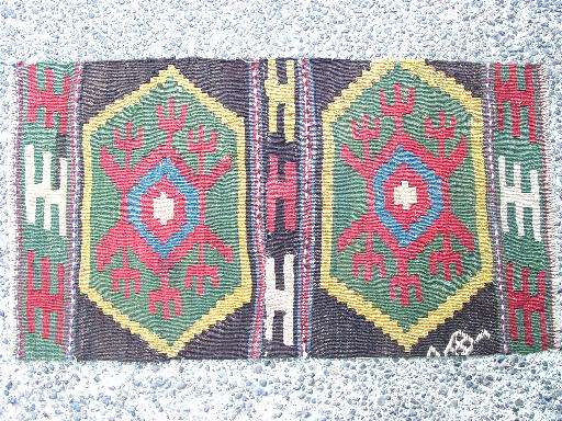
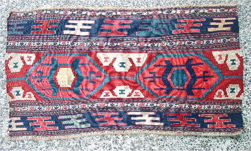
Here is a picture of a possibly Shahsavan weaving comprised of what may have
been the two end-panels of a mafrash, or the two faces of a khorjin.

It has been sewn together just
to the left of the middle section where the usual 6-arm devices have only four
arms. This middle border section belongs to the right-half piece. I expect this
was a mafrash due to the extra-weft device you can see at the lower right. It
would have continued around to the face of the mafrash. The faces of the mafrash
each would have had two of the medalions.

This piece has the slanted 6-arm
border motif, but there is no outlining at all, either around the border devices
or the medallion devices. This is rather unusual.
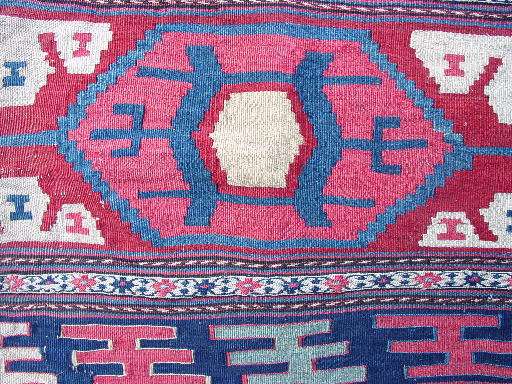
The unique aspect of
this piece is that the motifs in the medallions have three pitchfork arms
projecting from each side. There are no other examples of this design I have
found where all three projecting arms have forks. Usually only the central arm
has forks. I have an example showing the single forked arm which I will post
shortly.
Could this be the progenitor of the design? It is hard to tell
how old the piece is, though there is nothing to indicate synthetic dyes. The
yellow is clear and strong, the green is a yellow/blue and the field color is a
deep chocolate brown. I also have not seen other pieces with the feel or
coloration of this piece, although Kara-Koyunlu Kazaks come
close.
Patrick Weiler
Posted by Patrick Weiler on 09-06-2004 02:47 PM:
More six-armed pieces
Richard,
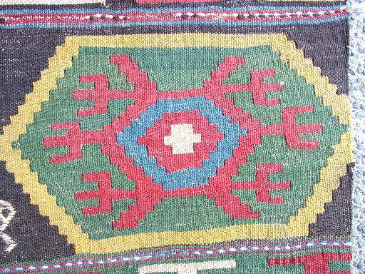
Here is The piece with all the passengers. It looks more
like a military tank with a four-Humvee escort:

Here is a close-up showing the tight
weave and cotton white. There is no green in this piece, but all of the small 4
and 6-arm devices are a blue-green, in contrast to the lighter blue in the
medallions.

And
finally, the piece with only one forked arm on each side of the medallion. It is
one face of a mafrash. The border devices are outlined in contrasting colors,
making them stand out clearly. Notice that the top border devices are slanting
to the right and the bottom devices are slanting to the left. This gives the
piece a dynamism lacking in the other pieces. :

This close-up shows the straw-yellow
center of the left-hand medallion. This is in stark contrast to the bright
yellow of the first piece, leading me to believe they were woven in different
areas. I have recently seen another piece on the internet with the same
coloration as this piece, but with a different central design:

If I could only keep one of
these three, it would be the last one, but the first one gives it a run for the
money.
Patrick Weiler
Posted by Filiberto Boncompagni on 09-07-2004 05:02 AM:
Hi Pat,
I’m not sure of the connection between Richard’s pieces and
your last mafrash panel, but it gives me the opportunity to show one of my last
acquisitions (and to use my new digicam).
This is a small, modern and
coarse kilim. As usual, it comes from Daghestan, so I doubt it has anything to
do with the Shahsavan:


Similar design to your last one…
At page 171 of
Hull&Luczyc-Wyhowska “Kilim” there is a detail of a kilim with a much more
similar forked device - this one with outlining – attributed to the
Shahsavan.
Regards,
Filiberto
Posted by Richard Tomlinson on 09-07-2004 07:26 AM:
Hi Patrick, All
Patrick - you asked about cotton in my pieces. No -
there is no cotton in either.
Thanks for posting comparisons and for the
comments. You have pointed out some aspects of design that I had not thought to
consider.
I like your pieces very much. The first example is most
unusual, especially the colouring. I have never seen the 3 pitchfork arms
either. I had a quick look through all my books and pics on the Internet but
found nought.
It is difficult to gauge the handle and colour of the 2nd
piece but it appears almost a carbon copy of a piece in Tanavoli (and Azadi)
that has been dated to early 19C. Could it be that old?
The 3rd piece
appears to have very nice colours as well, and I have seen several very nice
piece on the Internet that have similar colouring.
I actually like the
2nd piece best of the three, though. I like the vine meandering border (which I
assume is woven in soumac) and the simplicity of design. I also like the reverse
mirror effect of the colours in the 2 main sections.
Filiberto - I
like your piece too, even if it is a modern production piece. There are so many
terrible modern pieces floating around and its nice to see that in some places,
attractive looking pieces are being made.
Best Regards
Richard
Tomlinson
